Look beneath the obvious.
Ask a better question. Respect what the client knows. Notice what familiarity can hide.
Use this guide when writing, designing or making something for IOXIQ.
We help business owners and leaders investigate their options and decide what to do next.
A clear recommendation
on what to do next
in your business.
IOXIQ is an independent strategy consultancy in Amsterdam. We combine strategy and commercial research, with specialists brought in when the work needs them.
We write for people making decisions about their business. Explain the work in terms of customers, costs, people and the choices they face.
Input / output × intelligence.
Check the information behind a recommendation, and revisit it when new evidence changes the case.
Ask a better question. Respect what the client knows. Notice what familiarity can hide.
Follow evidence, challenge assumptions and show uncertainty. Confidence comes from reasoning.
A recommendation includes its trade-offs, limits and a proportionate action. IOXIQ recommends; the client decides.
Be approachable and specific. A confident design must never imply that business results are guaranteed.
Write for the person making a business decision. Help them understand the work, weigh the evidence and decide what to do next.
Use the words a business owner would use. Explain the work, name the output and make the next action clear.
IOXIQ sounds like an attentive adviser who understands business and takes the time to understand yours. We ask useful questions, explain our reasoning and give a recommendation the reader can judge.
Good copy gives the reader something useful: an explanation, a relevant detail or a next step. These standards apply to websites, proposals, reports, emails and social posts, whether written by a person, with AI or together.
Download the writing guideSay something the reader can use. The examples below demonstrate wording; they are not claims about completed client work. Use a scope or recommendation example only when it matches the actual work and evidence.
“Find out whether customers would pay before committing to a launch.”
“In today’s rapidly evolving landscape, understanding your customers is more crucial than ever.”
“We compare the options and explain which one we recommend.”
“We unlock actionable insights and deliver transformative strategic clarity.”
“Which customers are leaving, and what reasons do they give?”
“We take a comprehensive approach to your multifaceted challenges.”
“We help you decide what to do next.”
“We don’t just deliver strategy. We unlock your future.”
“Test demand before launching. The cost of a launch is hard to justify while willingness to pay is unknown.”
“There are advantages and disadvantages to launching. Ultimately, the right decision depends on your business.”
“Sales fell. We need to check whether price affected demand.”
“Sales fell, underscoring the urgent need for a transformative pricing strategy.”
“The review will help you compare the options.”
“A pivotal review that will redefine your business and guarantee lasting success.”
“The report includes the options and their costs.”
“The report serves as a comprehensive testament to the possibilities ahead.”
“Tell us what’s going on. You don’t need a finished brief.”
“Great question! Let’s dive into your exciting business journey.”
“Read the scope”
“Unlock your potential”
Lead with the point. Use the next sentence to explain it or give evidence. Let a paragraph end when it has done its job. A short headline can invite attention; the copy beneath it must explain something.
For a recommendation, move from the business question through evidence and options to a next step. A button, an email or a short answer needs only the parts that help its reader.
Prefer “use” to “leverage”, “look into” to “delve into”, and “includes” to “boasts”. Words such as “seamless”, “robust”, “innovative”, “pivotal” and “transformative” need a specific meaning and evidence. Often the useful edit is to describe what happens.
These are choices about meaning, not a banned-word list. Keep a necessary technical term, explain it once and use it consistently. A familiar word can still be vague: explain what “clarity”, “value” or “growth” means in this situation.
Bring in what IOXIQ actually knows: the question being investigated, a relevant observation, a trade-off or the reason for a recommendation. If the paragraph could belong to any consultancy, find the useful detail or remove it. Never invent detail to make the writing distinctive.
Our character stays consistent. The reader’s situation determines how much warmth, detail and formality is useful.
Be welcoming and easy to follow. Start with a recognisable business concern; invite an answer without assuming the problem.
Example wording“What are you trying to decide?”
Ask for the information needed now. Follow up on what the person has said and keep the same terms from the first choice through the final message.
Example wording“What would you need to know before going ahead?”
Be precise about evidence and willing to give a view. Explain the trade-off and uncertainty. Keep decorative language out of the reasoning.
Example wording“We don’t yet know whether customers would pay. Test that before deciding to launch.”
Be explicit about the work, outputs, price basis and limits. Put conditions beside the relevant promise. Use the agreed commercial terms.
Example wording“Scope, outputs and final terms are agreed before paid work.”
Be calm and direct. Explain the actual state and the next action. Avoid jokes, blame or a success message before something has happened.
Example wording“Review before you send. Nothing is sent until you choose to send it.”
Offer one useful observation or question, then develop it. A little playfulness is welcome when it serves the idea. Avoid grand predictions and empty provocation.
Example wording“What would have to be true for this to work?”
Imagine speaking with an owner you’ve just met. Ask about their customers, sales, costs and decisions. Let them describe what’s happening before naming the kind of help they need. Ask one clear question at a time and follow up on the answer.
“What’s on your mind?”
“Select your strategic challenge.”
“We need to grow the business.”
“Find our growth.”
“We’re struggling to stand out.”
“Sharpen our value.”
“I need someone to think this through with.”
“Get strategic support.”
“Where could AI actually help us?”
“Identify your AI transformation priorities.”
“What do you sell or do, and who are your customers?”
“Describe your operating model and target segments.”
“What are you considering, and what would you need to know before going ahead?”
“Outline your commercial due diligence requirements.”
“Does this sound right?”
“Validate your strategic brief.”
Confidence comes from the reasoning. Distinguish what we know, what we infer and what we recommend. A recommendation should explain its trade-offs and the evidence that could change it. IOXIQ recommends; the client decides.
Commercial copy must agree with the current fees and scope.
Use these established phrases where they fit the page and the actual action. Keep the surrounding explanation specific to the reader’s situation.
Read it once as the person who needs to understand it. Judge the usefulness and accuracy of the finished copy, whoever wrote the draft.
The supplied IOXIQ artwork is the identity. Its letterforms, spacing and proportions stay intact.
Keep the original 702 × 302 SVG artboard and its 2.325:1 ratio. Measure H as the full SVG height; reserve at least ¼ H beyond the artboard on every side.
Use at least 108px width for the full digital logo, matching the site header. For smaller browser identifiers use the supplied favicon. Keep logo SVGs vector in print and check legibility on a physical proof.
Ink, forest and cream make the space. Lime gives it energy. Supporting accents make individual moments recognisable.
Foundation / primary text
Depth / dark sections
Paper / reading surface
Primary accent / action
Humanity / curiosity
Possibility / reflection
Perspective / clarity
Supporting warmth
Secondary text on dark
Subtle dividers on dark
A composition starting point, not a quota: let the reading surface dominate, choose one leading accent and add a small secondary accent only when useful. A full lime chapter is an intentional exception. Peach supports selected priority stories; it is not the default illustration accent.
| Text / surface | Calculated contrast | Use |
|---|---|---|
| Cream on ink | 16.73:1 | Body copy and labels |
| Cream on forest | 12.85:1 | Body copy and labels |
| Ink on lime | 15.35:1 | Body copy and labels |
| Ink on pink | 11.06:1 | Body copy and labels |
| Ink on lilac | 9.50:1 | Body copy and labels |
| Ink on cyan | 11.85:1 | Body copy and labels |
| Muted on ink | 9.52:1 | Body copy and labels |
Ratios use the exact solid colours above. Use a 4.5:1 minimum for normal text and 3:1 for large text and meaningful UI boundaries. Pale accents and white on cream are unsuitable for text. The Line token is decorative, not a sufficient input boundary or focus indicator. Use the shared purple focus ring on light surfaces and lime on dark surfaces. The distinct focus colour helps separate keyboard location from ordinary text and borders; do not replace it with a page accent. Verify overlays and final states separately.
About also has a local paper shade, #F2F0DF, and darker green surfaces. These are existing scene treatments; use the core palette for new work unless a deliberate extension is documented. Older foundation colours are superseded by the active palette shown here.
Use Space Grotesk for display headings and Manrope for body text. Georgia italics can add emphasis.
Fresh eyes.
New possibilities.
We check the assumptions behind your options and explain which one we recommend.
Stay curious.
One short phrase. Never a whole paragraph.| Role | Shared scale at a 16px root | Setting |
|---|---|---|
| Display / shared hero | 48–108px / fluid | Space Grotesk 500 · 1.05 line height |
| Section heading | 32–48px / fluid | Space Grotesk 500 · 1.1 line height |
| Card heading | 24–32px / fluid | Space Grotesk 500 · 1.2 line height |
| Lead | 18–22px / fluid | Manrope; weight follows role · 1.5 line height |
| Body / standard controls | 16px | Manrope; weight follows role · 1.65 line height |
| Hints / compact controls | 14px | Manrope; weight follows role · 1.6 line height |
| Captions | 12px | Manrope; weight follows role · 1.5 line height |
This table is generated from the same type tokens as the UI kit and downloadable CSS/JSON. Values scale with the reader’s root font size. Use this shared scale for reusable components. Existing editorial scenes may use larger headings, tighter tracking or different line heights as documented page variants; they do not redefine the shared tokens. Home retains its established Manrope display treatment; About, How We Work and Contact use Space Grotesk for editorial headings. Contact keeps a white form surface with warm paper, lime highlights and brand-colour accents. Keep local font files, font-display: swap and system fallbacks. Don’t manufacture weights above the bundled 400–700 range. Confirm the font licence before redistribution outside the project.
Break lines where an idea breathes. Avoid stranded words, clipped descenders and fixed-height text boxes. At narrow widths, reduce size and let the content reflow; body copy never shrinks to preserve a desktop arrangement.
Group related content together. Give headings, copy and illustrations enough room to stay readable.
A short explanation sits in its own reading column.
One useful next step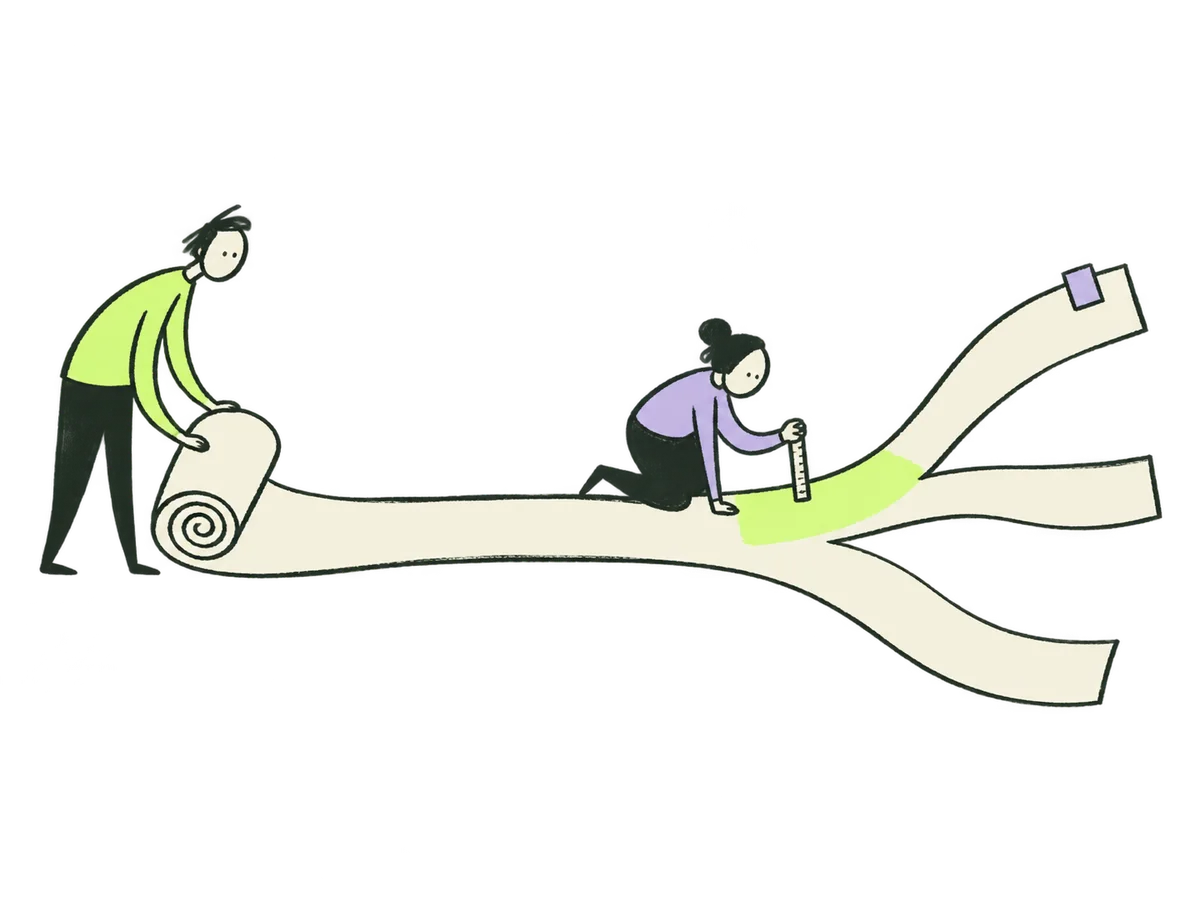 02 / ONE VISUAL METAPHOR
Use a centred 1,376–1,600px outer canvas, 24–80px fluid side gutters and a 12-column desktop logic. At 900px collapse complex splits; at 600px use one reading column with 20–24px gutters.
Use a 4px base with 8, 12, 16, 24, 32, 48, 64, 96 and 128px steps. Place related details close together and separate chapters generously.
Paper sheets, fine rules, stamps and small annotations express investigation. Keep paper corners crisp or subtly rounded; use raised rounded rectangles for actions. Illustrated discovery and process cards use 16–22px corners, a solid brand-colour surface, a separate cream artwork area and a circular action. Rotate decorative layers by about 2–5°, never a paragraph.
The illustrated discovery cards use expressive headlines to invite exploration, followed by canonical service names and readable scope. A selected card keeps its colour and gains a visible “Selected” label and check; colour is never the only signal. Compact form cards share the visual language with less decoration. Hover may lift a card or nudge its drawing, but all information and actions remain available on touch and keyboard.
Service-area names are navigation landmarks. Give them a bold numbered badge and a high-contrast nameplate: 22–28px on desktop, 20px on mobile, and at least 18px on overview cards. Use one name consistently in the menu, page label, overview, directory and enquiry: Strategy & Growth; Research & Validation; Positioning & Narrative; Digital Product; AI, Data & Agents; Advice & Leadership. Show that same name before the expressive headline. Keep category names visible when visitors arrive at a service deep link; never hide this context in tiny uppercase text.
Keep drawings and headings in separate layout areas. Let one metaphor dominate each view. Captions belong below artwork in normal flow. Place accents away from text and controls. Reserve image dimensions to prevent layout shifts.
Use readable HTML for all information. Touch targets should be at least 44 × 44px. Navigation, disclosures and controls need visible keyboard focus. At 320px width and 200% zoom, the reading column must reflow; no essential content may rely on hover or dragging.
Use editorial ink for explanations, 3D objects for the approved interactive scenes and analogue texture sparingly.

Every narrative illustration belongs to one named placement. Give another page or card a different scene, even when it explains a related topic. Navigation icons and logos may repeat. A selected card can retain its image while changing state; the reference gallery documents assets without creating another story placement.
Lifting a surface means examining assumptions. Sorting inputs means applying judgment. Comparing paths means a choice with trade-offs. A thread becoming clearer means finding the question.
People do the thinking. Avoid magical machines that turn uncertainty into certainty, generic handshakes, rockets, trophies and invented success charts.
Ink scenes sit on light paper surfaces. A dark section needs its own light image area. Don’t recolour a whole drawing to force it into a layout.
Use real supplied photography for real people. Retain identity, proportions and a natural expression. Don’t generate a staff portrait, client meeting or testimonial image that suggests a real relationship. Founder photography belongs to the About story.
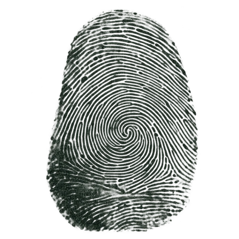
Fingerprints are synthetic decorative artwork, not biometric records. Keep their use within the established people-file concept; do not imply a new identity or credential.
The Home loop and Services perspective object may be tactile and dimensional. They have accessible click/tap controls and static fallbacks. About uses editorial ink, with no 3D magnifier. Editorial ink remains flat. Contact uses contextual drawings, not a live sculpture per question. Do not mix glossy and ink rendering inside one illustration.
Use the prompt builder below to describe a scene in the IOXIQ illustration style.
Describe the question being explained, the person doing something, the relationship between objects and the meaning of the scene. Specify materials, colour roles, framing, output and exclusions. “Make it on-brand” is not a complete brief.
This builds text locally. It does not generate or upload an image. Keep confidential information out of prompts you later send to an image service.
For a 3D object, specify geometry, material, lighting, camera and fallback agreement. For photography, start from real supplied imagery and authorised edits. Do not use the editorial master block for every medium.
Original IOXIQ conceptual object, separate from the editorial ink family. A single tactile {object} that expresses {meaning}. Soft studio lighting; rounded, precise geometry with a satin finish. Mint cyan (#8cdfd7), cream (#f6f6e9) and lilac (#c2b2f2); restrained material highlights, dark forest reflections. Three-quarter view, centred square composition with 12% clearance around the entire object. True transparent background. One focal object; zero people. No labels, text, lettering, logos, watermark, environment, hard cast shadow, busy particles or dramatic sci-fi effects. Match the geometry and camera of the approved live object when this is a fallback image. Deliver a high-resolution PNG master with alpha; verify a 640px WebP preview against cream and forest surfaces.Replace {object} and {meaning} with one specific object and its purpose. Use the approved homepage loop as reference; match the live render if it is a fallback.
Original decorative ink impression for IOXIQ. One invented fingertip-like whorl, made of imperfect thin ridges in dark forest ink (#1c3026), with uneven pressure, tiny dry gaps and believable ink transfer. Restrained analogue texture, not a perfect geometric diagram. Centred square composition, complete silhouette, at least 15% clear edge space, true transparent background. No background paper, text, labels, numbers, watermark, hands or surrounding props. Create synthetic decorative artwork only; do not reproduce a real person's biometric pattern or imply that it identifies anyone. Deliver a PNG master with alpha and check legibility at its intended small display size.
85 installed images. Open a scene for its exact original prompt, current placement and downloadable reference. Historical prompt wording is preserved here; use the standard above for new work.
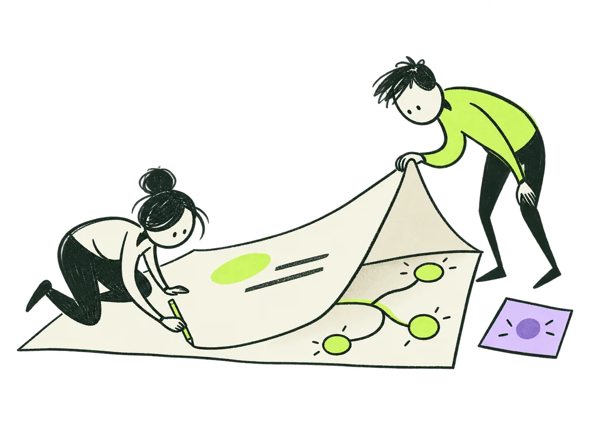
Look beneath the obviousHome / the world of IOXIQ+ORIGINAL PRODUCTION PROMPT
Use case: illustration-story. Asset type: original editorial website illustration for IOXIQ, an independent strategy and research consultancy. Art direction: witty, sophisticated hand-drawn editorial ink, inspired by the looseness of independent design studios and conceptual magazine drawings. Slightly scratchy dark forest charcoal strokes (#1c3026), irregular pressure, occasional open contours and deliberate imperfections. Airy, confident, simple. Flat chartreuse lime (#beff67) applied like one broad translucent marker swatch; one tiny lavender (#c2b2f2) accent at most. Organic expressive people drawn with simple oval heads, dot eyes, asymmetric curved bodies, thin limbs; personality through posture. No detached oversized glove hands, no corporate vector clip art, no polished uniform outlines, no glossy 3D, no gradients or shadows. Retain plenty of clear space between shapes. Genuine transparent background; cream areas inside objects may be solid #f6f6e9. The illustration should feel like a clever visual idea, not a busy infographic. No text, lettering, numbers, logos, signatures or watermark. Composition: a generous approximately 4:3 landscape canvas, entire illustration visible, centered with 12% empty edge clearance. Limited to 2 people and 3 major props. Clear at a small website display size. Scene: two inquisitive little people investigating one enormous folded sheet resting low in the scene. The nearer person in a lime top bends down and lifts the right corner of the sheet like a flap; the other person crouches at the left and traces a single dark line under it with a pencil. Under the raised paper is a surprising simple branching network with three round evidence nodes and a single lime connection. The raised flap is cream, with just two simple marks on top. One small lavender evidence card sits to the side. Strong asymmetry and a touch of visual wit, not a literal office. Meaning: your knowledge plus our independent investigation reveals possibilities beneath familiar assumptions. Avoid lens, magnifying glass, iceberg or diver.Download reference image
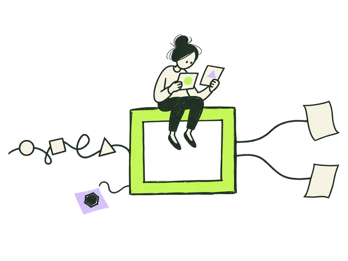 Better inputs, better decisionsHome / useful AI+
ORIGINAL PRODUCTION PROMPT
Use case: illustration-story. Asset type: original editorial website illustration for IOXIQ, an independent strategy and research consultancy. Art direction: witty, sophisticated hand-drawn editorial ink, inspired by the looseness of independent design studios and conceptual magazine drawings. Slightly scratchy dark forest charcoal strokes (#1c3026), irregular pressure, occasional open contours and deliberate imperfections. Airy, confident, simple. Flat chartreuse lime (#beff67) applied like one broad translucent marker swatch; one tiny lavender (#c2b2f2) accent at most. Organic expressive people drawn with simple oval heads, dot eyes, asymmetric curved bodies, thin limbs; personality through posture. No detached oversized glove hands, no corporate vector clip art, no polished uniform outlines, no glossy 3D, no gradients or shadows. Retain plenty of clear space between shapes. Genuine transparent background; cream areas inside objects may be solid #f6f6e9. The illustration should feel like a clever visual idea, not a busy infographic. No text, lettering, numbers, logos, signatures or watermark. Composition: a generous approximately 4:3 landscape canvas, entire illustration visible, centered with 12% empty edge clearance. Limited to 2 people and 3 major props. Clear at a small website display size. Scene: a curious small person sits astride a large lime open rectangular frame in the middle, manually comparing two small source cards. A loose scribbled dark thread with three ambiguous little geometric pieces enters from the left, and becomes two clear separated lines leaving at the right after the person's attentive inspection, ending in two open unlabelled paper routes. The person is actively checking the evidence, not just watching a machine. One unresolved small piece is deliberately left to the side on a tiny lavender slip. Diagram-like story, lots of negative space, one person only. Meaning: intelligence and human judgment improve the quality of inputs and make outputs useful; uncertainty is not magically erased. No gears, robots, brains, sparkles, filters, tap or funnel. No arrows promising upward growth.Download reference image
Choose what is worth pursuingHome / growth+ORIGINAL PRODUCTION PROMPT
Use case: illustration-story. Asset type: original editorial website illustration for IOXIQ, an independent strategy and research consultancy. Art direction: witty, sophisticated hand-drawn editorial ink, inspired by the looseness of independent design studios and conceptual magazine drawings. Slightly scratchy dark forest charcoal strokes (#1c3026), irregular pressure, occasional open contours and deliberate imperfections. Airy, confident, simple. Flat chartreuse lime (#beff67) applied like one broad translucent marker swatch; one tiny lavender (#c2b2f2) accent at most. Organic expressive people drawn with simple oval heads, dot eyes, asymmetric curved bodies, thin limbs; personality through posture. No detached oversized glove hands, no corporate vector clip art, no polished uniform outlines, no glossy 3D, no gradients or shadows. Retain plenty of clear space between shapes. Genuine transparent background; cream areas inside objects may be solid #f6f6e9. The illustration should feel like a clever visual idea, not a busy infographic. No text, lettering, numbers, logos, signatures or watermark. Composition: a generous approximately 4:3 landscape canvas, entire illustration visible, centered with 12% empty edge clearance. Limited to 2 people and 3 major props. Clear at a small website display size. Scene: a small inquisitive person at the left unrolls a large cream paper strip across the lower middle; the strip branches into three short possible routes angled apart at the right, like an unfolding paper map. Two routes stay open in dark forest ink, while a short lime marker stroke highlights only the first portion of the middle route. A second smaller person kneels at that first portion holding a tiny measuring stick, testing it before either person walks ahead. One small lavender square paper tab. Do not highlight an entire route or a final destination. Airy sweeping curves, charming awkward proportions, confident economical drawing. Meaning: compare options, test the next step, commit with evidence. No trophy, rocket, growth bar chart, flag at summit, treasure or guaranteed success.Download reference image
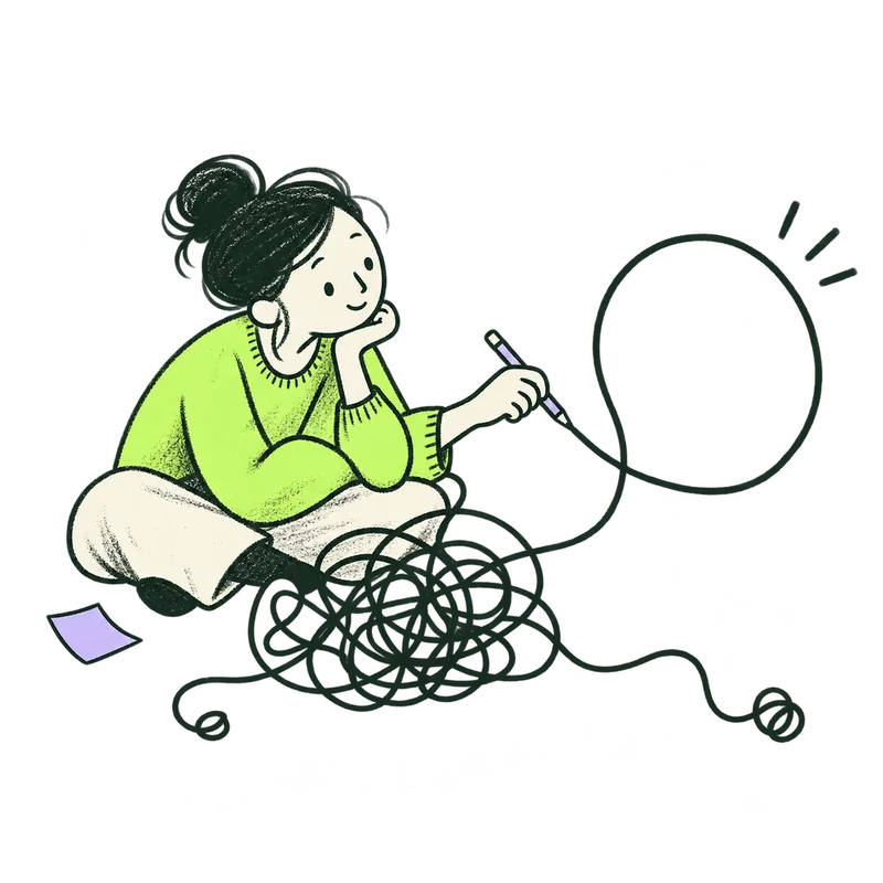
Untangle the questionContact / priority question+ORIGINAL PRODUCTION PROMPT
Use case: illustration-story. Original IOXIQ editorial website illustration, part of the same coordinated family as the recent "look beneath the obvious", "better inputs" and "choose a route" drawings in this conversation. Style: sophisticated but playful editorial charcoal and dry forest-green ink (#1c3026), slightly irregular hand-drawn contours, small expressive human figures with oval heads, dot eyes and confident curved gestures. Cream paper forms (#f6f6e9), one strong lime (#beff67) patch and a small lavender (#c2b2f2) detail. Sparse visible ink grain. Simple flat editorial drawing, not polished corporate vector clip art, not glossy or 3D. Main action immediately legible at 300px. Transparent background with true alpha, no ground rectangle or paper background. All figures and objects fit fully in frame with at least 12% clear margins. No text, letters, numbers, logos, watermark, shadow or infographic labels. No detached oversized hands. Keep one clear action, one or two people at most, very few props. Scene: Square composition. A curious person in a lime jumper sits beside a loose, airy dark-ink tangle and gently follows one thread with a pencil. The thread opens into a large clean loop, while two alternative thread ends remain unresolved. A tiny lavender slip lies nearby. The character looks interested rather than distressed. Meaning: find the question before assuming an answer.Download reference image
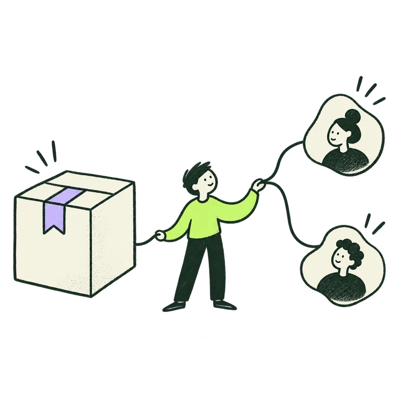 Your business and its customersContact / business context+
ORIGINAL PRODUCTION PROMPT
Use case: illustration-story. Original IOXIQ editorial website illustration, part of the same coordinated family as the recent "look beneath the obvious", "better inputs" and "choose a route" drawings in this conversation. Style: sophisticated but playful editorial charcoal and dry forest-green ink (#1c3026), slightly irregular hand-drawn contours, small expressive human figures with oval heads, dot eyes and confident curved gestures. Cream paper forms (#f6f6e9), one strong lime (#beff67) patch and a small lavender (#c2b2f2) detail. Sparse visible ink grain. Simple flat editorial drawing, not polished corporate vector clip art, not glossy or 3D. Main action immediately legible at 300px. Transparent background with true alpha, no ground rectangle or paper background. All figures and objects fit fully in frame with at least 12% clear margins. No text, letters, numbers, logos, watermark, shadow or infographic labels. No detached oversized hands. Keep one clear action, one or two people at most, very few props. Scene: Square composition. A small person stands between a large simple cream product box at the left and two smaller abstract cream customer profile shapes at the right, connecting them with one purposeful ink line. The person's long lime sleeve makes a lively curve; a lavender product tab adds one accent. The person is making the relationship understandable, no machinery or generic boardroom. Meaning: what your business offers and who it serves.Download reference image
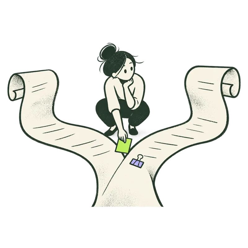 Make room for a decisionContact / decision+
ORIGINAL PRODUCTION PROMPT
Use case: illustration-story. Original IOXIQ editorial website illustration, part of the same coordinated family as the recent "look beneath the obvious", "better inputs" and "choose a route" drawings in this conversation. Style: sophisticated but playful editorial charcoal and dry forest-green ink (#1c3026), slightly irregular hand-drawn contours, small expressive human figures with oval heads, dot eyes and confident curved gestures. Cream paper forms (#f6f6e9), one strong lime (#beff67) patch and a small lavender (#c2b2f2) detail. Sparse visible ink grain. Simple flat editorial drawing, not polished corporate vector clip art, not glossy or 3D. Main action immediately legible at 300px. Transparent background with true alpha, no ground rectangle or paper background. All figures and objects fit fully in frame with at least 12% clear margins. No text, letters, numbers, logos, watermark, shadow or infographic labels. No detached oversized hands. Keep one clear action, one or two people at most, very few props. Scene: Square composition. One thoughtful person crouches at the junction of two large unfolding cream paper routes. They hold a little lime rectangular card between the routes while looking from one to the other, with a tiny lavender clip beside the junction. Both routes stay open. Strong simple silhouette, wit in the oversized paper and small human. Meaning: what needs deciding, before choosing a direction.Download reference image
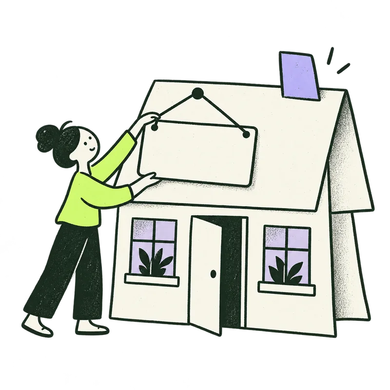 The company behind the questionContact / company+
ORIGINAL PRODUCTION PROMPT
Use case: illustration-story. Original IOXIQ editorial website illustration, part of the same coordinated family as the recent "look beneath the obvious", "better inputs" and "choose a route" drawings in this conversation. Style: sophisticated but playful editorial charcoal and dry forest-green ink (#1c3026), slightly irregular hand-drawn contours, small expressive human figures with oval heads, dot eyes and confident curved gestures. Cream paper forms (#f6f6e9), one strong lime (#beff67) patch and a small lavender (#c2b2f2) detail. Sparse visible ink grain. Simple flat editorial drawing, not polished corporate vector clip art, not glossy or 3D. Main action immediately legible at 300px. Transparent background with true alpha, no ground rectangle or paper background. All figures and objects fit fully in frame with at least 12% clear margins. No text, letters, numbers, logos, watermark, shadow or infographic labels. No detached oversized hands. Keep one clear action, one or two people at most, very few props. Scene: Square composition. A person in a lime top holds a large blank cream hanging sign against a simplified small building made from a folded sheet of paper, with two windows and an open door. A lavender tab is attached to the roof. The blank sign is central, no lettering anywhere. Meaning: giving the business a name and a place in the conversation. Not real architectural photography, no cityscape.Download reference image
 A window into the businessContact / website+
ORIGINAL PRODUCTION PROMPT
Use case: illustration-story. Original IOXIQ editorial website illustration, part of the same coordinated family as the recent "look beneath the obvious", "better inputs" and "choose a route" drawings in this conversation. Style: sophisticated but playful editorial charcoal and dry forest-green ink (#1c3026), slightly irregular hand-drawn contours, small expressive human figures with oval heads, dot eyes and confident curved gestures. Cream paper forms (#f6f6e9), one strong lime (#beff67) patch and a small lavender (#c2b2f2) detail. Sparse visible ink grain. Simple flat editorial drawing, not polished corporate vector clip art, not glossy or 3D. Main action immediately legible at 300px. Transparent background with true alpha, no ground rectangle or paper background. All figures and objects fit fully in frame with at least 12% clear margins. No text, letters, numbers, logos, watermark, shadow or infographic labels. No detached oversized hands. Keep one clear action, one or two people at most, very few props. Scene: Square composition. A curious person leans through an oversized simple cream browser-window frame, opening it like a physical window. One hand gently points into the open space. Lime fills one side of the frame; three small dark dots at the top suggest a browser. A tiny lavender pointer floats beside it. Meaning: a public website offers a useful view. No web text, complex interface or real logo.Download reference image
 A person behind the questionContact / name+
ORIGINAL PRODUCTION PROMPT
Use case: illustration-story. Original IOXIQ editorial website illustration, part of the same coordinated family as the recent "look beneath the obvious", "better inputs" and "choose a route" drawings in this conversation. Style: sophisticated but playful editorial charcoal and dry forest-green ink (#1c3026), slightly irregular hand-drawn contours, small expressive human figures with oval heads, dot eyes and confident curved gestures. Cream paper forms (#f6f6e9), one strong lime (#beff67) patch and a small lavender (#c2b2f2) detail. Sparse visible ink grain. Simple flat editorial drawing, not polished corporate vector clip art, not glossy or 3D. Main action immediately legible at 300px. Transparent background with true alpha, no ground rectangle or paper background. All figures and objects fit fully in frame with at least 12% clear margins. No text, letters, numbers, logos, watermark, shadow or infographic labels. No detached oversized hands. Keep one clear action, one or two people at most, very few props. Scene: Square composition. A friendly small person in a lime jumper introduces themself by holding an oversized blank cream name tag with a tiny lavender corner. An expressive wave with the free hand, one gentle curved greeting line. No written name or text. Natural asymmetrical pose, slightly humorous scale, sophisticated economical ink.Download reference image
 A place for the replyContact / reply email+
ORIGINAL PRODUCTION PROMPT
Use case: illustration-story. Original IOXIQ editorial website illustration, part of the same coordinated family as the recent "look beneath the obvious", "better inputs" and "choose a route" drawings in this conversation. Style: sophisticated but playful editorial charcoal and dry forest-green ink (#1c3026), slightly irregular hand-drawn contours, small expressive human figures with oval heads, dot eyes and confident curved gestures. Cream paper forms (#f6f6e9), one strong lime (#beff67) patch and a small lavender (#c2b2f2) detail. Sparse visible ink grain. Simple flat editorial drawing, not polished corporate vector clip art, not glossy or 3D. Main action immediately legible at 300px. Transparent background with true alpha, no ground rectangle or paper background. All figures and objects fit fully in frame with at least 12% clear margins. No text, letters, numbers, logos, watermark, shadow or infographic labels. No detached oversized hands. Keep one clear action, one or two people at most, very few props. Scene: Square composition. A person in a lime top gently places a folded cream reply note into a large open cream envelope, with a small lavender flap detail and one unclosed looping ink conversation line behind it. Everything remains open and in preparation. Meaning: a place to continue the conversation. No sent checkmark, no paper plane flying away, no address or text.Download reference image
 Understand a changing marketHome / market change+
ORIGINAL PRODUCTION PROMPT
Use case: illustration-story. Original IOXIQ editorial website illustration, part of the same coordinated family as the recent "look beneath the obvious", "better inputs" and "choose a route" drawings in this conversation. Style: sophisticated but playful editorial charcoal and dry forest-green ink (#1c3026), slightly irregular hand-drawn contours, small expressive human figures with oval heads, dot eyes and confident curved gestures. Cream paper forms (#f6f6e9), one strong lime (#beff67) patch and a small lavender (#c2b2f2) detail. Sparse visible ink grain. Simple flat editorial drawing, not polished corporate vector clip art, not glossy or 3D. Main action immediately legible at 300px. Transparent background with true alpha, no ground rectangle or paper background. All figures and objects fit fully in frame with at least 12% clear margins. No text, letters, numbers, logos, watermark, shadow or infographic labels. No detached oversized hands. Keep one clear action, one or two people at most, very few props. Scene: Landscape 4:3 composition. Two small curious people reorient a large folded cream map while three loose signal slips drift to one side. A lime line crosses the map and remains connected to one firm round point, with one small lavender slip. The people are adjusting deliberately, not panicking. Meaning: protect what works, adapt where needed, explore options. No weather disaster, chart, arrows of profit or text.Download reference image
 Examine what holds the case upHome / investment+
ORIGINAL PRODUCTION PROMPT
Use case: illustration-story. Original IOXIQ editorial website illustration, part of the same coordinated family as the recent "look beneath the obvious", "better inputs" and "choose a route" drawings in this conversation. Style: sophisticated but playful editorial charcoal and dry forest-green ink (#1c3026), slightly irregular hand-drawn contours, small expressive human figures with oval heads, dot eyes and confident curved gestures. Cream paper forms (#f6f6e9), one strong lime (#beff67) patch and a small lavender (#c2b2f2) detail. Sparse visible ink grain. Simple flat editorial drawing, not polished corporate vector clip art, not glossy or 3D. Main action immediately legible at 300px. Transparent background with true alpha, no ground rectangle or paper background. All figures and objects fit fully in frame with at least 12% clear margins. No text, letters, numbers, logos, watermark, shadow or infographic labels. No detached oversized hands. Keep one clear action, one or two people at most, very few props. Scene: Landscape 4:3 composition. A small investigator kneels beside a modest bridge made from a folded cream paper strip, carefully checking its three supporting pieces with a pencil. One support is lime and another is lightly sketched, visibly still unresolved. A lavender evidence card rests beside the person. Gentle visual wit in the scale. Meaning: examine the conditions beneath an opportunity. No crash, no money, no guaranteed returns, no numbers or text.Download reference image
 Make the relevant fit clearHome / positioning+
ORIGINAL PRODUCTION PROMPT
Use case: illustration-story. Original IOXIQ editorial website illustration, part of the same coordinated family as the recent "look beneath the obvious", "better inputs" and "choose a route" drawings in this conversation. Style: sophisticated but playful editorial charcoal and dry forest-green ink (#1c3026), slightly irregular hand-drawn contours, small expressive human figures with oval heads, dot eyes and confident curved gestures. Cream paper forms (#f6f6e9), one strong lime (#beff67) patch and a small lavender (#c2b2f2) detail. Sparse visible ink grain. Simple flat editorial drawing, not polished corporate vector clip art, not glossy or 3D. Main action immediately legible at 300px. Transparent background with true alpha, no ground rectangle or paper background. All figures and objects fit fully in frame with at least 12% clear margins. No text, letters, numbers, logos, watermark, shadow or infographic labels. No detached oversized hands. Keep one clear action, one or two people at most, very few props. Scene: Landscape 4:3 composition. Two small figures compare a large cream paper shape with an open silhouette in another cream sheet. A lime piece is brought toward the matching opening, while two different unused shapes sit apart at the side. One lavender tab. Meaning: understanding the customer's need and articulating a relevant offer, not forcing everyone into the same shape. Clean purposeful gesture, no puzzle jigsaw cliche, no text.Download reference image
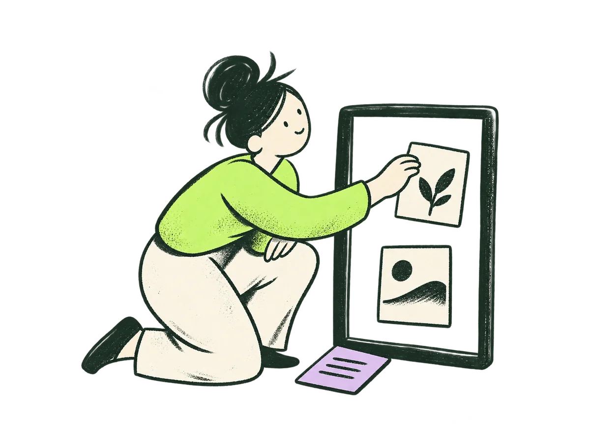 Focused assessment/how-we-work/#fees · Focused assessment+
ORIGINAL PRODUCTION PROMPT
Use case: illustration-story. Asset: a new standalone IOXIQ pricing-card illustration, part of the existing editorial family. Original IOXIQ editorial website illustration for an independent strategy and research consultancy. Communicate the business meaning through one recognisable human action. Sophisticated, curious and lightly witty. Dry forest-green ink (#1c3026), variable pressure, scratchy open contours and sparse grain inside the marks. Flat cream forms (#f6f6e9), one strong lime patch (#beff67), and at most one small secondary accent. One or two expressive people with oval heads, dot eyes, simple curved bodies and personality through posture. No more than three major props. Asymmetric but balanced; action readable at 300px. True transparent background, no ground rectangle; cream is allowed inside objects. Keep every limb and object in frame, with at least 12% clear edge space. Keep headings, captions and interface labels outside the artwork. No text, letters, numbers, logos, watermark, signatures, charts with invented data, generic office stock scenes, corporate vector clip art, uniform polished outlines, detached oversized hands, gradients, glossy 3D or drop shadows. Style fidelity: loose sophisticated mid-century editorial drawing, slightly irregular dry brush and lithographic grain, open contours with occasional dark filled patches; the same warm, simplified oval faces and gently exaggerated rounded bodies as the existing IOXIQ reference drawings. Cream paper-coloured material only inside the figures and objects, never a background. Human warmth, lively posture, restrained wit. Scene: One thoughtful person kneels beside a single upright open rectangular frame. They are placing a small cream evidence tile into the frame; two other simple tiles sit nearby. The action is making existing evidence coherent, not searching with a magnifying glass. A lime sleeve and one tiny lavender tile. One person, one frame, three simple evidence tiles. Clear, calm, slightly witty physical metaphor. Composition: compact 4:3 landscape, balanced silhouette, foreground action centred, generous 12% transparent clearance on every edge. No distant environment. Must remain immediately legible at 240 pixels wide inside a coloured card. Keep the full people and all props uncut. Exactly one finished illustration, no contact sheet, no UI or card mockup. True transparent PNG with clean alpha. No words, prices, symbols resembling letters or logos. Keep natural anatomy and each hand clearly connected to the right person.Download reference image
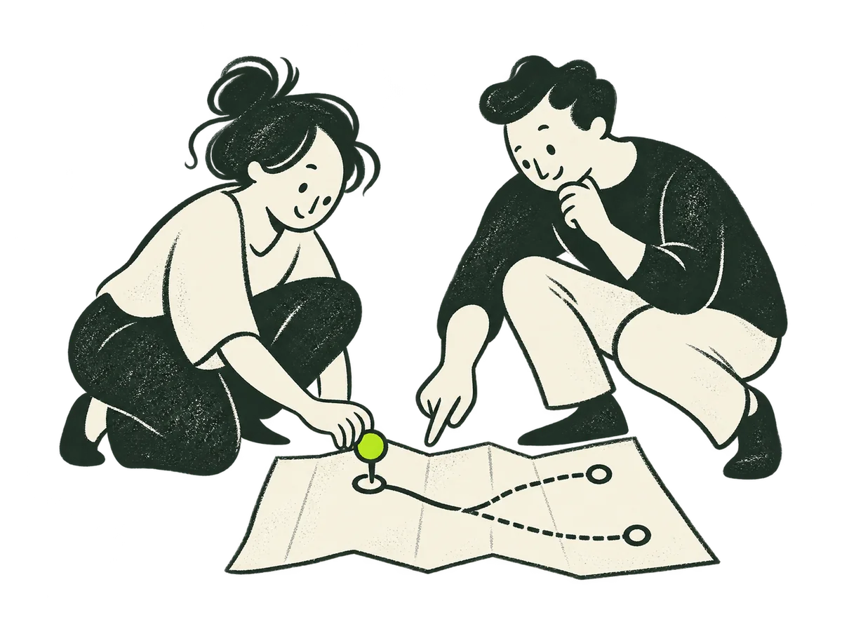 Decision Sprint/how-we-work/#fees · Decision Sprint+
ORIGINAL PRODUCTION PROMPT
Use case: illustration-story. Asset: a new standalone IOXIQ pricing-card illustration, part of the existing editorial family. Original IOXIQ editorial website illustration for an independent strategy and research consultancy. Communicate the business meaning through one recognisable human action. Sophisticated, curious and lightly witty. Dry forest-green ink (#1c3026), variable pressure, scratchy open contours and sparse grain inside the marks. Flat cream forms (#f6f6e9), one strong lime patch (#beff67), and at most one small secondary accent. One or two expressive people with oval heads, dot eyes, simple curved bodies and personality through posture. No more than three major props. Asymmetric but balanced; action readable at 300px. True transparent background, no ground rectangle; cream is allowed inside objects. Keep every limb and object in frame, with at least 12% clear edge space. Keep headings, captions and interface labels outside the artwork. No text, letters, numbers, logos, watermark, signatures, charts with invented data, generic office stock scenes, corporate vector clip art, uniform polished outlines, detached oversized hands, gradients, glossy 3D or drop shadows. Style fidelity: loose sophisticated mid-century editorial drawing, slightly irregular dry brush and lithographic grain, open contours with occasional dark filled patches; the same warm, simplified oval faces and gently exaggerated rounded bodies as the existing IOXIQ reference drawings. Cream paper-coloured material only inside the figures and objects, never a background. Human warmth, lively posture, restrained wit. Scene: Two expressive people crouch beside one folded paper map with two simple branching paths. One points to the first short step while the other places one small lime marker on it. The two paths remain visible; no finish line or guaranteed victory. One map, one marker, two people. Active collaborative gesture, a little forward energy, no text or arrows made of lettering. Composition: compact 4:3 landscape, balanced silhouette, foreground action centred, generous 12% transparent clearance on every edge. No distant environment. Must remain immediately legible at 240 pixels wide inside a coloured card. Keep the full people and all props uncut. Exactly one finished illustration, no contact sheet, no UI or card mockup. True transparent PNG with clean alpha. No words, prices, symbols resembling letters or logos. Keep natural anatomy and each hand clearly connected to the right person.Download reference image
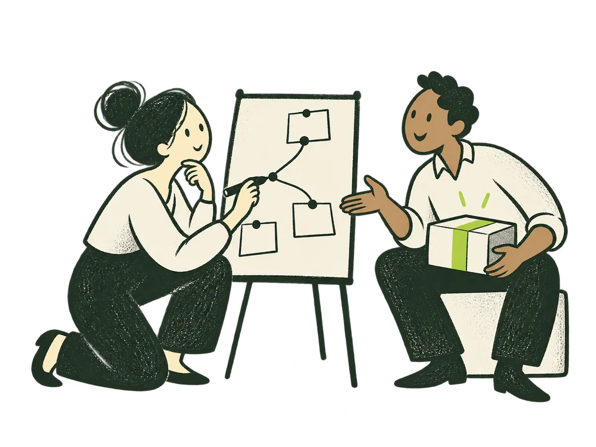 Market research/how-we-work/#fees · Market research+
ORIGINAL PRODUCTION PROMPT
Use case: illustration-story. Asset: a new standalone IOXIQ pricing-card illustration, part of the existing editorial family. Original IOXIQ editorial website illustration for an independent strategy and research consultancy. Communicate the business meaning through one recognisable human action. Sophisticated, curious and lightly witty. Dry forest-green ink (#1c3026), variable pressure, scratchy open contours and sparse grain inside the marks. Flat cream forms (#f6f6e9), one strong lime patch (#beff67), and at most one small secondary accent. One or two expressive people with oval heads, dot eyes, simple curved bodies and personality through posture. No more than three major props. Asymmetric but balanced; action readable at 300px. True transparent background, no ground rectangle; cream is allowed inside objects. Keep every limb and object in frame, with at least 12% clear edge space. Keep headings, captions and interface labels outside the artwork. No text, letters, numbers, logos, watermark, signatures, charts with invented data, generic office stock scenes, corporate vector clip art, uniform polished outlines, detached oversized hands, gradients, glossy 3D or drop shadows. Style fidelity: loose sophisticated mid-century editorial drawing, slightly irregular dry brush and lithographic grain, open contours with occasional dark filled patches; the same warm, simplified oval faces and gently exaggerated rounded bodies as the existing IOXIQ reference drawings. Cream paper-coloured material only inside the figures and objects, never a background. Human warmth, lively posture, restrained wit. Scene: One attentive researcher and one customer face each other beside a small upright board. The customer gestures towards a simple cream object representing an offer; the researcher connects three small blank evidence slips on the board with a hand-drawn ink line. One clear human action: listening and connecting what matters. No charts, percentages or invented findings. Two people, one small board, one offer object. Composition: compact 4:3 landscape, balanced silhouette, foreground action centred, generous 12% transparent clearance on every edge. No distant environment. Must remain immediately legible at 240 pixels wide inside a coloured card. Keep the full people and all props uncut. Exactly one finished illustration, no contact sheet, no UI or card mockup. True transparent PNG with clean alpha. No words, prices, symbols resembling letters or logos. Keep natural anatomy and each hand clearly connected to the right person.Download reference image
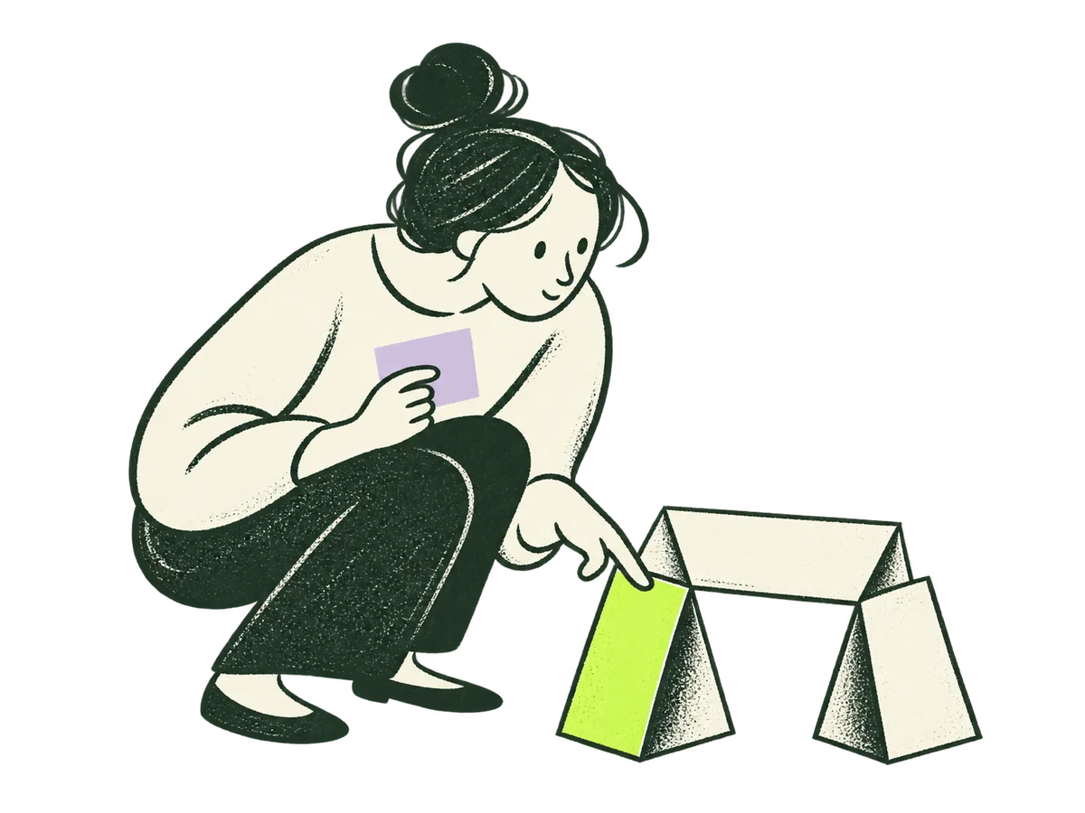 Commercial due diligence/how-we-work/#fees · Commercial due diligence+
ORIGINAL PRODUCTION PROMPT
Use case: illustration-story. Asset: a new standalone IOXIQ pricing-card illustration, part of the existing editorial family. Original IOXIQ editorial website illustration for an independent strategy and research consultancy. Communicate the business meaning through one recognisable human action. Sophisticated, curious and lightly witty. Dry forest-green ink (#1c3026), variable pressure, scratchy open contours and sparse grain inside the marks. Flat cream forms (#f6f6e9), one strong lime patch (#beff67), and at most one small secondary accent. One or two expressive people with oval heads, dot eyes, simple curved bodies and personality through posture. No more than three major props. Asymmetric but balanced; action readable at 300px. True transparent background, no ground rectangle; cream is allowed inside objects. Keep every limb and object in frame, with at least 12% clear edge space. Keep headings, captions and interface labels outside the artwork. No text, letters, numbers, logos, watermark, signatures, charts with invented data, generic office stock scenes, corporate vector clip art, uniform polished outlines, detached oversized hands, gradients, glossy 3D or drop shadows. Style fidelity: loose sophisticated mid-century editorial drawing, slightly irregular dry brush and lithographic grain, open contours with occasional dark filled patches; the same warm, simplified oval faces and gently exaggerated rounded bodies as the existing IOXIQ reference drawings. Cream paper-coloured material only inside the figures and objects, never a background. Human warmth, lively posture, restrained wit. Scene: One curious person crouches beside a small architectural paper arch made from three cream folded pieces. They carefully inspect and gently test one supporting fold with a finger while holding one small blank lavender note. A lime accent marks the fold being investigated. Show investigation rather than a broken structure or a guaranteed safe investment. One person and one simple paper structure, compact playful composition. Composition: compact 4:3 landscape, balanced silhouette, foreground action centred, generous 12% transparent clearance on every edge. No distant environment. Must remain immediately legible at 240 pixels wide inside a coloured card. Keep the full people and all props uncut. Exactly one finished illustration, no contact sheet, no UI or card mockup. True transparent PNG with clean alpha. No words, prices, symbols resembling letters or logos. Keep natural anatomy and each hand clearly connected to the right person.Download reference image
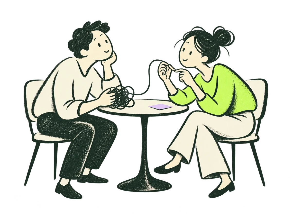 Ongoing advisory/how-we-work/#fees · Ongoing advisory+
ORIGINAL PRODUCTION PROMPT
Use case: illustration-story. Asset: a new standalone IOXIQ pricing-card illustration, part of the existing editorial family. Original IOXIQ editorial website illustration for an independent strategy and research consultancy. Communicate the business meaning through one recognisable human action. Sophisticated, curious and lightly witty. Dry forest-green ink (#1c3026), variable pressure, scratchy open contours and sparse grain inside the marks. Flat cream forms (#f6f6e9), one strong lime patch (#beff67), and at most one small secondary accent. One or two expressive people with oval heads, dot eyes, simple curved bodies and personality through posture. No more than three major props. Asymmetric but balanced; action readable at 300px. True transparent background, no ground rectangle; cream is allowed inside objects. Keep every limb and object in frame, with at least 12% clear edge space. Keep headings, captions and interface labels outside the artwork. No text, letters, numbers, logos, watermark, signatures, charts with invented data, generic office stock scenes, corporate vector clip art, uniform polished outlines, detached oversized hands, gradients, glossy 3D or drop shadows. Style fidelity: loose sophisticated mid-century editorial drawing, slightly irregular dry brush and lithographic grain, open contours with occasional dark filled patches; the same warm, simplified oval faces and gently exaggerated rounded bodies as the existing IOXIQ reference drawings. Cream paper-coloured material only inside the figures and objects, never a background. Human warmth, lively posture, restrained wit. Scene: Two expressive people lean towards each other across a tiny round table. A single loose ink thread goes from a modest tangle on one side to a simple clear loop between their hands as they work on it together. One lime garment and a tiny lavender note on the tabletop. Listening and shared thinking rather than hierarchy, lectures or a generic office meeting. Two people, one table, one thread; unmistakable action at small size. Composition: compact 4:3 landscape, balanced silhouette, foreground action centred, generous 12% transparent clearance on every edge. No distant environment. Must remain immediately legible at 240 pixels wide inside a coloured card. Keep the full people and all props uncut. Exactly one finished illustration, no contact sheet, no UI or card mockup. True transparent PNG with clean alpha. No words, prices, symbols resembling letters or logos. Keep natural anatomy and each hand clearly connected to the right person.Download reference image
 Fractional leadership/how-we-work/#fees · Fractional leadership+
ORIGINAL PRODUCTION PROMPT
Use case: illustration-story. Asset: a new standalone IOXIQ pricing-card illustration, part of the existing editorial family. Original IOXIQ editorial website illustration for an independent strategy and research consultancy. Communicate the business meaning through one recognisable human action. Sophisticated, curious and lightly witty. Dry forest-green ink (#1c3026), variable pressure, scratchy open contours and sparse grain inside the marks. Flat cream forms (#f6f6e9), one strong lime patch (#beff67), and at most one small secondary accent. One or two expressive people with oval heads, dot eyes, simple curved bodies and personality through posture. No more than three major props. Asymmetric but balanced; action readable at 300px. True transparent background, no ground rectangle; cream is allowed inside objects. Keep every limb and object in frame, with at least 12% clear edge space. Keep headings, captions and interface labels outside the artwork. No text, letters, numbers, logos, watermark, signatures, charts with invented data, generic office stock scenes, corporate vector clip art, uniform polished outlines, detached oversized hands, gradients, glossy 3D or drop shadows. Style fidelity: loose sophisticated mid-century editorial drawing, slightly irregular dry brush and lithographic grain, open contours with occasional dark filled patches; the same warm, simplified oval faces and gently exaggerated rounded bodies as the existing IOXIQ reference drawings. Cream paper-coloured material only inside the figures and objects, never a background. Human warmth, lively posture, restrained wit. Scene: Two expressive colleagues stand either side of a large folded paper plan on a low surface. One helps align three simple movable stepping-stone pieces into a coherent short route; the other places the first piece. Shared responsibility and practical direction, not a boss ordering people or a heroic saviour. One plan, three step pieces, two people, one strong lime clothing accent and at most one tiny lavender piece. Composition: compact 4:3 landscape, balanced silhouette, foreground action centred, generous 12% transparent clearance on every edge. No distant environment. Must remain immediately legible at 240 pixels wide inside a coloured card. Keep the full people and all props uncut. Exactly one finished illustration, no contact sheet, no UI or card mockup. True transparent PNG with clean alpha. No words, prices, symbols resembling letters or logos. Keep natural anatomy and each hand clearly connected to the right person.Download reference image
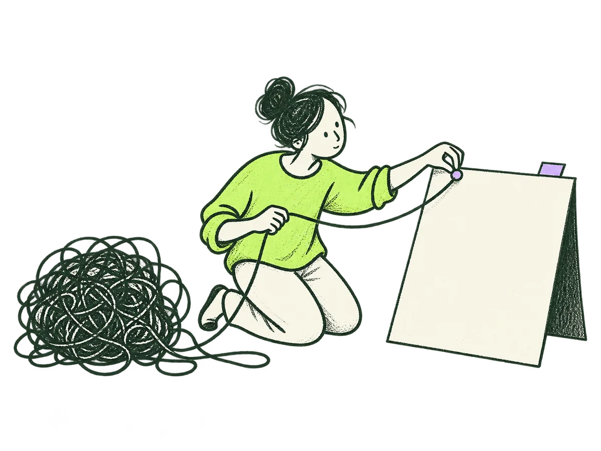 Find the real questionHome / Less noise. More direction. / Find the real question+
ORIGINAL PRODUCTION PROMPT
Use case: illustration-story. Asset type: original IOXIQ editorial ink website card illustration. Match the established IOXIQ family: dry forest-green ink (#1c3026), variable pressure, scratchy open contours, delicate pencil-like grain contained inside marks. Flat warm cream forms (#f6f6e9), one strong lime patch (#beff67), at most a small lilac (#c2b2f2) detail. Expressive oval-headed people, dot eyes, curved simplified bodies, anatomically coherent hands and limbs, character through gesture and posture. Sophisticated, curious, lightly witty, never corporate clip art. Flat editorial print illustration, not dimensional or glossy. Landscape 4:3 composition, all limbs and props fully in frame, generous 12% clear margin on every edge. One recognisable human action, readable at 300px. Genuinely transparent alpha background, no paper or colour rectangle behind the scene, no cast shadow or ground plane. Cream fills INSIDE people and objects are allowed. No text, lettering, digits, logos, watermarks, charts, fake data, rockets, handshakes or trophies. People do the thinking; no magical machines. Keep the entire scene simple enough to read inside a small card. Primary request / scene: A curious oval-headed person in a lime sweater kneels beside a loose tangle of dark ink thread. With one hand they gently draw out one useful strand; with the other they pin the free end to a large blank cream question card propped at an angle. The thread remains connected to the tangle. Clear visible action of isolating the useful question without pretending the whole tangle is solved. A tiny lilac paper tab on the card. Only the person, tangle and large card. Asymmetric balanced landscape, large confident gestures.Download reference image
 Put assumptions to workHome / Less noise. More direction. / Put assumptions to work+
ORIGINAL PRODUCTION PROMPT
Use case: illustration-story. Asset type: original IOXIQ editorial ink website card illustration. Match the established IOXIQ family: dry forest-green ink (#1c3026), variable pressure, scratchy open contours, delicate pencil-like grain contained inside marks. Flat warm cream forms (#f6f6e9), one strong lime patch (#beff67), at most a small lilac (#c2b2f2) detail. Expressive oval-headed people, dot eyes, curved simplified bodies, anatomically coherent hands and limbs, character through gesture and posture. Sophisticated, curious, lightly witty, never corporate clip art. Flat editorial print illustration, not dimensional or glossy. Landscape 4:3 composition, all limbs and props fully in frame, generous 12% clear margin on every edge. One recognisable human action, readable at 300px. Genuinely transparent alpha background, no paper or colour rectangle behind the scene, no cast shadow or ground plane. Cream fills INSIDE people and objects are allowed. No text, lettering, digits, logos, watermarks, charts, fake data, rockets, handshakes or trophies. People do the thinking; no magical machines. Keep the entire scene simple enough to read inside a small card. Primary request / scene: An expressive oval-headed investigator in a lime shirt leans low over two large overlapping cream evidence cards, inspecting the join between them with an oversized simple hand-held magnifying lens. A second small lilac slip peeks from beneath one card. The cards contain only a few loose abstract ink strokes and an empty outlined circle, no words or data charts. The person is actively comparing what fits and what does not, curious rather than triumphant. One person, the lens and a group of paper cards. Distinctive compact silhouette, generous space, horizontal editorial scene.Download reference image
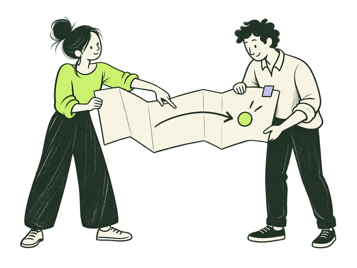 Make the choice usableHome / Less noise. More direction. / Make the choice usable+
ORIGINAL PRODUCTION PROMPT
Use case: illustration-story. Asset type: original IOXIQ editorial ink website card illustration. Match the established IOXIQ family: dry forest-green ink (#1c3026), variable pressure, scratchy open contours, delicate pencil-like grain contained inside marks. Flat warm cream forms (#f6f6e9), one strong lime patch (#beff67), at most a small lilac (#c2b2f2) detail. Expressive oval-headed people, dot eyes, curved simplified bodies, anatomically coherent hands and limbs, character through gesture and posture. Sophisticated, curious, lightly witty, never corporate clip art. Flat editorial print illustration, not dimensional or glossy. Landscape 4:3 composition, all limbs and props fully in frame, generous 12% clear margin on every edge. One recognisable human action, readable at 300px. Genuinely transparent alpha background, no paper or colour rectangle behind the scene, no cast shadow or ground plane. Cream fills INSIDE people and objects are allowed. No text, lettering, digits, logos, watermarks, charts, fake data, rockets, handshakes or trophies. People do the thinking; no magical machines. Keep the entire scene simple enough to read inside a small card. Primary request / scene: Two expressive oval-headed people work with a large cream folded route sheet at waist height. One wears a lime top, holds one end of the sheet and points clearly to a simple ink arrow and a single lime circular next-step marker. The other, in cream and dark forest clothing, takes the other edge attentively. One small lilac tab on the sheet. They are turning a recommendation into a shared next action. The paper has only the arrow and marker, no text or fake data. No table needed. The hands meet the edges naturally; feet and full bodies are visible. Balanced lively horizontal composition.Download reference image
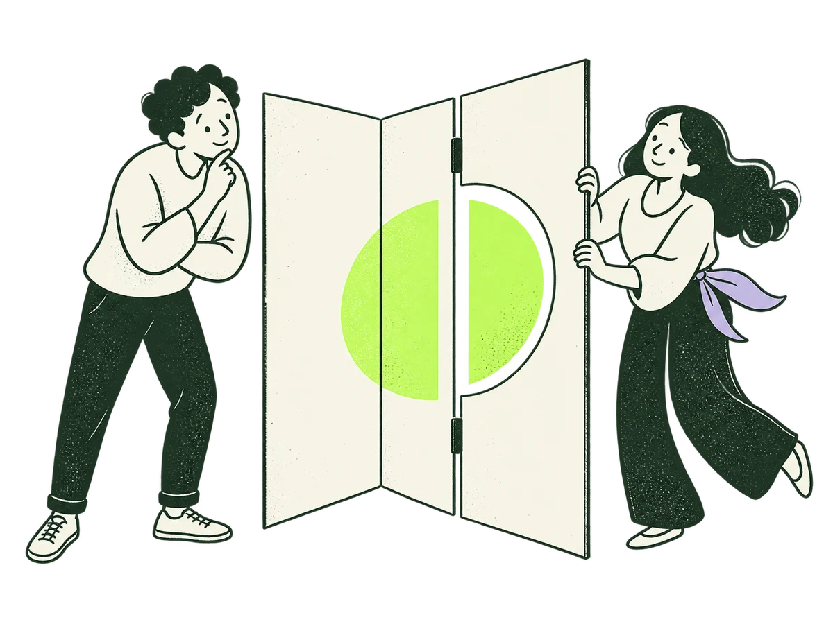 About PerspectiveAbout / opening+
ORIGINAL PRODUCTION PROMPT
Create one original IOXIQ editorial website illustration, landscape 4:3, for the About page: an outside perspective helps reveal possibilities. Scene: two thoughtful people stand on opposite sides of a large folded paper screen. One person gently turns a hinged cream panel; the other steps sideways and discovers that two separate shapes now align into a single lime circle through its opening. Show this one clear collaborative action, expressive full bodies, no table, no office backdrop. Curious, intelligent and lightly witty. Dry forest-green ink (#1c3026), variable pressure, scratchy open contours and sparse grain inside marks. Flat cream forms (#f6f6e9), one strong lime patch (#beff67), one small lilac detail (#c2b2f2). Oval heads, dot eyes, simple curved bodies with personality through posture. Maximum two people, three major props. Asymmetric balanced composition filling the central 76% of the canvas with 12% transparent safe margins on every edge. Readable at 300px. True transparent background, no ground rectangle. No text, letters, numbers, logos, watermarks, charts, generic office scenes, uniform vector lines, detached hands, gradients, glossy 3D, shadows or magnifying glass. This is a finished illustration asset, not a webpage mockup.Download reference image
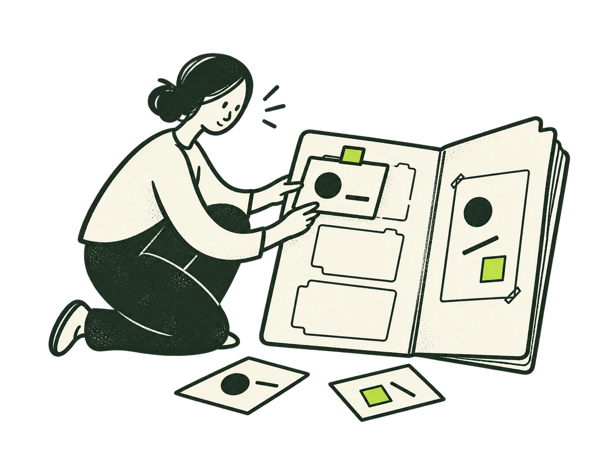 About EvidenceAbout / clear choices+
ORIGINAL PRODUCTION PROMPT
Edit this IOXIQ editorial illustration. Preserve the entire person, pose, dry ink drawing technique, cream/lime palette, framing and transparent background exactly. The metaphor is business evidence, not nature or environmental research. Remove ALL trees, leaves, plants, pine cones, mountains and landscape icons from every paper surface. Replace these motifs with sparse abstract geometric observations: a circle, a short line, a simple square. Keep the person filing a small observation card into the open evidence folder. Its pages and loose cards contain only sparse geometric marks. No writing, numbers, logos or decorative motifs. Full composition with generous transparent edge space.Download reference image
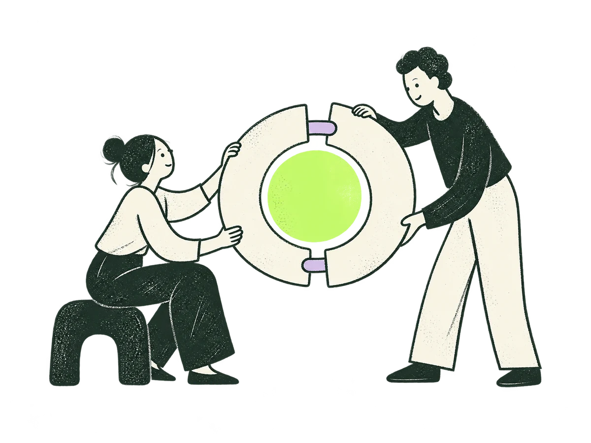 About CollaborationAbout / shaped around you+
ORIGINAL PRODUCTION PROMPT
Original IOXIQ editorial website illustration for an independent strategy and research consultancy. Communicate the business meaning through one recognisable human action. Sophisticated, curious and lightly witty. Dry forest-green ink (#1c3026), variable pressure, scratchy open contours and sparse grain inside the marks. Flat cream forms (#f6f6e9), one strong lime patch (#beff67), and at most one small secondary accent. One or two expressive people with oval heads, dot eyes, simple curved bodies and personality through posture. No more than three major props. Asymmetric but balanced; action readable at 300px. True transparent background, no ground rectangle; cream is allowed inside objects. Keep every limb and object in frame, with at least 12% clear edge space. Keep headings, captions and interface labels outside the artwork. No text, letters, numbers, logos, watermark, signatures, charts with invented data, generic office stock scenes, corporate vector clip art, uniform polished outlines, detached oversized hands, gradients, glossy 3D or drop shadows. Scene: Two people, one seated and one standing, bring differently shaped cream paper strips together to form a single lime-centred circular frame. Their different pieces are complementary, not identical. A small lilac connector is the only additional prop. Composition: landscape 4:3. One complete original standalone scene, no montage. Clear readable action at 300px. Fill the central 76% of the canvas, retaining 12% clear transparent edge space on all sides. Cream interiors must be opaque. Finished website asset; no text and no page mockup.Download reference image
 Priority ResearchHome / research story+
ORIGINAL PRODUCTION PROMPT
Original IOXIQ editorial website illustration for an independent strategy and research consultancy. Communicate the business meaning through one recognisable human action. Sophisticated, curious and lightly witty. Dry forest-green ink (#1c3026), variable pressure, scratchy open contours and sparse grain inside the marks. Flat cream forms (#f6f6e9), one strong lime patch (#beff67), and at most one small secondary accent. One or two expressive people with oval heads, dot eyes, simple curved bodies and personality through posture. No more than three major props. Asymmetric but balanced; action readable at 300px. True transparent background, no ground rectangle; cream is allowed inside objects. Keep every limb and object in frame, with at least 12% clear edge space. Keep headings, captions and interface labels outside the artwork. No text, letters, numbers, logos, watermark, signatures, charts with invented data, generic office stock scenes, corporate vector clip art, uniform polished outlines, detached oversized hands, gradients, glossy 3D or drop shadows. Scene: One researcher carefully listens through a simple oversized ear-shaped cream listening funnel while holding a small lime observation card. Another person at the other end speaks with one empty speech bubble. Listening before interpretation. Composition: landscape 4:3. One complete original standalone scene, no montage. Clear readable action at 300px. Fill the central 76% of the canvas, retaining 12% clear transparent edge space on all sides. Cream interiors must be opaque. Finished website asset; no text and no page mockup.Download reference image
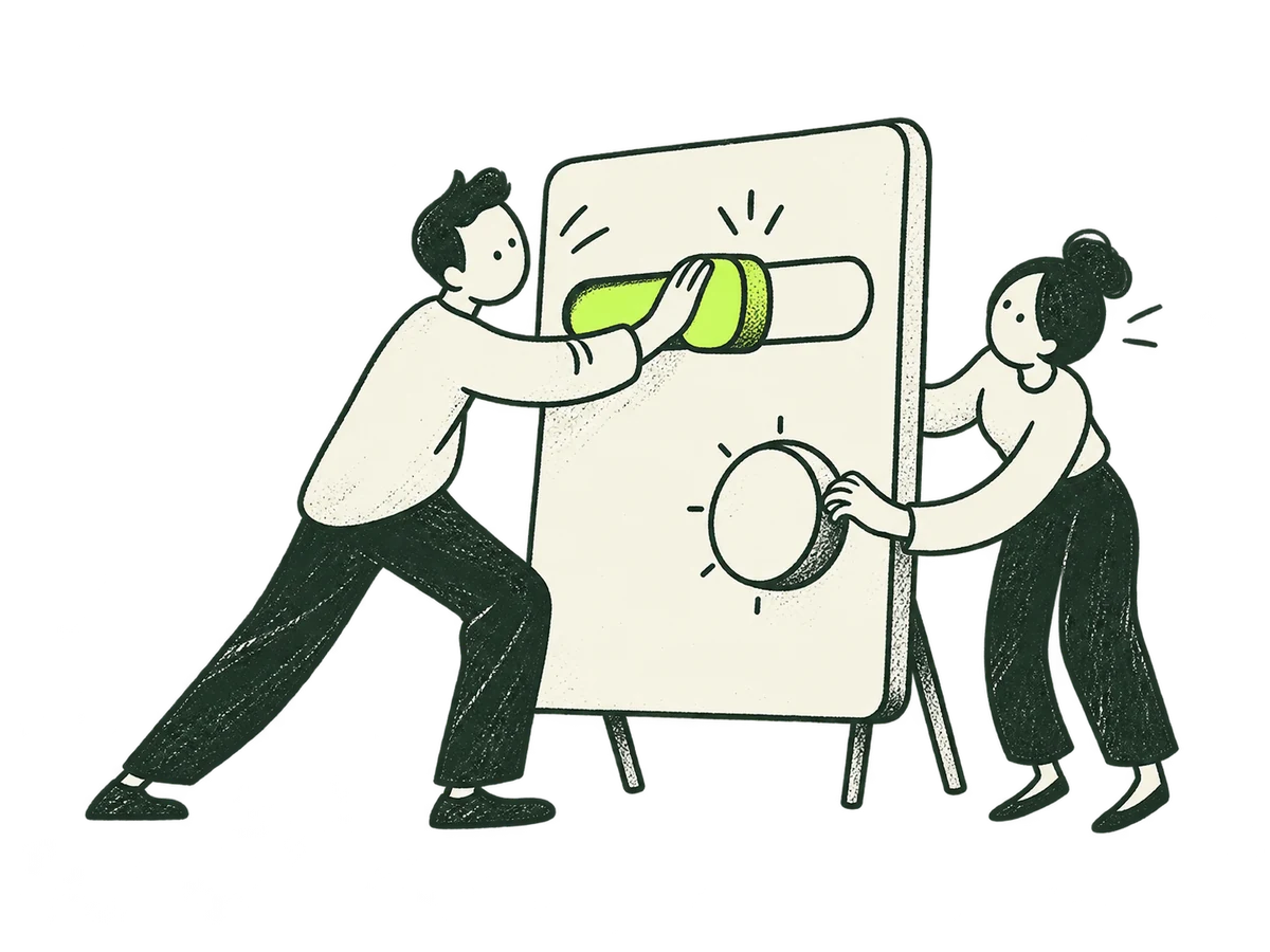 Priority ProductHome / digital product story+
ORIGINAL PRODUCTION PROMPT
Original IOXIQ editorial website illustration for an independent strategy and research consultancy. Communicate the business meaning through one recognisable human action. Sophisticated, curious and lightly witty. Dry forest-green ink (#1c3026), variable pressure, scratchy open contours and sparse grain inside the marks. Flat cream forms (#f6f6e9), one strong lime patch (#beff67), and at most one small secondary accent. One or two expressive people with oval heads, dot eyes, simple curved bodies and personality through posture. No more than three major props. Asymmetric but balanced; action readable at 300px. True transparent background, no ground rectangle; cream is allowed inside objects. Keep every limb and object in frame, with at least 12% clear edge space. Keep headings, captions and interface labels outside the artwork. No text, letters, numbers, logos, watermark, signatures, charts with invented data, generic office stock scenes, corporate vector clip art, uniform polished outlines, detached oversized hands, gradients, glossy 3D or drop shadows. Scene: A person moves a large lime slider along a freestanding cream interface panel while another person tries its round handle from the other side. The panel has only two simple controls. Product usefulness through observing real use. Composition: landscape 4:3. One complete original standalone scene, no montage. Clear readable action at 300px. Fill the central 76% of the canvas, retaining 12% clear transparent edge space on all sides. Cream interiors must be opaque. Finished website asset; no text and no page mockup.Download reference image
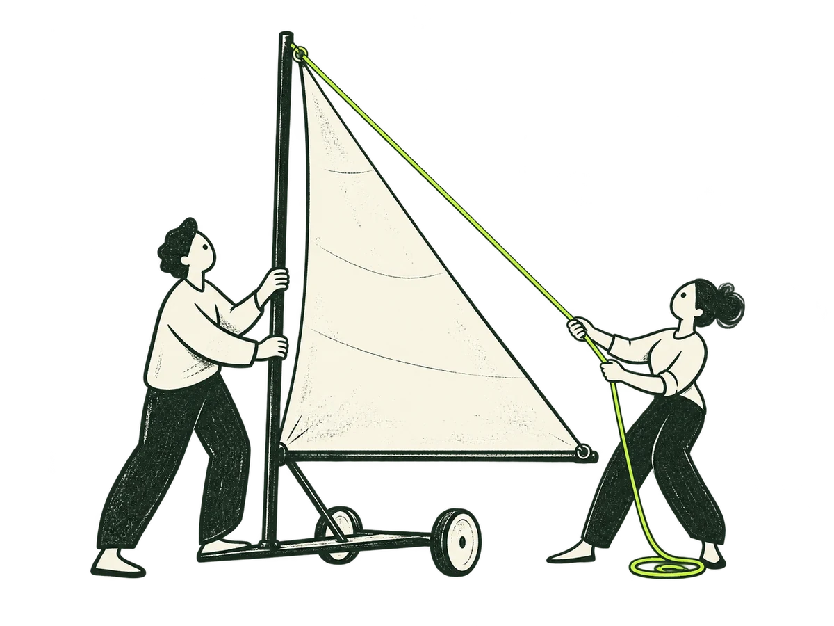 Priority LeadershipHome / leadership story+
ORIGINAL PRODUCTION PROMPT
Original IOXIQ editorial website illustration for an independent strategy and research consultancy. Communicate the business meaning through one recognisable human action. Sophisticated, curious and lightly witty. Dry forest-green ink (#1c3026), variable pressure, scratchy open contours and sparse grain inside the marks. Flat cream forms (#f6f6e9), one strong lime patch (#beff67), and at most one small secondary accent. One or two expressive people with oval heads, dot eyes, simple curved bodies and personality through posture. No more than three major props. Asymmetric but balanced; action readable at 300px. True transparent background, no ground rectangle; cream is allowed inside objects. Keep every limb and object in frame, with at least 12% clear edge space. Keep headings, captions and interface labels outside the artwork. No text, letters, numbers, logos, watermark, signatures, charts with invented data, generic office stock scenes, corporate vector clip art, uniform polished outlines, detached oversized hands, gradients, glossy 3D or drop shadows. Scene: Two people stand beside a tall paper sail. One steadies its mast while the other adjusts a lime rigging line to set its direction. Show a land-based model, no ocean, no triumphant pose. Shared strategic direction. Composition: landscape 4:3. One complete original standalone scene, no montage. Clear readable action at 300px. Fill the central 76% of the canvas, retaining 12% clear transparent edge space on all sides. Cream interiors must be opaque. Finished website asset; no text and no page mockup.Download reference image
 Priority UnsureHome / open question story+
ORIGINAL PRODUCTION PROMPT
Original IOXIQ editorial website illustration for an independent strategy and research consultancy. Communicate the business meaning through one recognisable human action. Sophisticated, curious and lightly witty. Dry forest-green ink (#1c3026), variable pressure, scratchy open contours and sparse grain inside the marks. Flat cream forms (#f6f6e9), one strong lime patch (#beff67), and at most one small secondary accent. One or two expressive people with oval heads, dot eyes, simple curved bodies and personality through posture. No more than three major props. Asymmetric but balanced; action readable at 300px. True transparent background, no ground rectangle; cream is allowed inside objects. Keep every limb and object in frame, with at least 12% clear edge space. Keep headings, captions and interface labels outside the artwork. No text, letters, numbers, logos, watermark, signatures, charts with invented data, generic office stock scenes, corporate vector clip art, uniform polished outlines, detached oversized hands, gradients, glossy 3D or drop shadows. Scene: One person opens a loosely folded cream paper parcel with a curious head tilt. Inside is one lime abstract shape still partly hidden. Another small lilac fold remains closed. Start with an incomplete thought rather than a finished brief. Composition: landscape 4:3. One complete original standalone scene, no montage. Clear readable action at 300px. Fill the central 76% of the canvas, retaining 12% clear transparent edge space on all sides. Cream interiors must be opaque. Finished website asset; no text and no page mockup.Download reference image
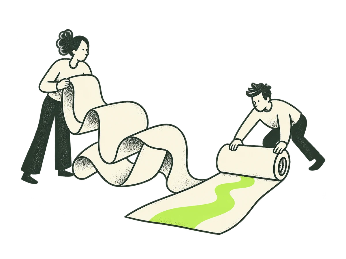 Method OpeningHow we work / opening+
ORIGINAL PRODUCTION PROMPT
Original IOXIQ editorial website illustration for an independent strategy and research consultancy. Communicate the business meaning through one recognisable human action. Sophisticated, curious and lightly witty. Dry forest-green ink (#1c3026), variable pressure, scratchy open contours and sparse grain inside the marks. Flat cream forms (#f6f6e9), one strong lime patch (#beff67), and at most one small secondary accent. One or two expressive people with oval heads, dot eyes, simple curved bodies and personality through posture. No more than three major props. Asymmetric but balanced; action readable at 300px. True transparent background, no ground rectangle; cream is allowed inside objects. Keep every limb and object in frame, with at least 12% clear edge space. Keep headings, captions and interface labels outside the artwork. No text, letters, numbers, logos, watermark, signatures, charts with invented data, generic office stock scenes, corporate vector clip art, uniform polished outlines, detached oversized hands, gradients, glossy 3D or drop shadows. Scene: One person holds one end of an enormous loosely folded cream ribbon; a second person unrolls the other end revealing a short lime route. No fork, no arrows, no text. Turn an unfinished thought into a tractable investigation. Composition: landscape 4:3. One complete original standalone scene, no montage. Clear readable action at 300px. Fill the central 76% of the canvas, retaining 12% clear transparent edge space on all sides. Cream interiors must be opaque. Finished website asset; no text and no page mockup.Download reference image
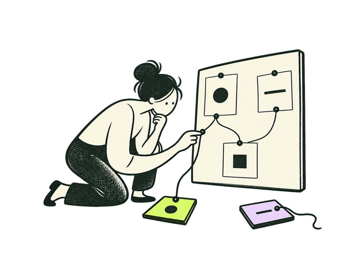 Method EvidenceHow we work / investigate+
ORIGINAL PRODUCTION PROMPT
Edit this IOXIQ editorial illustration. Preserve the entire person, pose, dry ink drawing technique, cream/lime palette, framing and transparent background exactly. The metaphor is business evidence, not nature or environmental research. Remove ALL trees, leaves, plants, pine cones, mountains and landscape icons from every paper surface. Replace these motifs with sparse abstract geometric observations: a circle, a short line, a simple square. On the upright evidence board show just three small cream cards connected by a single fine ink thread. Keep the person's finger tracing that thread and the two small source slips below. No writing, numbers, logos or decorative motifs. Full composition with generous transparent edge space.Download reference image
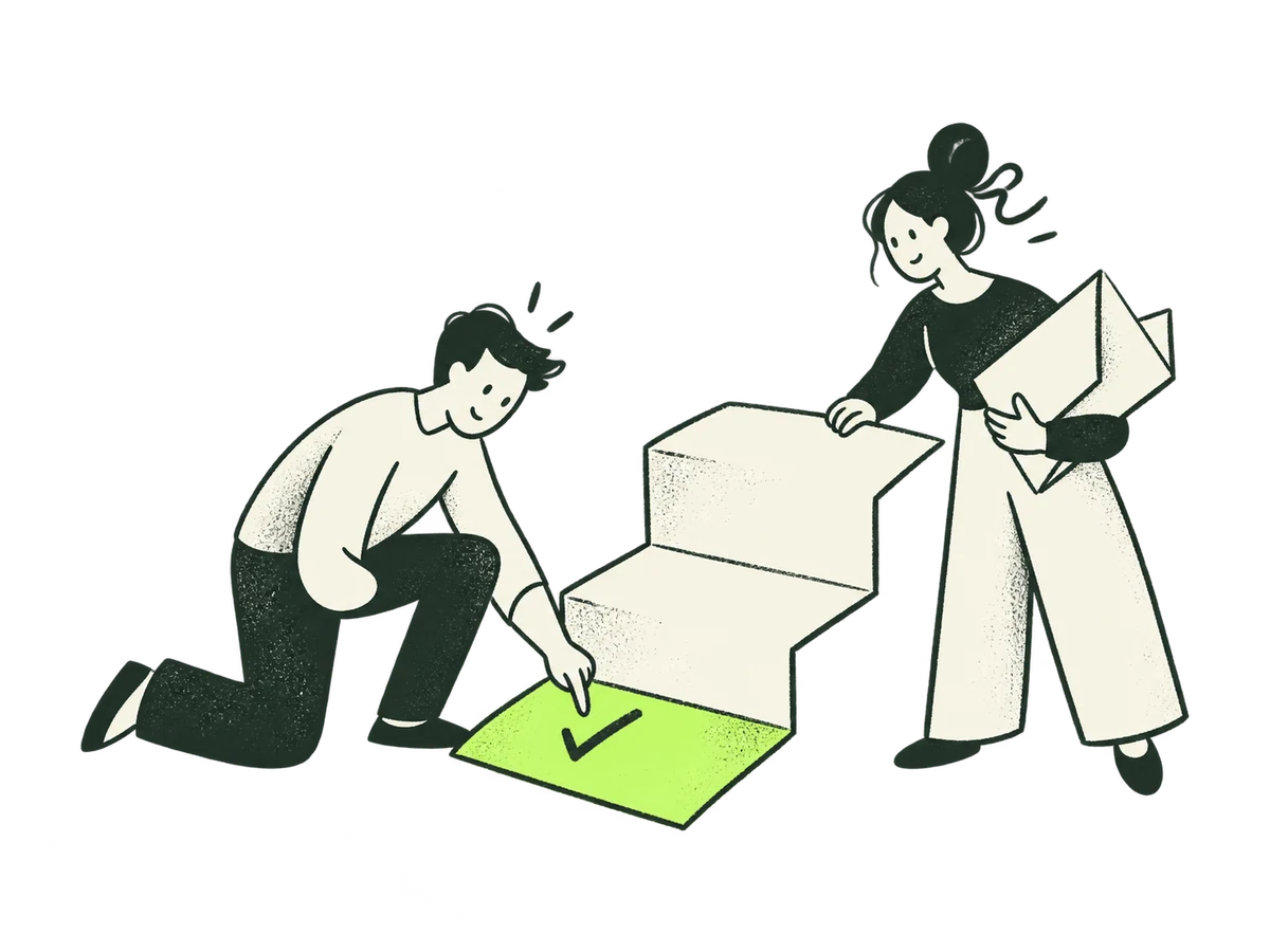 Method RecommendHow we work / recommend+
ORIGINAL PRODUCTION PROMPT
Original IOXIQ editorial website illustration for an independent strategy and research consultancy. Communicate the business meaning through one recognisable human action. Sophisticated, curious and lightly witty. Dry forest-green ink (#1c3026), variable pressure, scratchy open contours and sparse grain inside the marks. Flat cream forms (#f6f6e9), one strong lime patch (#beff67), and at most one small secondary accent. One or two expressive people with oval heads, dot eyes, simple curved bodies and personality through posture. No more than three major props. Asymmetric but balanced; action readable at 300px. True transparent background, no ground rectangle; cream is allowed inside objects. Keep every limb and object in frame, with at least 12% clear edge space. Keep headings, captions and interface labels outside the artwork. No text, letters, numbers, logos, watermark, signatures, charts with invented data, generic office stock scenes, corporate vector clip art, uniform polished outlines, detached oversized hands, gradients, glossy 3D or drop shadows. Scene: Two people unfold a cream decision card into a low three-step paper staircase. One person checks the first lime step while the other holds the folded alternatives. A recommendation with a practical, proportionate next step. Composition: landscape 4:3. One complete original standalone scene, no montage. Clear readable action at 300px. Fill the central 76% of the canvas, retaining 12% clear transparent edge space on all sides. Cream interiors must be opaque. Finished website asset; no text and no page mockup.Download reference image
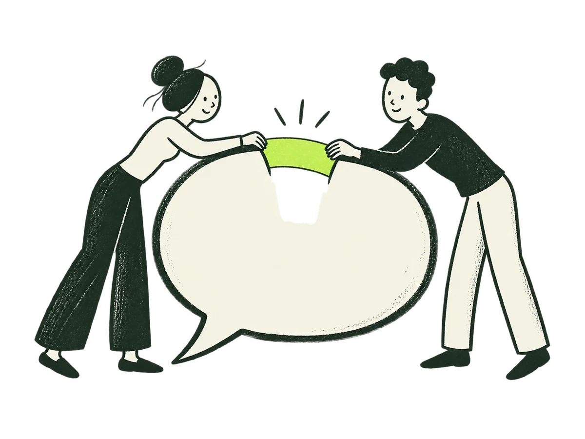 Contact WelcomeContact / welcome+
ORIGINAL PRODUCTION PROMPT
Original IOXIQ editorial website illustration for an independent strategy and research consultancy. Communicate the business meaning through one recognisable human action. Sophisticated, curious and lightly witty. Dry forest-green ink (#1c3026), variable pressure, scratchy open contours and sparse grain inside the marks. Flat cream forms (#f6f6e9), one strong lime patch (#beff67), and at most one small secondary accent. One or two expressive people with oval heads, dot eyes, simple curved bodies and personality through posture. No more than three major props. Asymmetric but balanced; action readable at 300px. True transparent background, no ground rectangle; cream is allowed inside objects. Keep every limb and object in frame, with at least 12% clear edge space. Keep headings, captions and interface labels outside the artwork. No text, letters, numbers, logos, watermark, signatures, charts with invented data, generic office stock scenes, corporate vector clip art, uniform polished outlines, detached oversized hands, gradients, glossy 3D or drop shadows. Scene: Two people lean in from opposite sides of a large open cream speech bubble and join its two incomplete ends with a short lime strip. An inviting conversation begins with a shared connection. No letter, envelope or route. Composition: landscape 4:3. One complete original standalone scene, no montage. Clear readable action at 300px. Fill the central 76% of the canvas, retaining 12% clear transparent edge space on all sides. Cream interiors must be opaque. Finished website asset; no text and no page mockup.Download reference image
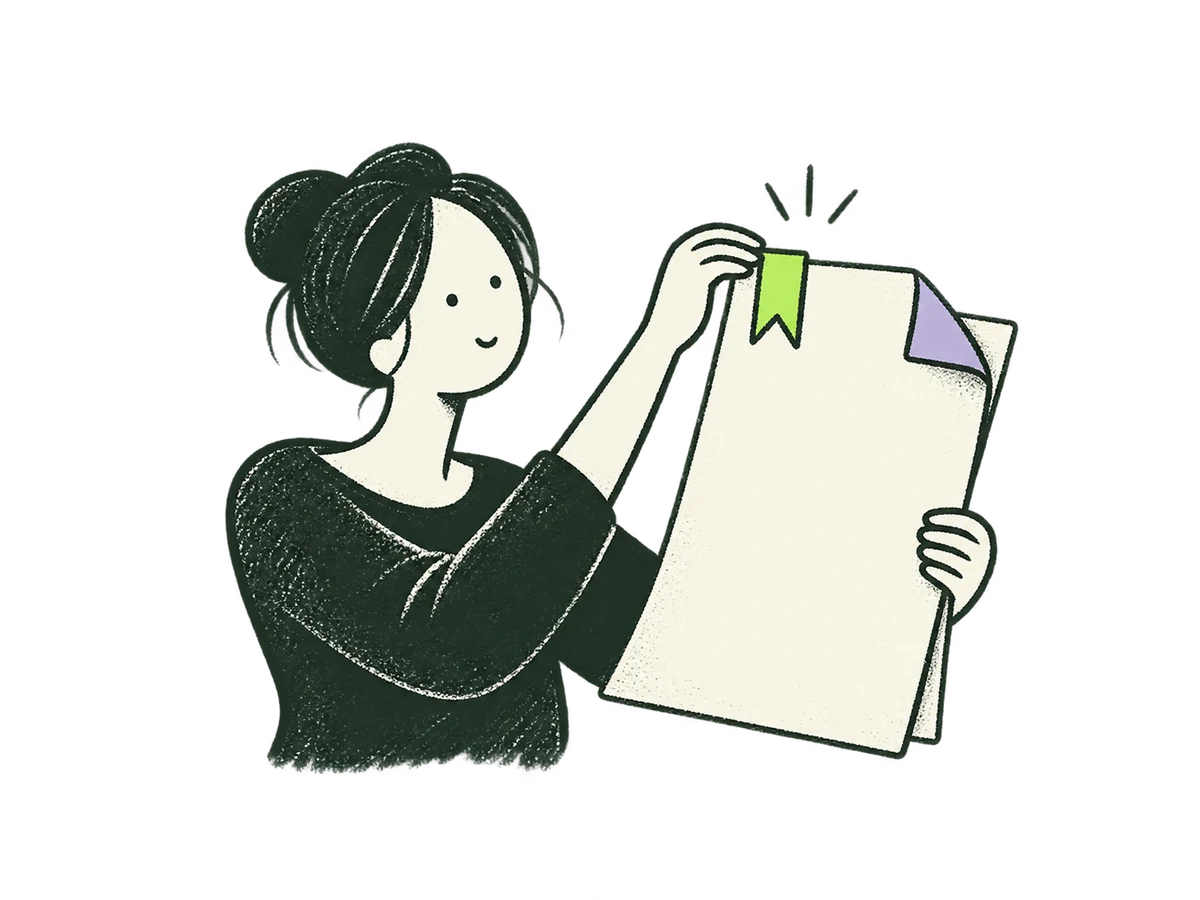 Contact ReviewContact / message review+
ORIGINAL PRODUCTION PROMPT
Original IOXIQ editorial website illustration for an independent strategy and research consultancy. Communicate the business meaning through one recognisable human action. Sophisticated, curious and lightly witty. Dry forest-green ink (#1c3026), variable pressure, scratchy open contours and sparse grain inside the marks. Flat cream forms (#f6f6e9), one strong lime patch (#beff67), and at most one small secondary accent. One or two expressive people with oval heads, dot eyes, simple curved bodies and personality through posture. No more than three major props. Asymmetric but balanced; action readable at 300px. True transparent background, no ground rectangle; cream is allowed inside objects. Keep every limb and object in frame, with at least 12% clear edge space. Keep headings, captions and interface labels outside the artwork. No text, letters, numbers, logos, watermark, signatures, charts with invented data, generic office stock scenes, corporate vector clip art, uniform polished outlines, detached oversized hands, gradients, glossy 3D or drop shadows. Scene: One person gently places a small lime bookmark on a large cream draft sheet held upright with the other hand. A folded lilac corner remains open. Deliberate final review before sending; no envelope, flying mail or send arrow. Composition: landscape 4:3. One complete original standalone scene, no montage. Clear readable action at 300px. Fill the central 76% of the canvas, retaining 12% clear transparent edge space on all sides. Cream interiors must be opaque. Finished website asset; no text and no page mockup.Download reference image
 Services QuestionServices / start with your challenge+
ORIGINAL PRODUCTION PROMPT
Original IOXIQ editorial website illustration for an independent strategy and research consultancy. Communicate the business meaning through one recognisable human action. Sophisticated, curious and lightly witty. Dry forest-green ink (#1c3026), variable pressure, scratchy open contours and sparse grain inside the marks. Flat cream forms (#f6f6e9), one strong lime patch (#beff67), and at most one small secondary accent. One or two expressive people with oval heads, dot eyes, simple curved bodies and personality through posture. No more than three major props. Asymmetric but balanced; action readable at 300px. True transparent background, no ground rectangle; cream is allowed inside objects. Keep every limb and object in frame, with at least 12% clear edge space. Keep headings, captions and interface labels outside the artwork. No text, letters, numbers, logos, watermark, signatures, charts with invented data, generic office stock scenes, corporate vector clip art, uniform polished outlines, detached oversized hands, gradients, glossy 3D or drop shadows. Scene: A person peeks through a small opening in a large cream question-mark-shaped ribbon, gently widening it with both hands. A lime patch marks the new opening. Shape is a sculptural ribbon, not printed typography. Composition: landscape 4:3. One complete original standalone scene, no montage. Clear readable action at 300px. Fill the central 76% of the canvas, retaining 12% clear transparent edge space on all sides. Cream interiors must be opaque. Finished website asset; no text and no page mockup.Download reference image
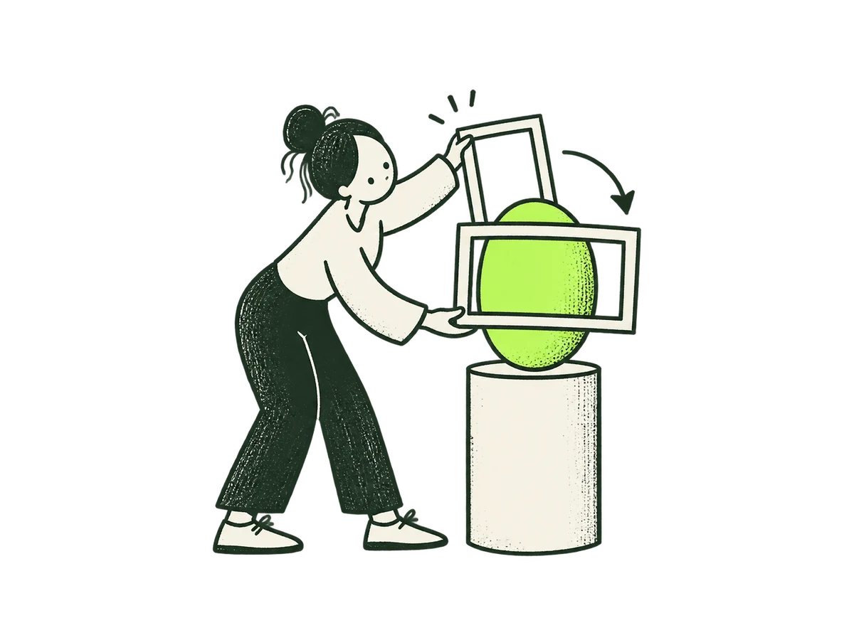 Engagement PerspectiveServices / focused engagement+
ORIGINAL PRODUCTION PROMPT
Original IOXIQ editorial website illustration for an independent strategy and research consultancy. Communicate the business meaning through one recognisable human action. Sophisticated, curious and lightly witty. Dry forest-green ink (#1c3026), variable pressure, scratchy open contours and sparse grain inside the marks. Flat cream forms (#f6f6e9), one strong lime patch (#beff67), and at most one small secondary accent. One or two expressive people with oval heads, dot eyes, simple curved bodies and personality through posture. No more than three major props. Asymmetric but balanced; action readable at 300px. True transparent background, no ground rectangle; cream is allowed inside objects. Keep every limb and object in frame, with at least 12% clear edge space. Keep headings, captions and interface labels outside the artwork. No text, letters, numbers, logos, watermark, signatures, charts with invented data, generic office stock scenes, corporate vector clip art, uniform polished outlines, detached oversized hands, gradients, glossy 3D or drop shadows. Scene: One person rotates a small cream picture frame from vertical to horizontal around a lime oval object, considering a more useful way to frame it. Both feet visible. Composition: landscape 4:3. One complete original standalone scene, no montage. Clear readable action at 300px. Fill the central 76% of the canvas, retaining 12% clear transparent edge space on all sides. Cream interiors must be opaque. Finished website asset; no text and no page mockup.Download reference image
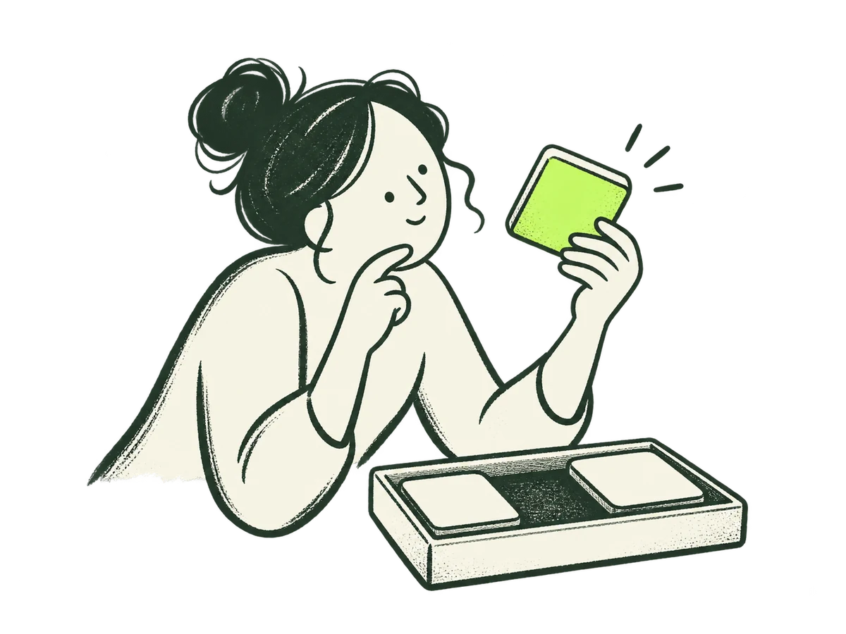 Engagement EvidenceServices / investigation engagement+
ORIGINAL PRODUCTION PROMPT
Original IOXIQ editorial website illustration for an independent strategy and research consultancy. Communicate the business meaning through one recognisable human action. Sophisticated, curious and lightly witty. Dry forest-green ink (#1c3026), variable pressure, scratchy open contours and sparse grain inside the marks. Flat cream forms (#f6f6e9), one strong lime patch (#beff67), and at most one small secondary accent. One or two expressive people with oval heads, dot eyes, simple curved bodies and personality through posture. No more than three major props. Asymmetric but balanced; action readable at 300px. True transparent background, no ground rectangle; cream is allowed inside objects. Keep every limb and object in frame, with at least 12% clear edge space. Keep headings, captions and interface labels outside the artwork. No text, letters, numbers, logos, watermark, signatures, charts with invented data, generic office stock scenes, corporate vector clip art, uniform polished outlines, detached oversized hands, gradients, glossy 3D or drop shadows. Scene: One person carefully lifts a single cream observation tile from a shallow tray of three pieces and inspects its lime underside. Inquiry, no magic discovery spark. Composition: landscape 4:3. One complete original standalone scene, no montage. Clear readable action at 300px. Fill the central 76% of the canvas, retaining 12% clear transparent edge space on all sides. Cream interiors must be opaque. Finished website asset; no text and no page mockup.Download reference image
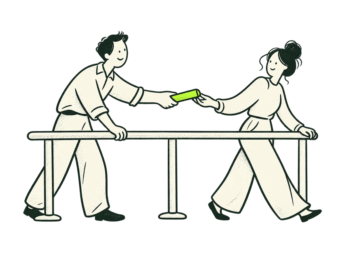 Engagement PartnerServices / ongoing engagement+
ORIGINAL PRODUCTION PROMPT
Original IOXIQ editorial website illustration for an independent strategy and research consultancy. Communicate the business meaning through one recognisable human action. Sophisticated, curious and lightly witty. Dry forest-green ink (#1c3026), variable pressure, scratchy open contours and sparse grain inside the marks. Flat cream forms (#f6f6e9), one strong lime patch (#beff67), and at most one small secondary accent. One or two expressive people with oval heads, dot eyes, simple curved bodies and personality through posture. No more than three major props. Asymmetric but balanced; action readable at 300px. True transparent background, no ground rectangle; cream is allowed inside objects. Keep every limb and object in frame, with at least 12% clear edge space. Keep headings, captions and interface labels outside the artwork. No text, letters, numbers, logos, watermark, signatures, charts with invented data, generic office stock scenes, corporate vector clip art, uniform polished outlines, detached oversized hands, gradients, glossy 3D or drop shadows. Scene: Two people pass a small lime baton across a steady cream rail, each supporting the same direction. A modest shared handover, not a race or victory. Composition: landscape 4:3. One complete original standalone scene, no montage. Clear readable action at 300px. Fill the central 76% of the canvas, retaining 12% clear transparent edge space on all sides. Cream interiors must be opaque. Finished website asset; no text and no page mockup.Download reference image
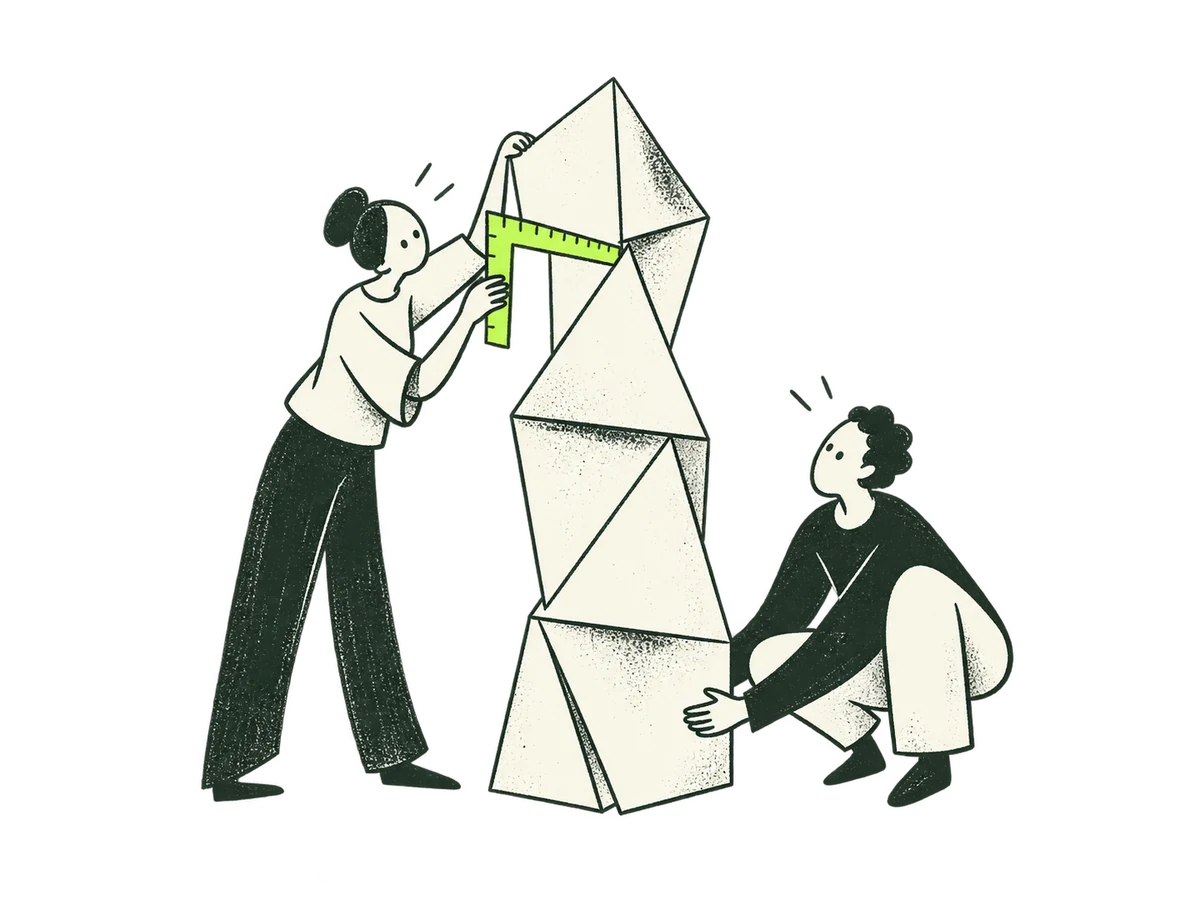 Family ResearchResearch & Validation / hero+
ORIGINAL PRODUCTION PROMPT
Original IOXIQ editorial website illustration for an independent strategy and research consultancy. Communicate the business meaning through one recognisable human action. Sophisticated, curious and lightly witty. Dry forest-green ink (#1c3026), variable pressure, scratchy open contours and sparse grain inside the marks. Flat cream forms (#f6f6e9), one strong lime patch (#beff67), and at most one small secondary accent. One or two expressive people with oval heads, dot eyes, simple curved bodies and personality through posture. No more than three major props. Asymmetric but balanced; action readable at 300px. True transparent background, no ground rectangle; cream is allowed inside objects. Keep every limb and object in frame, with at least 12% clear edge space. Keep headings, captions and interface labels outside the artwork. No text, letters, numbers, logos, watermark, signatures, charts with invented data, generic office stock scenes, corporate vector clip art, uniform polished outlines, detached oversized hands, gradients, glossy 3D or drop shadows. Scene: A researcher checks the seams of a tall cream folded-paper tower with a lime measuring square while a second person steadies its base. Test what the commercial case depends on, no magnifier or bridge. Composition: landscape 4:3. One complete original standalone scene, no montage. Clear readable action at 300px. Fill the central 76% of the canvas, retaining 12% clear transparent edge space on all sides. Cream interiors must be opaque. Finished website asset; no text and no page mockup.Download reference image
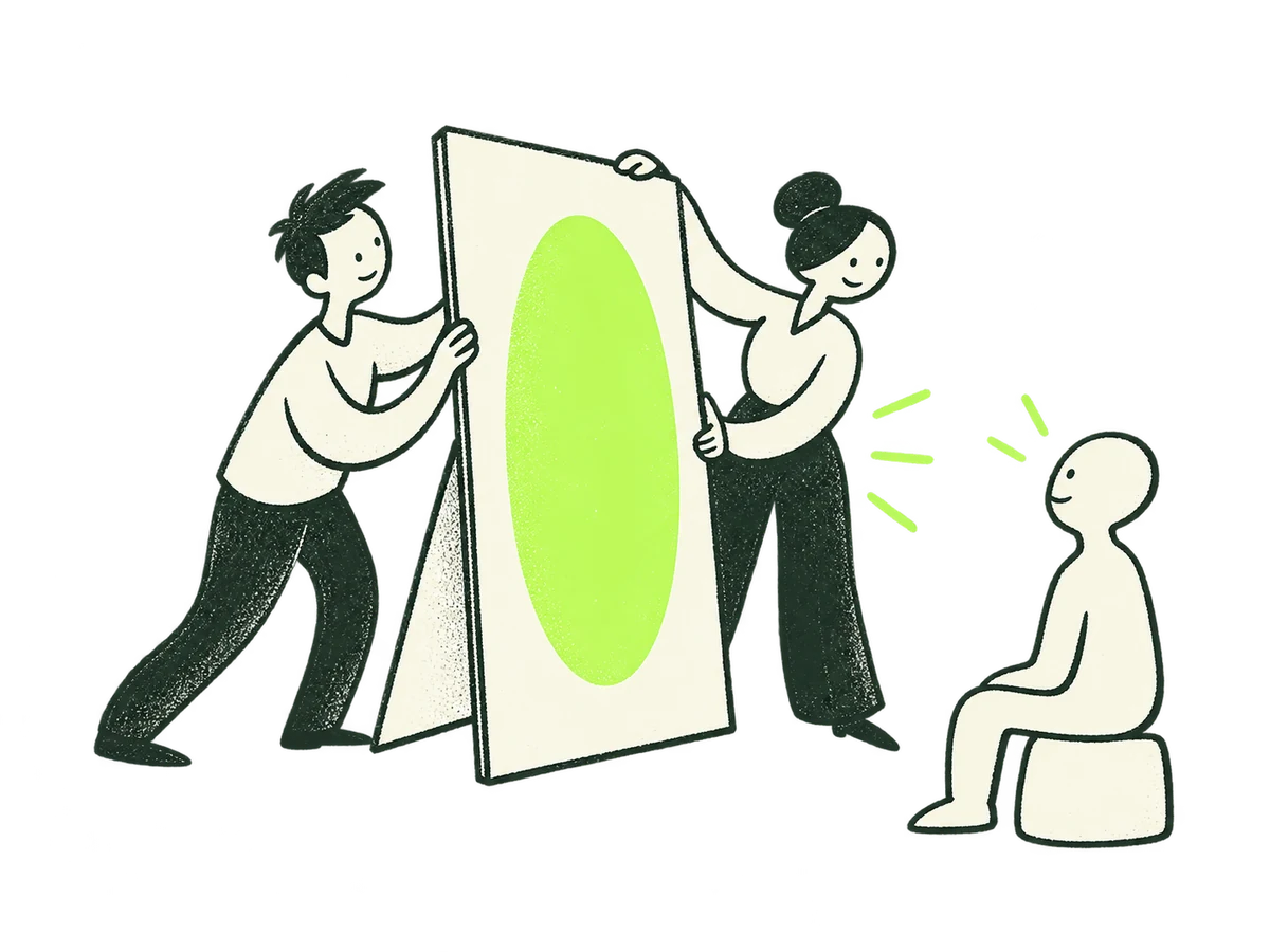 Family PositioningPositioning & Narrative / hero+
ORIGINAL PRODUCTION PROMPT
Original IOXIQ editorial website illustration for an independent strategy and research consultancy. Communicate the business meaning through one recognisable human action. Sophisticated, curious and lightly witty. Dry forest-green ink (#1c3026), variable pressure, scratchy open contours and sparse grain inside the marks. Flat cream forms (#f6f6e9), one strong lime patch (#beff67), and at most one small secondary accent. One or two expressive people with oval heads, dot eyes, simple curved bodies and personality through posture. No more than three major props. Asymmetric but balanced; action readable at 300px. True transparent background, no ground rectangle; cream is allowed inside objects. Keep every limb and object in frame, with at least 12% clear edge space. Keep headings, captions and interface labels outside the artwork. No text, letters, numbers, logos, watermark, signatures, charts with invented data, generic office stock scenes, corporate vector clip art, uniform polished outlines, detached oversized hands, gradients, glossy 3D or drop shadows. Scene: Two people turn a freestanding cream sign panel so its single lime oval faces a small attentive seated person silhouette cutout. Keep only the two living people and one simple audience cutout. Make the reason to choose visible to the right audience. No words. Composition: landscape 4:3. One complete original standalone scene, no montage. Clear readable action at 300px. Fill the central 76% of the canvas, retaining 12% clear transparent edge space on all sides. Cream interiors must be opaque. Finished website asset; no text and no page mockup.Download reference image
 Family ProductDigital Product / hero+
ORIGINAL PRODUCTION PROMPT
Original IOXIQ editorial website illustration for an independent strategy and research consultancy. Communicate the business meaning through one recognisable human action. Sophisticated, curious and lightly witty. Dry forest-green ink (#1c3026), variable pressure, scratchy open contours and sparse grain inside the marks. Flat cream forms (#f6f6e9), one strong lime patch (#beff67), and at most one small secondary accent. One or two expressive people with oval heads, dot eyes, simple curved bodies and personality through posture. No more than three major props. Asymmetric but balanced; action readable at 300px. True transparent background, no ground rectangle; cream is allowed inside objects. Keep every limb and object in frame, with at least 12% clear edge space. Keep headings, captions and interface labels outside the artwork. No text, letters, numbers, logos, watermark, signatures, charts with invented data, generic office stock scenes, corporate vector clip art, uniform polished outlines, detached oversized hands, gradients, glossy 3D or drop shadows. Scene: Two people work on a large tilted cream browser panel. One carefully removes an unnecessary lilac tile; the other places a single useful lime round control within easy reach. Full panel, all corners visible. Human product improvement, not generic coding. Composition: landscape 4:3. One complete original standalone scene, no montage. Clear readable action at 300px. Fill the central 76% of the canvas, retaining 12% clear transparent edge space on all sides. Cream interiors must be opaque. Finished website asset; no text and no page mockup. Use geometric marks on blank evidence cards; do not draw trees, leaves, landscapes, forests or nature motifs. Every illustrated element belongs to the stated business metaphor.Download reference image
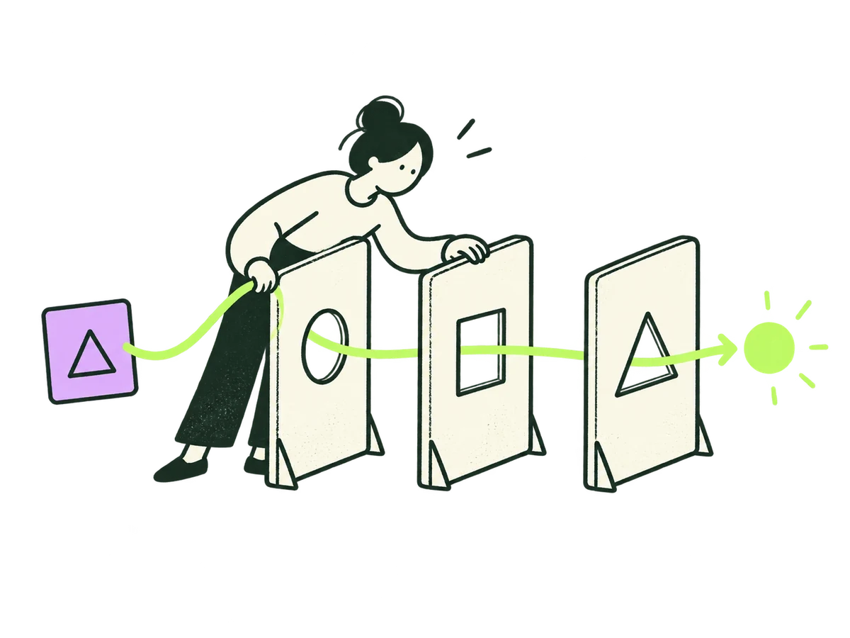 Family AiAI, Data & Agents / hero+
ORIGINAL PRODUCTION PROMPT
Original IOXIQ editorial website illustration for an independent strategy and research consultancy. Communicate the business meaning through one recognisable human action. Sophisticated, curious and lightly witty. Dry forest-green ink (#1c3026), variable pressure, scratchy open contours and sparse grain inside the marks. Flat cream forms (#f6f6e9), one strong lime patch (#beff67), and at most one small secondary accent. One or two expressive people with oval heads, dot eyes, simple curved bodies and personality through posture. No more than three major props. Asymmetric but balanced; action readable at 300px. True transparent background, no ground rectangle; cream is allowed inside objects. Keep every limb and object in frame, with at least 12% clear edge space. Keep headings, captions and interface labels outside the artwork. No text, letters, numbers, logos, watermark, signatures, charts with invented data, generic office stock scenes, corporate vector clip art, uniform polished outlines, detached oversized hands, gradients, glossy 3D or drop shadows. Scene: A person guides a lime thread through three simple cream workflow gates, pausing with a hand on the middle gate to inspect the result. One small lilac input tile at the beginning. Human oversight of useful automation, no robot or magic machine. Composition: landscape 4:3. One complete original standalone scene, no montage. Clear readable action at 300px. Fill the central 76% of the canvas, retaining 12% clear transparent edge space on all sides. Cream interiors must be opaque. Finished website asset; no text and no page mockup. Use geometric marks on blank evidence cards; do not draw trees, leaves, landscapes, forests or nature motifs. Every illustrated element belongs to the stated business metaphor.Download reference image
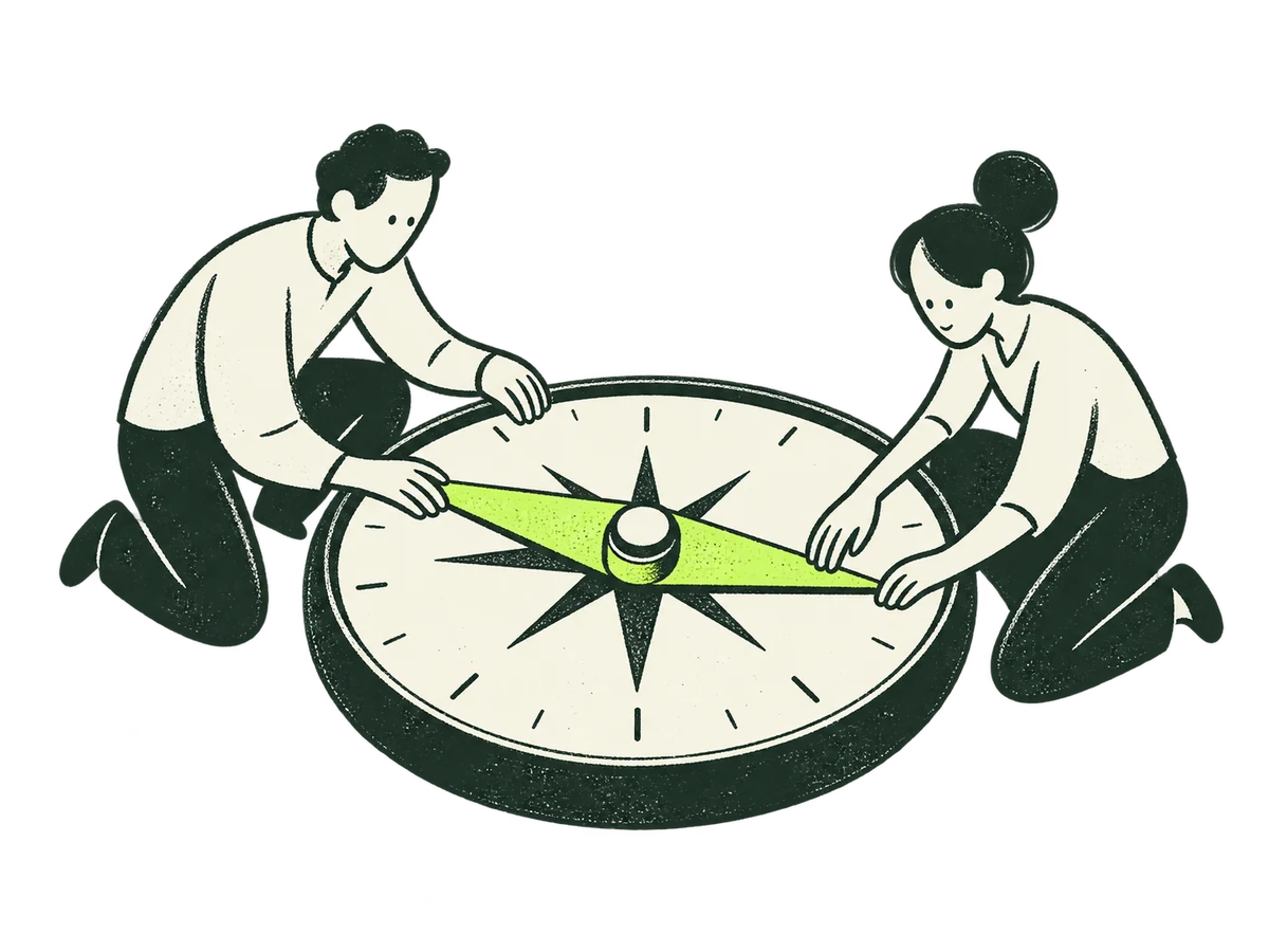 Family AdviceAdvice & Leadership / hero+
ORIGINAL PRODUCTION PROMPT
Original IOXIQ editorial website illustration for an independent strategy and research consultancy. Communicate the business meaning through one recognisable human action. Sophisticated, curious and lightly witty. Dry forest-green ink (#1c3026), variable pressure, scratchy open contours and sparse grain inside the marks. Flat cream forms (#f6f6e9), one strong lime patch (#beff67), and at most one small secondary accent. One or two expressive people with oval heads, dot eyes, simple curved bodies and personality through posture. No more than three major props. Asymmetric but balanced; action readable at 300px. True transparent background, no ground rectangle; cream is allowed inside objects. Keep every limb and object in frame, with at least 12% clear edge space. Keep headings, captions and interface labels outside the artwork. No text, letters, numbers, logos, watermark, signatures, charts with invented data, generic office stock scenes, corporate vector clip art, uniform polished outlines, detached oversized hands, gradients, glossy 3D or drop shadows. Scene: Two people sit on opposite sides of a large cream compass dial and carefully align one movable lime pointer together. A grounded joint decision, no upward arrow or victory. Composition: landscape 4:3. One complete original standalone scene, no montage. Clear readable action at 300px. Fill the central 76% of the canvas, retaining 12% clear transparent edge space on all sides. Cream interiors must be opaque. Finished website asset; no text and no page mockup. Use geometric marks on blank evidence cards; do not draw trees, leaves, landscapes, forests or nature motifs. Every illustrated element belongs to the stated business metaphor.Download reference image
 Area StrategyServices directory / Strategy & Growth card+
ORIGINAL PRODUCTION PROMPT
Original IOXIQ editorial website illustration for an independent strategy and research consultancy. Communicate the business meaning through one recognisable human action. Sophisticated, curious and lightly witty. Dry forest-green ink (#1c3026), variable pressure, scratchy open contours and sparse grain inside the marks. Flat cream forms (#f6f6e9), one strong lime patch (#beff67), and at most one small secondary accent. One or two expressive people with oval heads, dot eyes, simple curved bodies and personality through posture. No more than three major props. Asymmetric but balanced; action readable at 300px. True transparent background, no ground rectangle; cream is allowed inside objects. Keep every limb and object in frame, with at least 12% clear edge space. Keep headings, captions and interface labels outside the artwork. No text, letters, numbers, logos, watermark, signatures, charts with invented data, generic office stock scenes, corporate vector clip art, uniform polished outlines, detached oversized hands, gradients, glossy 3D or drop shadows. Scene: A person opens a folded cream map and extends one lime edge into new blank space. A tiny lilac marker indicates the starting point. Expanding considered possibilities. Composition: landscape 4:3. One complete original standalone scene, no montage. Clear readable action at 300px. Fill the central 76% of the canvas, retaining 12% clear transparent edge space on all sides. Cream interiors must be opaque. Finished website asset; no text and no page mockup. Use geometric marks on blank evidence cards; do not draw trees, leaves, landscapes, forests or nature motifs. Every illustrated element belongs to the stated business metaphor.Download reference image
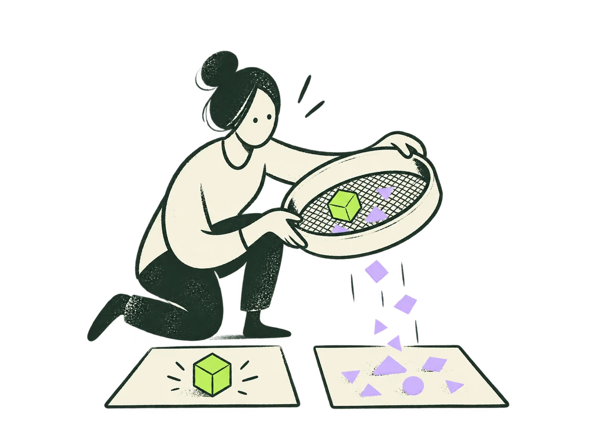 Area ResearchServices directory / Research & Validation card+
ORIGINAL PRODUCTION PROMPT
Original IOXIQ editorial website illustration for an independent strategy and research consultancy. Communicate the business meaning through one recognisable human action. Sophisticated, curious and lightly witty. Dry forest-green ink (#1c3026), variable pressure, scratchy open contours and sparse grain inside the marks. Flat cream forms (#f6f6e9), one strong lime patch (#beff67), and at most one small secondary accent. One or two expressive people with oval heads, dot eyes, simple curved bodies and personality through posture. No more than three major props. Asymmetric but balanced; action readable at 300px. True transparent background, no ground rectangle; cream is allowed inside objects. Keep every limb and object in frame, with at least 12% clear edge space. Keep headings, captions and interface labels outside the artwork. No text, letters, numbers, logos, watermark, signatures, charts with invented data, generic office stock scenes, corporate vector clip art, uniform polished outlines, detached oversized hands, gradients, glossy 3D or drop shadows. Scene: A person holds a cream sieve-like frame above two simple observation cards, carefully separates a lime solid fact from a lilac loose piece. No machine, no charts. Composition: landscape 4:3. One complete original standalone scene, no montage. Clear readable action at 300px. Fill the central 76% of the canvas, retaining 12% clear transparent edge space on all sides. Cream interiors must be opaque. Finished website asset; no text and no page mockup. Use geometric marks on blank evidence cards; do not draw trees, leaves, landscapes, forests or nature motifs. Every illustrated element belongs to the stated business metaphor.Download reference image
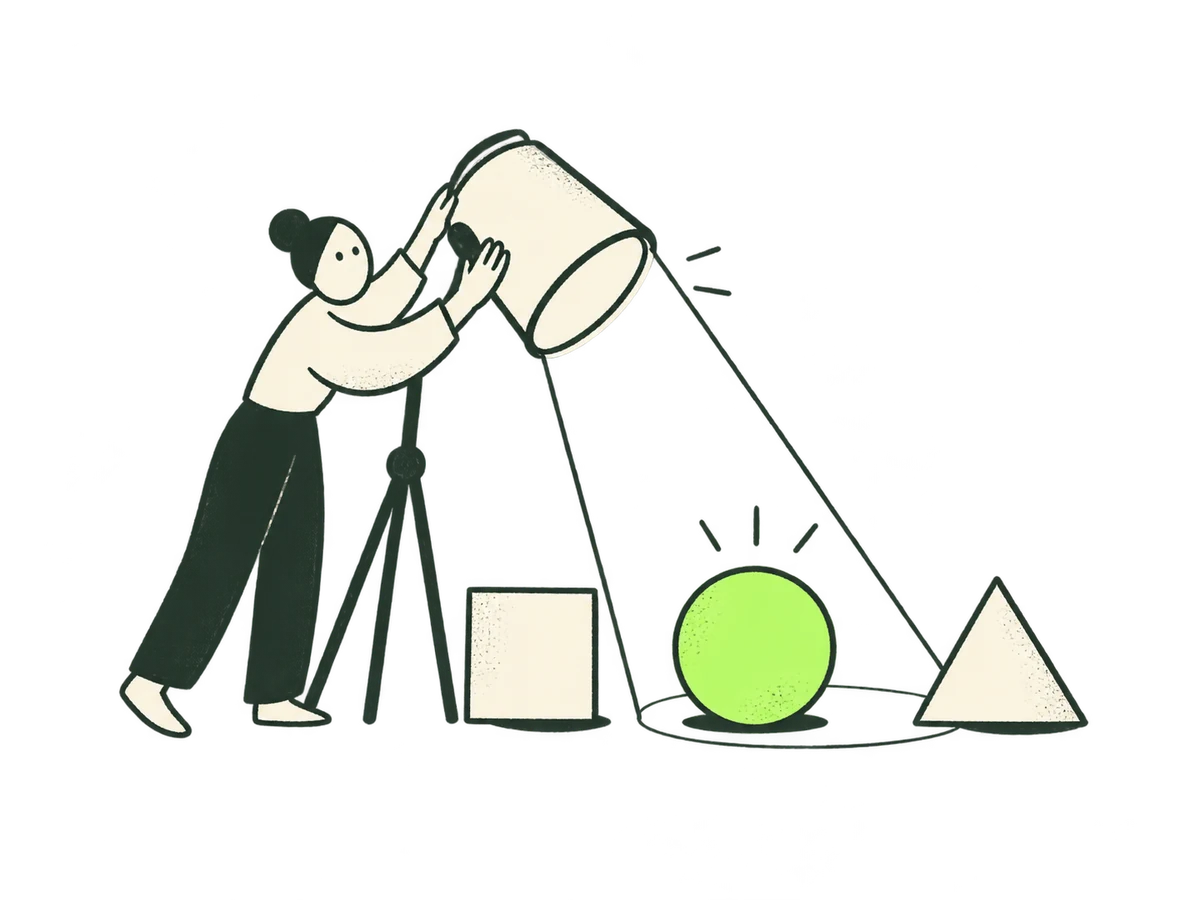 Area PositioningServices directory / Positioning & Narrative card+
ORIGINAL PRODUCTION PROMPT
Original IOXIQ editorial website illustration for an independent strategy and research consultancy. Communicate the business meaning through one recognisable human action. Sophisticated, curious and lightly witty. Dry forest-green ink (#1c3026), variable pressure, scratchy open contours and sparse grain inside the marks. Flat cream forms (#f6f6e9), one strong lime patch (#beff67), and at most one small secondary accent. One or two expressive people with oval heads, dot eyes, simple curved bodies and personality through posture. No more than three major props. Asymmetric but balanced; action readable at 300px. True transparent background, no ground rectangle; cream is allowed inside objects. Keep every limb and object in frame, with at least 12% clear edge space. Keep headings, captions and interface labels outside the artwork. No text, letters, numbers, logos, watermark, signatures, charts with invented data, generic office stock scenes, corporate vector clip art, uniform polished outlines, detached oversized hands, gradients, glossy 3D or drop shadows. Scene: A person adjusts a large cream spotlight shade by hand so one lime abstract form stands out from two cream forms. Flat ink light beam outline, no gradients, show deliberate emphasis. Composition: landscape 4:3. One complete original standalone scene, no montage. Clear readable action at 300px. Fill the central 76% of the canvas, retaining 12% clear transparent edge space on all sides. Cream interiors must be opaque. Finished website asset; no text and no page mockup. Use geometric marks on blank evidence cards; do not draw trees, leaves, landscapes, forests or nature motifs. Every illustrated element belongs to the stated business metaphor.Download reference image
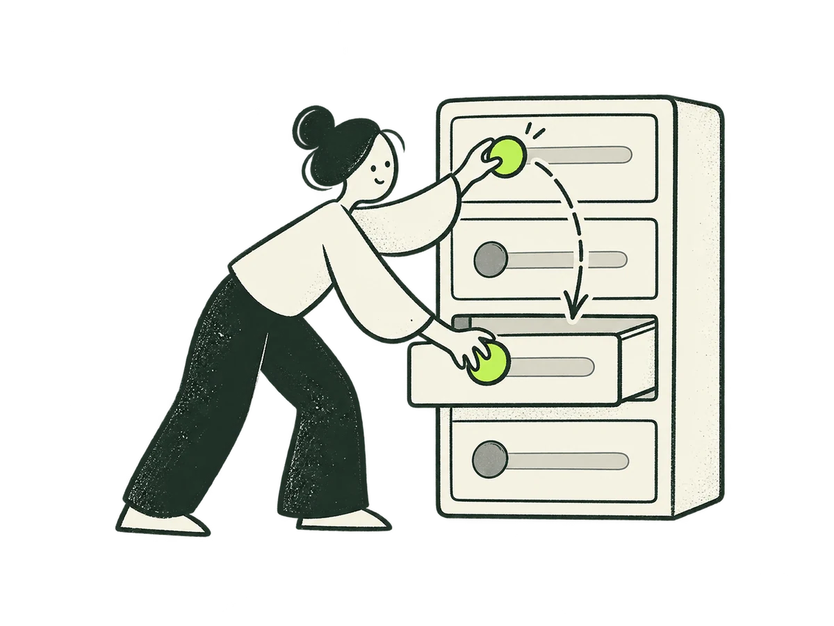 Area ProductServices directory / Digital Product card+
ORIGINAL PRODUCTION PROMPT
Original IOXIQ editorial website illustration for an independent strategy and research consultancy. Communicate the business meaning through one recognisable human action. Sophisticated, curious and lightly witty. Dry forest-green ink (#1c3026), variable pressure, scratchy open contours and sparse grain inside the marks. Flat cream forms (#f6f6e9), one strong lime patch (#beff67), and at most one small secondary accent. One or two expressive people with oval heads, dot eyes, simple curved bodies and personality through posture. No more than three major props. Asymmetric but balanced; action readable at 300px. True transparent background, no ground rectangle; cream is allowed inside objects. Keep every limb and object in frame, with at least 12% clear edge space. Keep headings, captions and interface labels outside the artwork. No text, letters, numbers, logos, watermark, signatures, charts with invented data, generic office stock scenes, corporate vector clip art, uniform polished outlines, detached oversized hands, gradients, glossy 3D or drop shadows. Scene: One person opens a cream interface drawer and moves a useful lime handle from an awkward high location to an easy-to-reach lower slot. All limbs and the drawer visible. Composition: landscape 4:3. One complete original standalone scene, no montage. Clear readable action at 300px. Fill the central 76% of the canvas, retaining 12% clear transparent edge space on all sides. Cream interiors must be opaque. Finished website asset; no text and no page mockup. Use geometric marks on blank evidence cards; do not draw trees, leaves, landscapes, forests or nature motifs. Every illustrated element belongs to the stated business metaphor.Download reference image
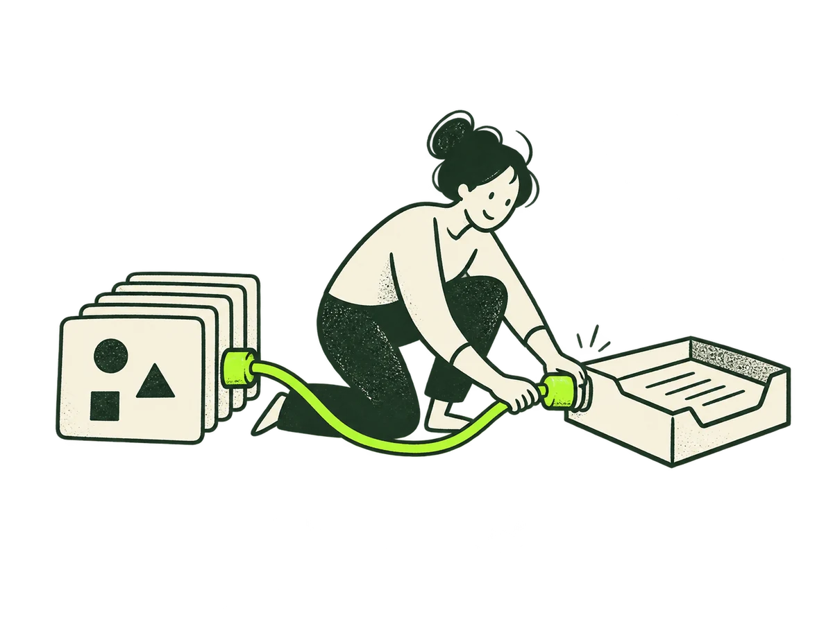 Area AiServices directory / AI, Data & Agents card+
ORIGINAL PRODUCTION PROMPT
Original IOXIQ editorial website illustration for an independent strategy and research consultancy. Communicate the business meaning through one recognisable human action. Sophisticated, curious and lightly witty. Dry forest-green ink (#1c3026), variable pressure, scratchy open contours and sparse grain inside the marks. Flat cream forms (#f6f6e9), one strong lime patch (#beff67), and at most one small secondary accent. One or two expressive people with oval heads, dot eyes, simple curved bodies and personality through posture. No more than three major props. Asymmetric but balanced; action readable at 300px. True transparent background, no ground rectangle; cream is allowed inside objects. Keep every limb and object in frame, with at least 12% clear edge space. Keep headings, captions and interface labels outside the artwork. No text, letters, numbers, logos, watermark, signatures, charts with invented data, generic office stock scenes, corporate vector clip art, uniform polished outlines, detached oversized hands, gradients, glossy 3D or drop shadows. Scene: A person connects a lime cable between a small cream stack of evidence cards and a simple cream task tray. Hands actively connect knowledge to work. No robot, circuitry or glow. Composition: landscape 4:3. One complete original standalone scene, no montage. Clear readable action at 300px. Fill the central 76% of the canvas, retaining 12% clear transparent edge space on all sides. Cream interiors must be opaque. Finished website asset; no text and no page mockup. Use geometric marks on blank evidence cards; do not draw trees, leaves, landscapes, forests or nature motifs. Every illustrated element belongs to the stated business metaphor.Download reference image
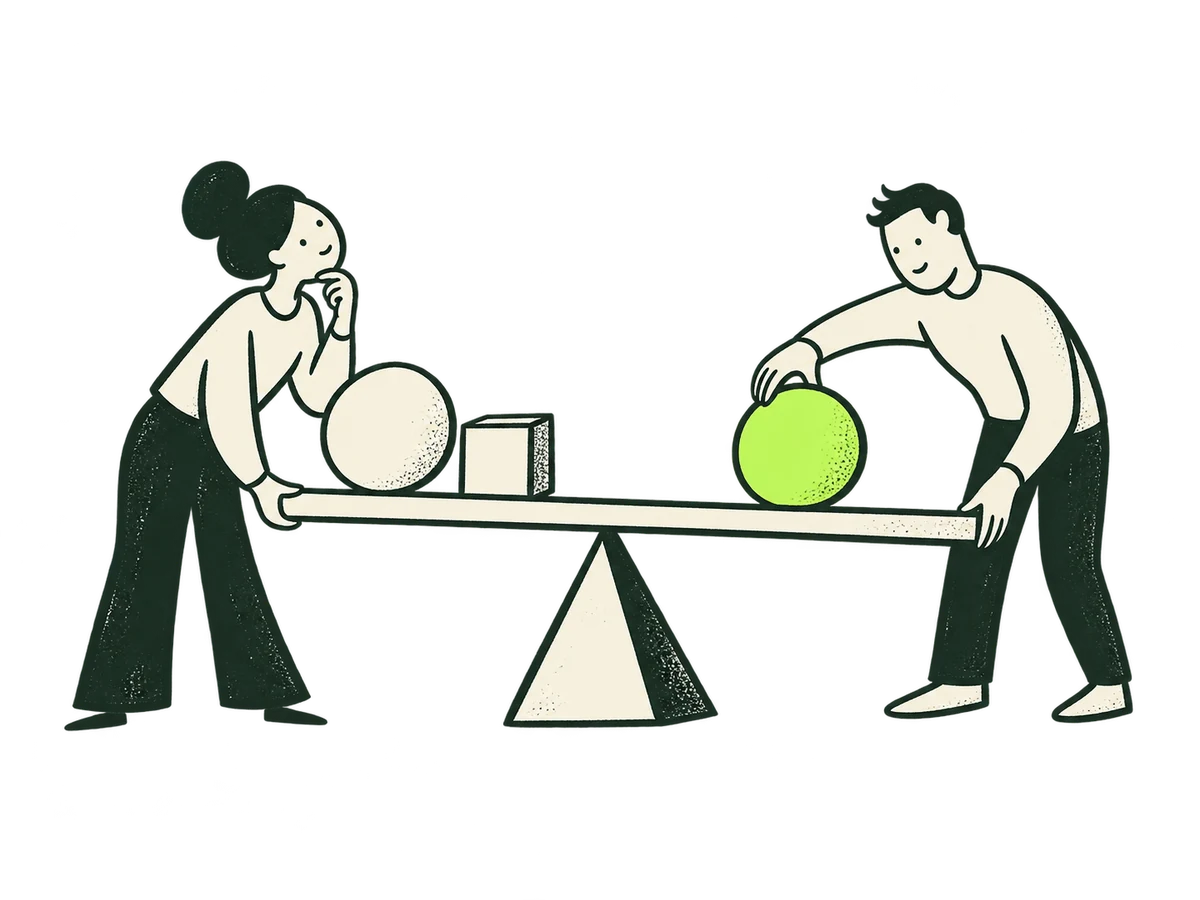 Area AdviceServices directory / Advice & Leadership card+
ORIGINAL PRODUCTION PROMPT
Original IOXIQ editorial website illustration for an independent strategy and research consultancy. Communicate the business meaning through one recognisable human action. Sophisticated, curious and lightly witty. Dry forest-green ink (#1c3026), variable pressure, scratchy open contours and sparse grain inside the marks. Flat cream forms (#f6f6e9), one strong lime patch (#beff67), and at most one small secondary accent. One or two expressive people with oval heads, dot eyes, simple curved bodies and personality through posture. No more than three major props. Asymmetric but balanced; action readable at 300px. True transparent background, no ground rectangle; cream is allowed inside objects. Keep every limb and object in frame, with at least 12% clear edge space. Keep headings, captions and interface labels outside the artwork. No text, letters, numbers, logos, watermark, signatures, charts with invented data, generic office stock scenes, corporate vector clip art, uniform polished outlines, detached oversized hands, gradients, glossy 3D or drop shadows. Scene: Two people hold opposite ends of a cream balancing beam, adjusting one lime weight until the beam is stable. Thoughtful advice balances trade-offs. No success pose. Composition: landscape 4:3. One complete original standalone scene, no montage. Clear readable action at 300px. Fill the central 76% of the canvas, retaining 12% clear transparent edge space on all sides. Cream interiors must be opaque. Finished website asset; no text and no page mockup. Use geometric marks on blank evidence cards; do not draw trees, leaves, landscapes, forests or nature motifs. Every illustrated element belongs to the stated business metaphor.Download reference image
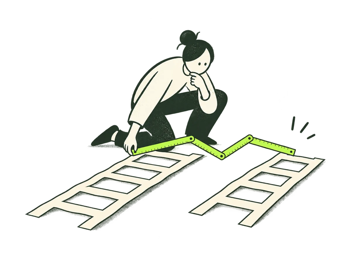 Focus Growth DirectionHome / focus / growth-direction+
ORIGINAL PRODUCTION PROMPT
Original IOXIQ editorial website illustration for an independent strategy and research consultancy. Communicate the business meaning through one recognisable human action. Sophisticated, curious and lightly witty. Dry forest-green ink (#1c3026), variable pressure, scratchy open contours and sparse grain inside the marks. Flat cream forms (#f6f6e9), one strong lime patch (#beff67), and at most one small secondary accent. One or two expressive people with oval heads, dot eyes, simple curved bodies and personality through posture. No more than three major props. Asymmetric but balanced; action readable at 300px. True transparent background, no ground rectangle; cream is allowed inside objects. Keep every limb and object in frame, with at least 12% clear edge space. Keep headings, captions and interface labels outside the artwork. No text, letters, numbers, logos, watermark, signatures, charts with invented data, generic office stock scenes, corporate vector clip art, uniform polished outlines, detached oversized hands, gradients, glossy 3D or drop shadows. Scene: A person uses a lime folding ruler to compare two cream paper ladders laid horizontally. Choosing a feasible growth path, not climbing to success. Composition: landscape 4:3. One complete original standalone scene, no montage. Clear readable action at 300px. Fill the central 76% of the canvas, retaining 12% clear transparent edge space on all sides. Cream interiors must be opaque. Finished website asset; no text and no page mockup. Use geometric marks on blank evidence cards; do not draw trees, leaves, landscapes, forests or nature motifs. Every illustrated element belongs to the stated business metaphor.Download reference image
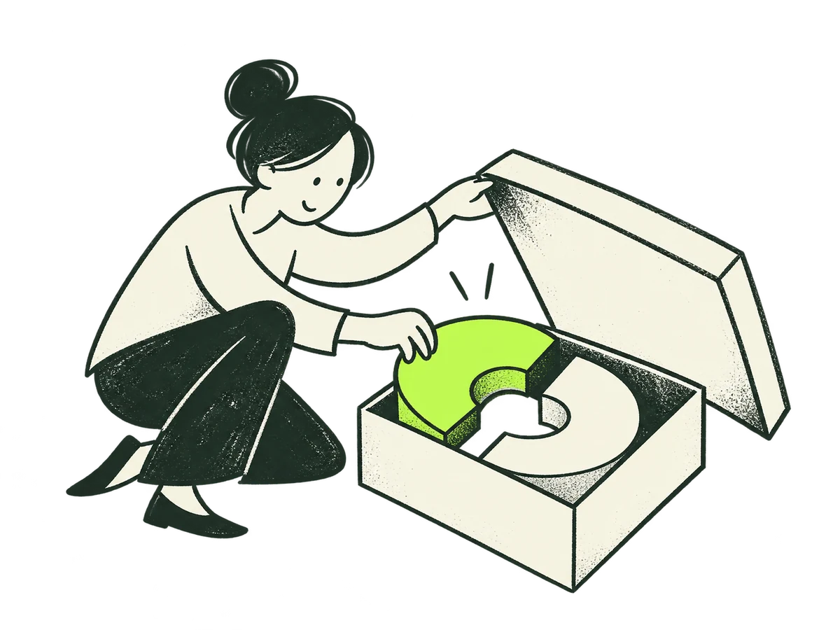 Focus New OffersHome / focus / new-offers+
ORIGINAL PRODUCTION PROMPT
Original IOXIQ editorial website illustration for an independent strategy and research consultancy. Communicate the business meaning through one recognisable human action. Sophisticated, curious and lightly witty. Dry forest-green ink (#1c3026), variable pressure, scratchy open contours and sparse grain inside the marks. Flat cream forms (#f6f6e9), one strong lime patch (#beff67), and at most one small secondary accent. One or two expressive people with oval heads, dot eyes, simple curved bodies and personality through posture. No more than three major props. Asymmetric but balanced; action readable at 300px. True transparent background, no ground rectangle; cream is allowed inside objects. Keep every limb and object in frame, with at least 12% clear edge space. Keep headings, captions and interface labels outside the artwork. No text, letters, numbers, logos, watermark, signatures, charts with invented data, generic office stock scenes, corporate vector clip art, uniform polished outlines, detached oversized hands, gradients, glossy 3D or drop shadows. Scene: A person lifts the lid of a cream box and carefully fits a new lime curved piece beside an existing cream piece. Explore a new offer, no gift ribbons. Composition: landscape 4:3. One complete original standalone scene, no montage. Clear readable action at 300px. Fill the central 76% of the canvas, retaining 12% clear transparent edge space on all sides. Cream interiors must be opaque. Finished website asset; no text and no page mockup. Use geometric marks on blank evidence cards; do not draw trees, leaves, landscapes, forests or nature motifs. Every illustrated element belongs to the stated business metaphor.Download reference image
 Focus Business ModelHome / focus / business-model+
ORIGINAL PRODUCTION PROMPT
Original IOXIQ editorial website illustration for an independent strategy and research consultancy. Communicate the business meaning through one recognisable human action. Sophisticated, curious and lightly witty. Dry forest-green ink (#1c3026), variable pressure, scratchy open contours and sparse grain inside the marks. Flat cream forms (#f6f6e9), one strong lime patch (#beff67), and at most one small secondary accent. One or two expressive people with oval heads, dot eyes, simple curved bodies and personality through posture. No more than three major props. Asymmetric but balanced; action readable at 300px. True transparent background, no ground rectangle; cream is allowed inside objects. Keep every limb and object in frame, with at least 12% clear edge space. Keep headings, captions and interface labels outside the artwork. No text, letters, numbers, logos, watermark, signatures, charts with invented data, generic office stock scenes, corporate vector clip art, uniform polished outlines, detached oversized hands, gradients, glossy 3D or drop shadows. Scene: A person rearranges three interlocking cream paper gears, replacing one with a lime wheel so the mechanism connects differently. Rethink how value is created. Composition: landscape 4:3. One complete original standalone scene, no montage. Clear readable action at 300px. Fill the central 76% of the canvas, retaining 12% clear transparent edge space on all sides. Cream interiors must be opaque. Finished website asset; no text and no page mockup. Use geometric marks on blank evidence cards; do not draw trees, leaves, landscapes, forests or nature motifs. Every illustrated element belongs to the stated business metaphor.Download reference image
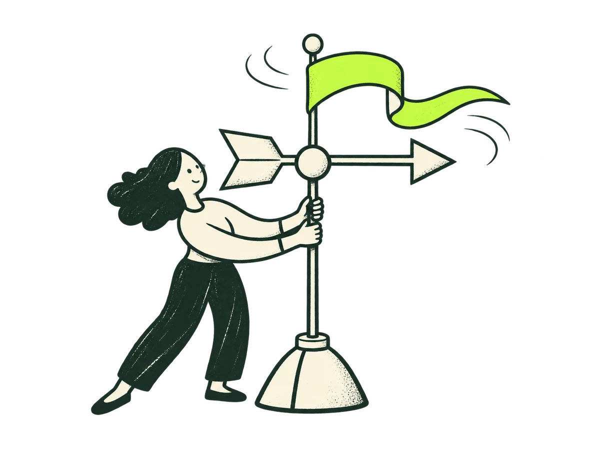 Focus Market ShiftsHome / focus / market-shifts+
ORIGINAL PRODUCTION PROMPT
Original IOXIQ editorial website illustration for an independent strategy and research consultancy. Communicate the business meaning through one recognisable human action. Sophisticated, curious and lightly witty. Dry forest-green ink (#1c3026), variable pressure, scratchy open contours and sparse grain inside the marks. Flat cream forms (#f6f6e9), one strong lime patch (#beff67), and at most one small secondary accent. One or two expressive people with oval heads, dot eyes, simple curved bodies and personality through posture. No more than three major props. Asymmetric but balanced; action readable at 300px. True transparent background, no ground rectangle; cream is allowed inside objects. Keep every limb and object in frame, with at least 12% clear edge space. Keep headings, captions and interface labels outside the artwork. No text, letters, numbers, logos, watermark, signatures, charts with invented data, generic office stock scenes, corporate vector clip art, uniform polished outlines, detached oversized hands, gradients, glossy 3D or drop shadows. Scene: A person turns a cream weather vane as a lime ribbon changes direction in a gentle breeze. Read changing market signals. All pieces on a short stand. Composition: landscape 4:3. One complete original standalone scene, no montage. Clear readable action at 300px. Fill the central 76% of the canvas, retaining 12% clear transparent edge space on all sides. Cream interiors must be opaque. Finished website asset; no text and no page mockup. Use geometric marks on blank evidence cards; do not draw trees, leaves, landscapes, forests or nature motifs. Every illustrated element belongs to the stated business metaphor.Download reference image
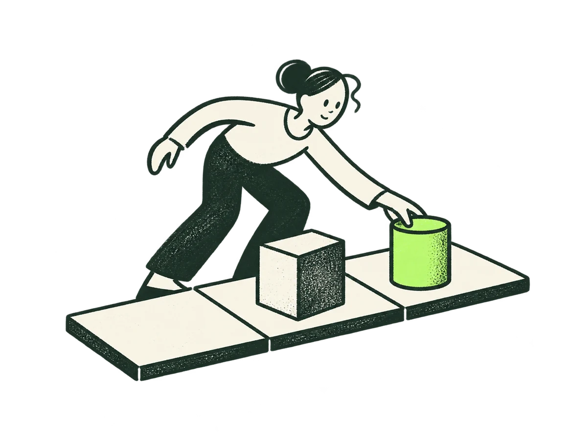 Focus Strategic ResponseHome / focus / strategic-response+
ORIGINAL PRODUCTION PROMPT
Original IOXIQ editorial website illustration for an independent strategy and research consultancy. Communicate the business meaning through one recognisable human action. Sophisticated, curious and lightly witty. Dry forest-green ink (#1c3026), variable pressure, scratchy open contours and sparse grain inside the marks. Flat cream forms (#f6f6e9), one strong lime patch (#beff67), and at most one small secondary accent. One or two expressive people with oval heads, dot eyes, simple curved bodies and personality through posture. No more than three major props. Asymmetric but balanced; action readable at 300px. True transparent background, no ground rectangle; cream is allowed inside objects. Keep every limb and object in frame, with at least 12% clear edge space. Keep headings, captions and interface labels outside the artwork. No text, letters, numbers, logos, watermark, signatures, charts with invented data, generic office stock scenes, corporate vector clip art, uniform polished outlines, detached oversized hands, gradients, glossy 3D or drop shadows. Scene: A person moves a lime chess-like plain cylinder from an obstructed cream square to an open one on a minimal three-square board. A considered response, not winning a game. Composition: landscape 4:3. One complete original standalone scene, no montage. Clear readable action at 300px. Fill the central 76% of the canvas, retaining 12% clear transparent edge space on all sides. Cream interiors must be opaque. Finished website asset; no text and no page mockup. Use geometric marks on blank evidence cards; do not draw trees, leaves, landscapes, forests or nature motifs. Every illustrated element belongs to the stated business metaphor.Download reference image
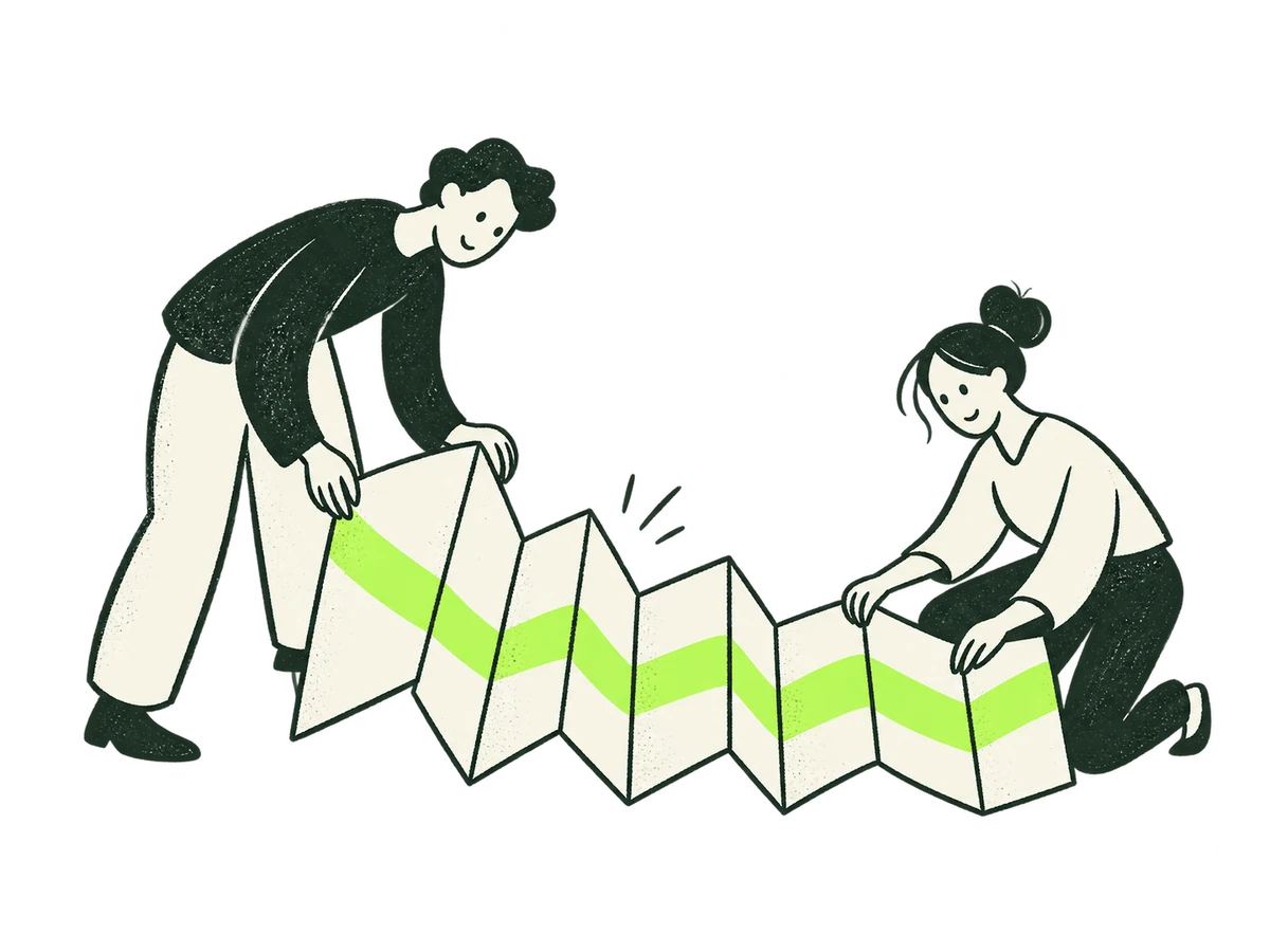 Focus TransformationHome / focus / transformation+
ORIGINAL PRODUCTION PROMPT
Original IOXIQ editorial website illustration for an independent strategy and research consultancy. Communicate the business meaning through one recognisable human action. Sophisticated, curious and lightly witty. Dry forest-green ink (#1c3026), variable pressure, scratchy open contours and sparse grain inside the marks. Flat cream forms (#f6f6e9), one strong lime patch (#beff67), and at most one small secondary accent. One or two expressive people with oval heads, dot eyes, simple curved bodies and personality through posture. No more than three major props. Asymmetric but balanced; action readable at 300px. True transparent background, no ground rectangle; cream is allowed inside objects. Keep every limb and object in frame, with at least 12% clear edge space. Keep headings, captions and interface labels outside the artwork. No text, letters, numbers, logos, watermark, signatures, charts with invented data, generic office stock scenes, corporate vector clip art, uniform polished outlines, detached oversized hands, gradients, glossy 3D or drop shadows. Scene: Two people fold a long cream sheet into an orderly accordion, aligning a lime strip across the folds. Turn change into a workable sequence. Composition: landscape 4:3. One complete original standalone scene, no montage. Clear readable action at 300px. Fill the central 76% of the canvas, retaining 12% clear transparent edge space on all sides. Cream interiors must be opaque. Finished website asset; no text and no page mockup. Use geometric marks on blank evidence cards; do not draw trees, leaves, landscapes, forests or nature motifs. Every illustrated element belongs to the stated business metaphor.Download reference image
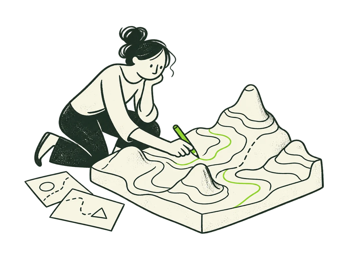 Focus Market EvidenceHome / focus / market-evidence+
ORIGINAL PRODUCTION PROMPT
Original IOXIQ editorial website illustration for an independent strategy and research consultancy. Communicate the business meaning through one recognisable human action. Sophisticated, curious and lightly witty. Dry forest-green ink (#1c3026), variable pressure, scratchy open contours and sparse grain inside the marks. Flat cream forms (#f6f6e9), one strong lime patch (#beff67), and at most one small secondary accent. One or two expressive people with oval heads, dot eyes, simple curved bodies and personality through posture. No more than three major props. Asymmetric but balanced; action readable at 300px. True transparent background, no ground rectangle; cream is allowed inside objects. Keep every limb and object in frame, with at least 12% clear edge space. Keep headings, captions and interface labels outside the artwork. No text, letters, numbers, logos, watermark, signatures, charts with invented data, generic office stock scenes, corporate vector clip art, uniform polished outlines, detached oversized hands, gradients, glossy 3D or drop shadows. Scene: A person kneels to trace the contours of a large cream terrain model with a lime pencil. Understand the market landscape before making a move. Composition: landscape 4:3. One complete original standalone scene, no montage. Clear readable action at 300px. Fill the central 76% of the canvas, retaining 12% clear transparent edge space on all sides. Cream interiors must be opaque. Finished website asset; no text and no page mockup. Use geometric marks on blank evidence cards; do not draw trees, leaves, landscapes, forests or nature motifs. Every illustrated element belongs to the stated business metaphor.Download reference image
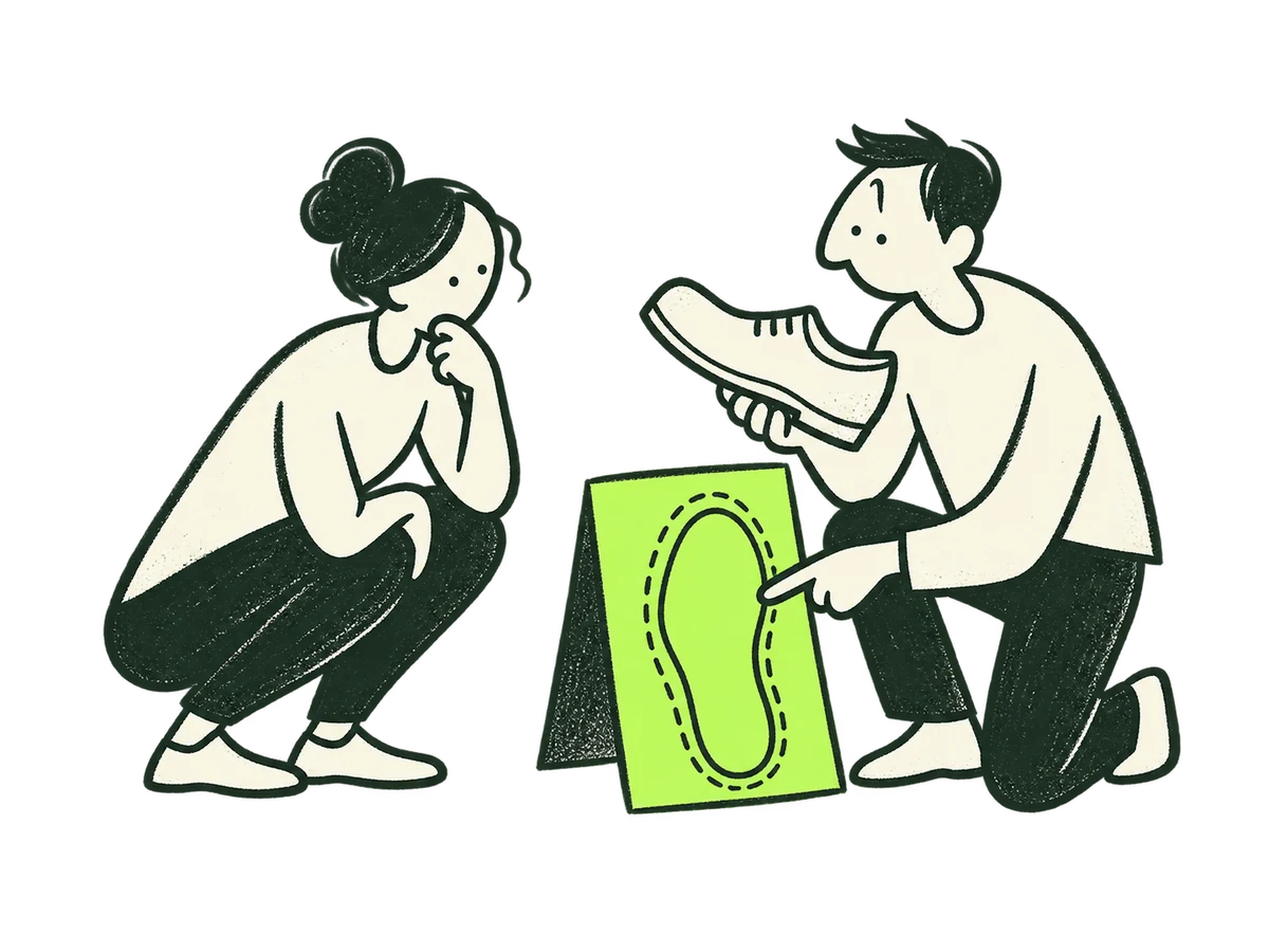 Focus Customer DemandHome / focus / customer-demand+
ORIGINAL PRODUCTION PROMPT
Original IOXIQ editorial website illustration for an independent strategy and research consultancy. Communicate the business meaning through one recognisable human action. Sophisticated, curious and lightly witty. Dry forest-green ink (#1c3026), variable pressure, scratchy open contours and sparse grain inside the marks. Flat cream forms (#f6f6e9), one strong lime patch (#beff67), and at most one small secondary accent. One or two expressive people with oval heads, dot eyes, simple curved bodies and personality through posture. No more than three major props. Asymmetric but balanced; action readable at 300px. True transparent background, no ground rectangle; cream is allowed inside objects. Keep every limb and object in frame, with at least 12% clear edge space. Keep headings, captions and interface labels outside the artwork. No text, letters, numbers, logos, watermark, signatures, charts with invented data, generic office stock scenes, corporate vector clip art, uniform polished outlines, detached oversized hands, gradients, glossy 3D or drop shadows. Scene: Two people compare one cream shoe-shaped cutout with a lime footprint template. One listens while the other points to the mismatch. Learn what fits a real need. Composition: landscape 4:3. One complete original standalone scene, no montage. Clear readable action at 300px. Fill the central 76% of the canvas, retaining 12% clear transparent edge space on all sides. Cream interiors must be opaque. Finished website asset; no text and no page mockup. Use geometric marks on blank evidence cards; do not draw trees, leaves, landscapes, forests or nature motifs. Every illustrated element belongs to the stated business metaphor.Download reference image
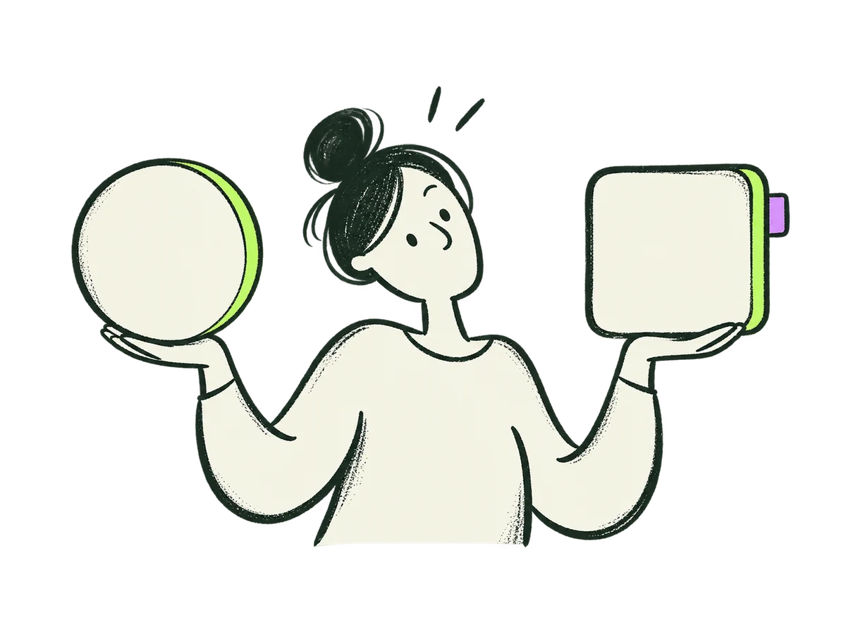 Focus Competitive EvidenceHome / focus / competitive-evidence+
ORIGINAL PRODUCTION PROMPT
Original IOXIQ editorial website illustration for an independent strategy and research consultancy. Communicate the business meaning through one recognisable human action. Sophisticated, curious and lightly witty. Dry forest-green ink (#1c3026), variable pressure, scratchy open contours and sparse grain inside the marks. Flat cream forms (#f6f6e9), one strong lime patch (#beff67), and at most one small secondary accent. One or two expressive people with oval heads, dot eyes, simple curved bodies and personality through posture. No more than three major props. Asymmetric but balanced; action readable at 300px. True transparent background, no ground rectangle; cream is allowed inside objects. Keep every limb and object in frame, with at least 12% clear edge space. Keep headings, captions and interface labels outside the artwork. No text, letters, numbers, logos, watermark, signatures, charts with invented data, generic office stock scenes, corporate vector clip art, uniform polished outlines, detached oversized hands, gradients, glossy 3D or drop shadows. Scene: A person holds two different cream offer silhouettes at the same height, comparing their lime edges. One small lilac distinguishing tab. Compare alternatives fairly. Composition: landscape 4:3. One complete original standalone scene, no montage. Clear readable action at 300px. Fill the central 76% of the canvas, retaining 12% clear transparent edge space on all sides. Cream interiors must be opaque. Finished website asset; no text and no page mockup. Use geometric marks on blank evidence cards; do not draw trees, leaves, landscapes, forests or nature motifs. Every illustrated element belongs to the stated business metaphor.Download reference image
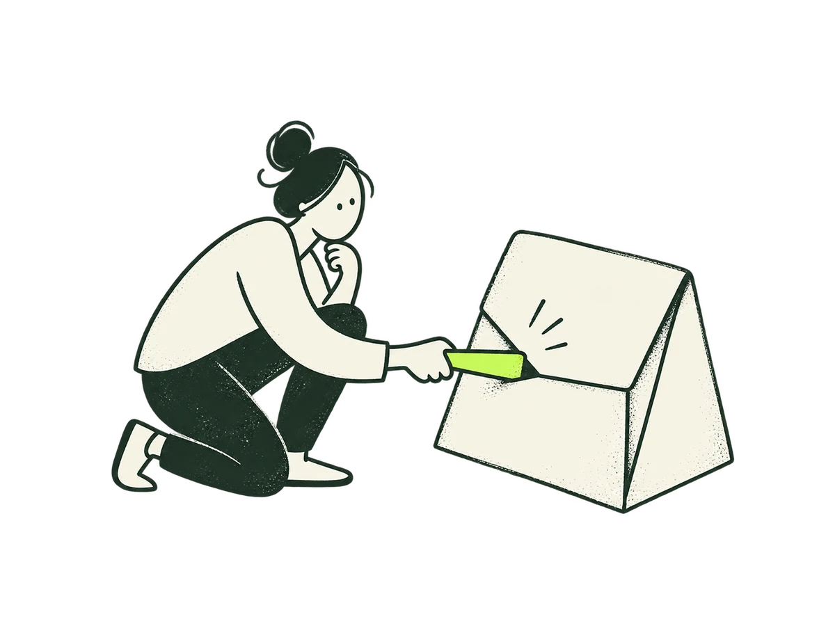 Focus Commercial DiligenceHome / focus / commercial-diligence+
ORIGINAL PRODUCTION PROMPT
Original IOXIQ editorial website illustration for an independent strategy and research consultancy. Communicate the business meaning through one recognisable human action. Sophisticated, curious and lightly witty. Dry forest-green ink (#1c3026), variable pressure, scratchy open contours and sparse grain inside the marks. Flat cream forms (#f6f6e9), one strong lime patch (#beff67), and at most one small secondary accent. One or two expressive people with oval heads, dot eyes, simple curved bodies and personality through posture. No more than three major props. Asymmetric but balanced; action readable at 300px. True transparent background, no ground rectangle; cream is allowed inside objects. Keep every limb and object in frame, with at least 12% clear edge space. Keep headings, captions and interface labels outside the artwork. No text, letters, numbers, logos, watermark, signatures, charts with invented data, generic office stock scenes, corporate vector clip art, uniform polished outlines, detached oversized hands, gradients, glossy 3D or drop shadows. Scene: A person gently pulls a lime support peg to test a cream folded case, observing where its seam opens. Careful commercial assumption testing, no bridge or tower. Composition: landscape 4:3. One complete original standalone scene, no montage. Clear readable action at 300px. Fill the central 76% of the canvas, retaining 12% clear transparent edge space on all sides. Cream interiors must be opaque. Finished website asset; no text and no page mockup. Use geometric marks on blank evidence cards; do not draw trees, leaves, landscapes, forests or nature motifs. Every illustrated element belongs to the stated business metaphor.Download reference image
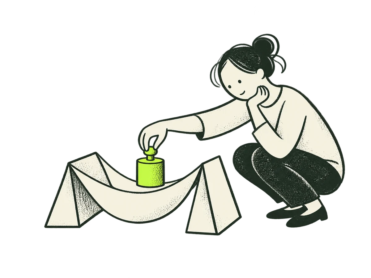 Focus Validate OpportunityHome / focus / validate-opportunity+
ORIGINAL PRODUCTION PROMPT
Original IOXIQ editorial website illustration for an independent strategy and research consultancy. Communicate the business meaning through one recognisable human action. Sophisticated, curious and lightly witty. Dry forest-green ink (#1c3026), variable pressure, scratchy open contours and sparse grain inside the marks. Flat cream forms (#f6f6e9), one strong lime patch (#beff67), and at most one small secondary accent. One or two expressive people with oval heads, dot eyes, simple curved bodies and personality through posture. No more than three major props. Asymmetric but balanced; action readable at 300px. True transparent background, no ground rectangle; cream is allowed inside objects. Keep every limb and object in frame, with at least 12% clear edge space. Keep headings, captions and interface labels outside the artwork. No text, letters, numbers, logos, watermark, signatures, charts with invented data, generic office stock scenes, corporate vector clip art, uniform polished outlines, detached oversized hands, gradients, glossy 3D or drop shadows. Scene: A person lowers one small lime test weight into a simple cream paper cradle and watches its stability. A bounded opportunity test before committing. Composition: landscape 4:3. One complete original standalone scene, no montage. Clear readable action at 300px. Fill the central 76% of the canvas, retaining 12% clear transparent edge space on all sides. Cream interiors must be opaque. Finished website asset; no text and no page mockup. Use geometric marks on blank evidence cards; do not draw trees, leaves, landscapes, forests or nature motifs. Every illustrated element belongs to the stated business metaphor.Download reference image
 Focus Entry Venture PartnerHome / focus / entry-venture-partner+
ORIGINAL PRODUCTION PROMPT
Original IOXIQ editorial website illustration for an independent strategy and research consultancy. Communicate the business meaning through one recognisable human action. Sophisticated, curious and lightly witty. Dry forest-green ink (#1c3026), variable pressure, scratchy open contours and sparse grain inside the marks. Flat cream forms (#f6f6e9), one strong lime patch (#beff67), and at most one small secondary accent. One or two expressive people with oval heads, dot eyes, simple curved bodies and personality through posture. No more than three major props. Asymmetric but balanced; action readable at 300px. True transparent background, no ground rectangle; cream is allowed inside objects. Keep every limb and object in frame, with at least 12% clear edge space. Keep headings, captions and interface labels outside the artwork. No text, letters, numbers, logos, watermark, signatures, charts with invented data, generic office stock scenes, corporate vector clip art, uniform polished outlines, detached oversized hands, gradients, glossy 3D or drop shadows. Scene: Two people on opposite sides of a narrow gap test whether their differently shaped cream connectors meet. One lime connecting joint. Assess partnership fit before crossing. Composition: landscape 4:3. One complete original standalone scene, no montage. Clear readable action at 300px. Fill the central 76% of the canvas, retaining 12% clear transparent edge space on all sides. Cream interiors must be opaque. Finished website asset; no text and no page mockup. Use geometric marks on blank evidence cards; do not draw trees, leaves, landscapes, forests or nature motifs. Every illustrated element belongs to the stated business metaphor.Download reference image
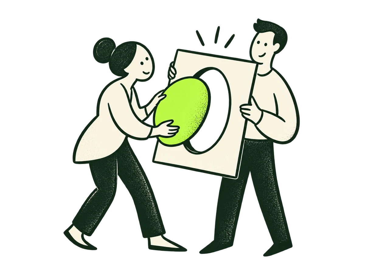 Focus Audience PositionHome / focus / audience-position+
ORIGINAL PRODUCTION PROMPT
Refine this IOXIQ editorial ink illustration. Remove the four small audience spectators completely. Keep ONLY the two full-length central people and the oval framing object they hold. Recompose the remaining scene to comfortably fill the central 76% of the 4:3 canvas, with generous true transparent margins on every side. Preserve the existing dry dark green ink, cream figures, single lime oval, friendly posture and flat drawing technique. Exactly two people, no extra heads or bodies, no words, no letters, no additional props. The action means finding the relevant fit between an offer and its audience.Download reference image
 Focus Proposition PortfolioHome / focus / proposition-portfolio+
ORIGINAL PRODUCTION PROMPT
Original IOXIQ editorial website illustration for an independent strategy and research consultancy. Communicate the business meaning through one recognisable human action. Sophisticated, curious and lightly witty. Dry forest-green ink (#1c3026), variable pressure, scratchy open contours and sparse grain inside the marks. Flat cream forms (#f6f6e9), one strong lime patch (#beff67), and at most one small secondary accent. One or two expressive people with oval heads, dot eyes, simple curved bodies and personality through posture. No more than three major props. Asymmetric but balanced; action readable at 300px. True transparent background, no ground rectangle; cream is allowed inside objects. Keep every limb and object in frame, with at least 12% clear edge space. Keep headings, captions and interface labels outside the artwork. No text, letters, numbers, logos, watermark, signatures, charts with invented data, generic office stock scenes, corporate vector clip art, uniform polished outlines, detached oversized hands, gradients, glossy 3D or drop shadows. Scene: A person arranges three cream folded offer cards into a fan, bringing the lime card forward. Clarify the leading value and relationship of offers. Composition: landscape 4:3. One complete original standalone scene, no montage. Clear readable action at 300px. Fill the central 76% of the canvas, retaining 12% clear transparent edge space on all sides. Cream interiors must be opaque. Finished website asset; no text and no page mockup. Use geometric marks on blank evidence cards; do not draw trees, leaves, landscapes, forests or nature motifs. Every illustrated element belongs to the stated business metaphor.Download reference image
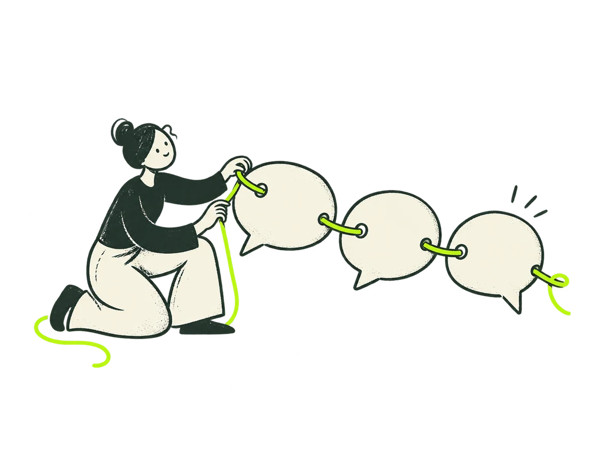 Focus Messaging NarrativeHome / focus / messaging-narrative+
ORIGINAL PRODUCTION PROMPT
Original IOXIQ editorial website illustration for an independent strategy and research consultancy. Communicate the business meaning through one recognisable human action. Sophisticated, curious and lightly witty. Dry forest-green ink (#1c3026), variable pressure, scratchy open contours and sparse grain inside the marks. Flat cream forms (#f6f6e9), one strong lime patch (#beff67), and at most one small secondary accent. One or two expressive people with oval heads, dot eyes, simple curved bodies and personality through posture. No more than three major props. Asymmetric but balanced; action readable at 300px. True transparent background, no ground rectangle; cream is allowed inside objects. Keep every limb and object in frame, with at least 12% clear edge space. Keep headings, captions and interface labels outside the artwork. No text, letters, numbers, logos, watermark, signatures, charts with invented data, generic office stock scenes, corporate vector clip art, uniform polished outlines, detached oversized hands, gradients, glossy 3D or drop shadows. Scene: A person threads three large cream blank speech-bubble shapes onto a single lime string in a clear sequence. Coherent narrative, no words. Composition: landscape 4:3. One complete original standalone scene, no montage. Clear readable action at 300px. Fill the central 76% of the canvas, retaining 12% clear transparent edge space on all sides. Cream interiors must be opaque. Finished website asset; no text and no page mockup. Use geometric marks on blank evidence cards; do not draw trees, leaves, landscapes, forests or nature motifs. Every illustrated element belongs to the stated business metaphor.Download reference image
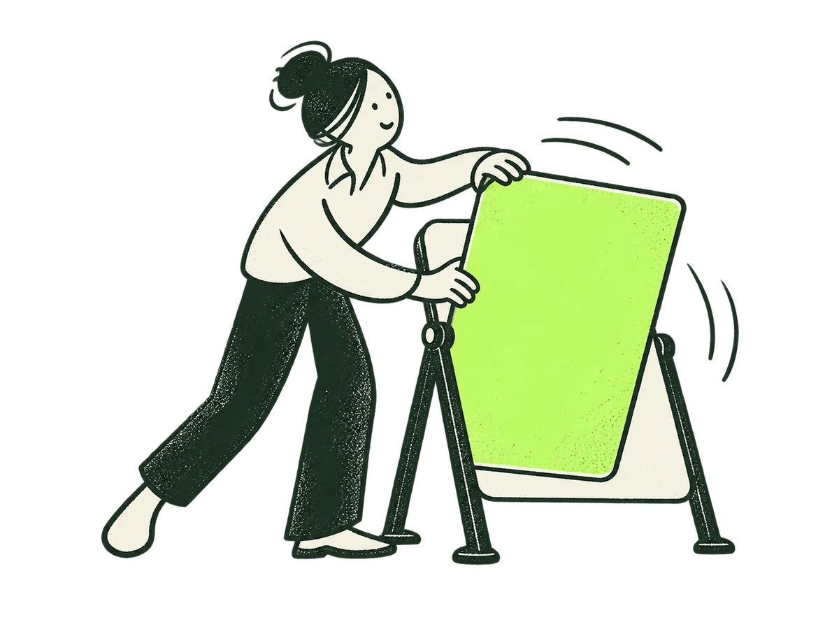 Focus RepositionHome / focus / reposition+
ORIGINAL PRODUCTION PROMPT
Original IOXIQ editorial website illustration for an independent strategy and research consultancy. Communicate the business meaning through one recognisable human action. Sophisticated, curious and lightly witty. Dry forest-green ink (#1c3026), variable pressure, scratchy open contours and sparse grain inside the marks. Flat cream forms (#f6f6e9), one strong lime patch (#beff67), and at most one small secondary accent. One or two expressive people with oval heads, dot eyes, simple curved bodies and personality through posture. No more than three major props. Asymmetric but balanced; action readable at 300px. True transparent background, no ground rectangle; cream is allowed inside objects. Keep every limb and object in frame, with at least 12% clear edge space. Keep headings, captions and interface labels outside the artwork. No text, letters, numbers, logos, watermark, signatures, charts with invented data, generic office stock scenes, corporate vector clip art, uniform polished outlines, detached oversized hands, gradients, glossy 3D or drop shadows. Scene: A person turns a cream reversible sign on a low stand to reveal a lime face toward a different direction. A changed context calls for a new position. Composition: landscape 4:3. One complete original standalone scene, no montage. Clear readable action at 300px. Fill the central 76% of the canvas, retaining 12% clear transparent edge space on all sides. Cream interiors must be opaque. Finished website asset; no text and no page mockup. Use geometric marks on blank evidence cards; do not draw trees, leaves, landscapes, forests or nature motifs. Every illustrated element belongs to the stated business metaphor.Download reference image
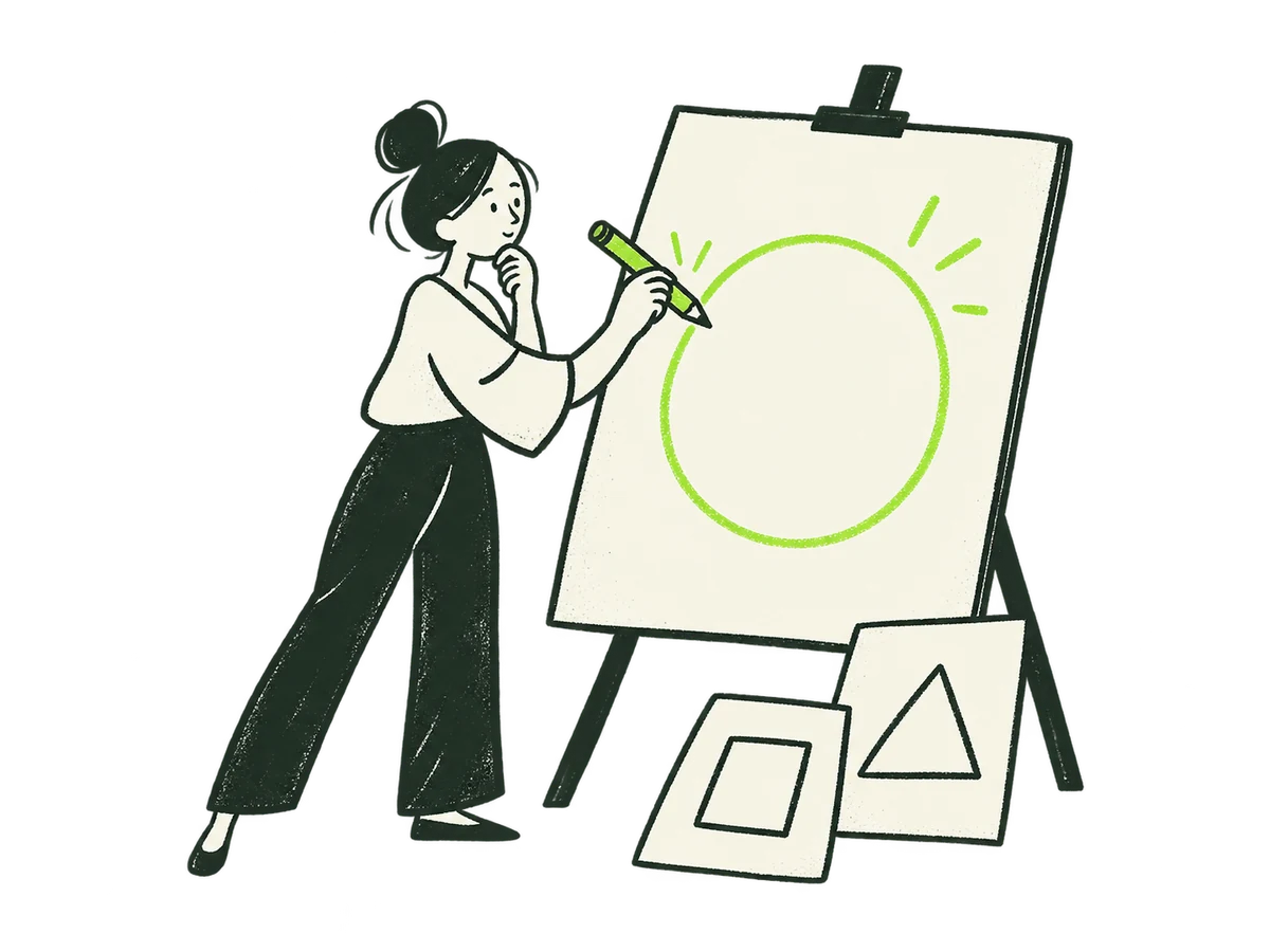 Focus Product DirectionHome / focus / product-direction+
ORIGINAL PRODUCTION PROMPT
Original IOXIQ editorial website illustration for an independent strategy and research consultancy. Communicate the business meaning through one recognisable human action. Sophisticated, curious and lightly witty. Dry forest-green ink (#1c3026), variable pressure, scratchy open contours and sparse grain inside the marks. Flat cream forms (#f6f6e9), one strong lime patch (#beff67), and at most one small secondary accent. One or two expressive people with oval heads, dot eyes, simple curved bodies and personality through posture. No more than three major props. Asymmetric but balanced; action readable at 300px. True transparent background, no ground rectangle; cream is allowed inside objects. Keep every limb and object in frame, with at least 12% clear edge space. Keep headings, captions and interface labels outside the artwork. No text, letters, numbers, logos, watermark, signatures, charts with invented data, generic office stock scenes, corporate vector clip art, uniform polished outlines, detached oversized hands, gradients, glossy 3D or drop shadows. Scene: A person uses a lime pencil to sketch the central useful shape onto a large blank cream product canvas, pausing thoughtfully. Clear product purpose, no tiny interface details. Composition: landscape 4:3. One complete original standalone scene, no montage. Clear readable action at 300px. Fill the central 76% of the canvas, retaining 12% clear transparent edge space on all sides. Cream interiors must be opaque. Finished website asset; no text and no page mockup. Use geometric marks on blank evidence cards; do not draw trees, leaves, landscapes, forests or nature motifs. Every illustrated element belongs to the stated business metaphor.Download reference image
 Focus Features RoadmapHome / focus / features-roadmap+
ORIGINAL PRODUCTION PROMPT
Original IOXIQ editorial website illustration for an independent strategy and research consultancy. Communicate the business meaning through one recognisable human action. Sophisticated, curious and lightly witty. Dry forest-green ink (#1c3026), variable pressure, scratchy open contours and sparse grain inside the marks. Flat cream forms (#f6f6e9), one strong lime patch (#beff67), and at most one small secondary accent. One or two expressive people with oval heads, dot eyes, simple curved bodies and personality through posture. No more than three major props. Asymmetric but balanced; action readable at 300px. True transparent background, no ground rectangle; cream is allowed inside objects. Keep every limb and object in frame, with at least 12% clear edge space. Keep headings, captions and interface labels outside the artwork. No text, letters, numbers, logos, watermark, signatures, charts with invented data, generic office stock scenes, corporate vector clip art, uniform polished outlines, detached oversized hands, gradients, glossy 3D or drop shadows. Scene: A person removes a distracting lilac block from a cream three-slot feature tray and marks the next lime block to keep. Prioritisation, not a calendar full of noise. Composition: landscape 4:3. One complete original standalone scene, no montage. Clear readable action at 300px. Fill the central 76% of the canvas, retaining 12% clear transparent edge space on all sides. Cream interiors must be opaque. Finished website asset; no text and no page mockup. Use geometric marks on blank evidence cards; do not draw trees, leaves, landscapes, forests or nature motifs. Every illustrated element belongs to the stated business metaphor.Download reference image
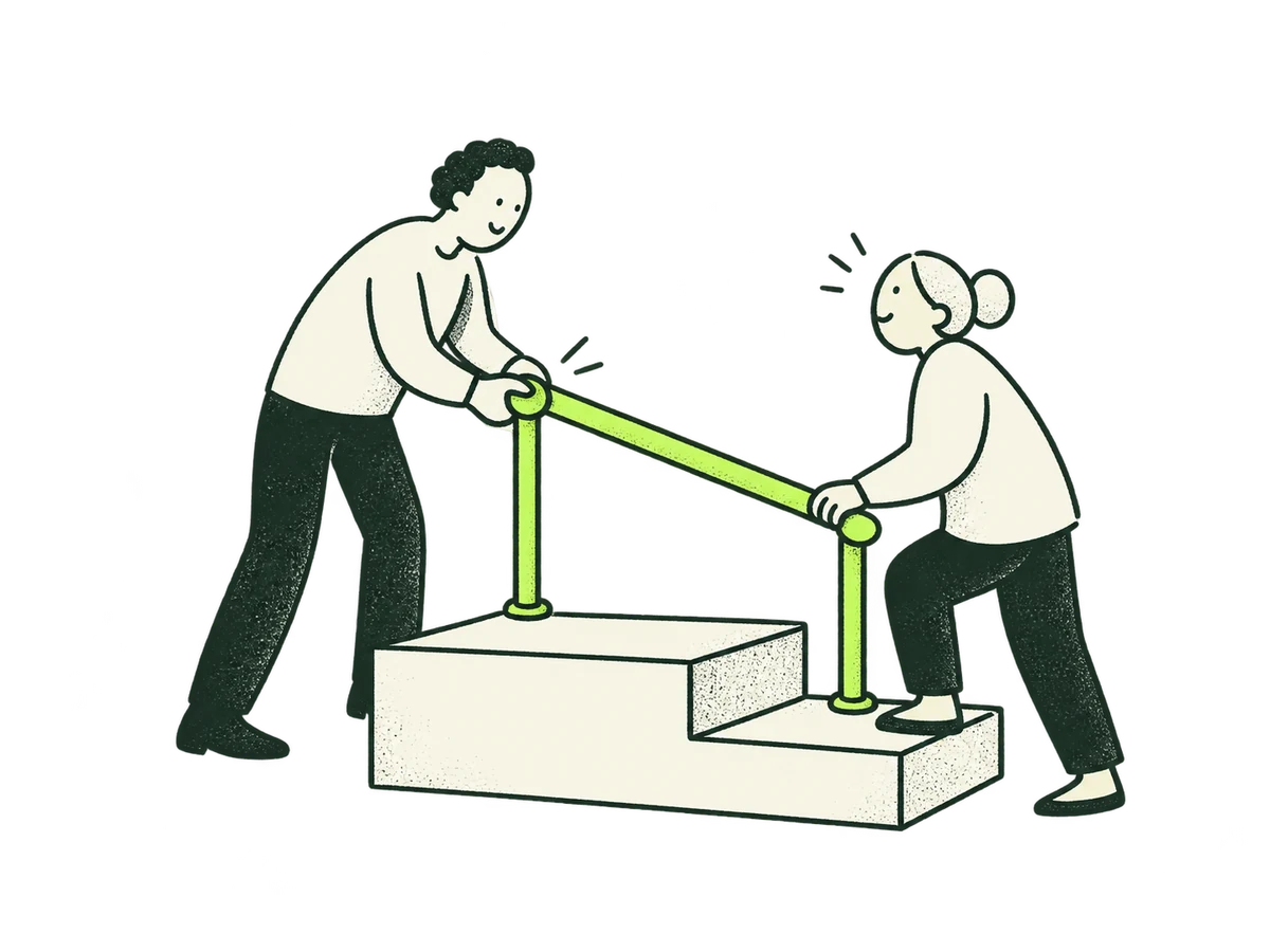 Focus Journey AdoptionHome / focus / journey-adoption+
ORIGINAL PRODUCTION PROMPT
Original IOXIQ editorial website illustration for an independent strategy and research consultancy. Communicate the business meaning through one recognisable human action. Sophisticated, curious and lightly witty. Dry forest-green ink (#1c3026), variable pressure, scratchy open contours and sparse grain inside the marks. Flat cream forms (#f6f6e9), one strong lime patch (#beff67), and at most one small secondary accent. One or two expressive people with oval heads, dot eyes, simple curved bodies and personality through posture. No more than three major props. Asymmetric but balanced; action readable at 300px. True transparent background, no ground rectangle; cream is allowed inside objects. Keep every limb and object in frame, with at least 12% clear edge space. Keep headings, captions and interface labels outside the artwork. No text, letters, numbers, logos, watermark, signatures, charts with invented data, generic office stock scenes, corporate vector clip art, uniform polished outlines, detached oversized hands, gradients, glossy 3D or drop shadows. Scene: A person lowers a lime handrail beside two broad cream steps to make them easier for another person to use. Remove friction from discovering value. Composition: landscape 4:3. One complete original standalone scene, no montage. Clear readable action at 300px. Fill the central 76% of the canvas, retaining 12% clear transparent edge space on all sides. Cream interiors must be opaque. Finished website asset; no text and no page mockup. Use geometric marks on blank evidence cards; do not draw trees, leaves, landscapes, forests or nature motifs. Every illustrated element belongs to the stated business metaphor.Download reference image
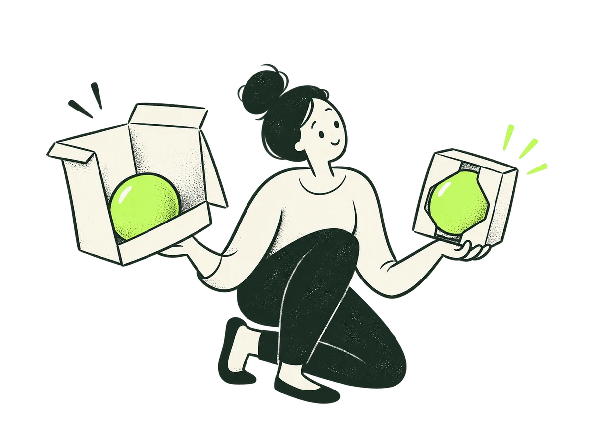 Focus Pricing ExpansionHome / focus / pricing-expansion+
ORIGINAL PRODUCTION PROMPT
Original IOXIQ editorial website illustration for an independent strategy and research consultancy. Communicate the business meaning through one recognisable human action. Sophisticated, curious and lightly witty. Dry forest-green ink (#1c3026), variable pressure, scratchy open contours and sparse grain inside the marks. Flat cream forms (#f6f6e9), one strong lime patch (#beff67), and at most one small secondary accent. One or two expressive people with oval heads, dot eyes, simple curved bodies and personality through posture. No more than three major props. Asymmetric but balanced; action readable at 300px. True transparent background, no ground rectangle; cream is allowed inside objects. Keep every limb and object in frame, with at least 12% clear edge space. Keep headings, captions and interface labels outside the artwork. No text, letters, numbers, logos, watermark, signatures, charts with invented data, generic office stock scenes, corporate vector clip art, uniform polished outlines, detached oversized hands, gradients, glossy 3D or drop shadows. Scene: A person compares two cream package sleeves around the same lime object and selects the closer fit. Align packaging and value, no price numerals. Composition: landscape 4:3. One complete original standalone scene, no montage. Clear readable action at 300px. Fill the central 76% of the canvas, retaining 12% clear transparent edge space on all sides. Cream interiors must be opaque. Finished website asset; no text and no page mockup. Use geometric marks on blank evidence cards; do not draw trees, leaves, landscapes, forests or nature motifs. Every illustrated element belongs to the stated business metaphor.Download reference image
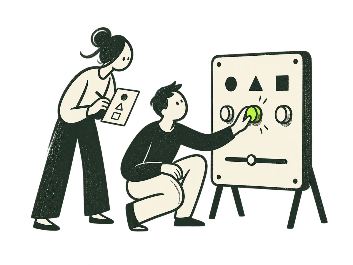 Focus Product EvidenceHome / focus / product-evidence+
ORIGINAL PRODUCTION PROMPT
Original IOXIQ editorial website illustration for an independent strategy and research consultancy. Communicate the business meaning through one recognisable human action. Sophisticated, curious and lightly witty. Dry forest-green ink (#1c3026), variable pressure, scratchy open contours and sparse grain inside the marks. Flat cream forms (#f6f6e9), one strong lime patch (#beff67), and at most one small secondary accent. One or two expressive people with oval heads, dot eyes, simple curved bodies and personality through posture. No more than three major props. Asymmetric but balanced; action readable at 300px. True transparent background, no ground rectangle; cream is allowed inside objects. Keep every limb and object in frame, with at least 12% clear edge space. Keep headings, captions and interface labels outside the artwork. No text, letters, numbers, logos, watermark, signatures, charts with invented data, generic office stock scenes, corporate vector clip art, uniform polished outlines, detached oversized hands, gradients, glossy 3D or drop shadows. Scene: A person watches a second person turn one lime control on a freestanding cream test panel while holding a blank observation card. Learn from actual product use. Composition: landscape 4:3. One complete original standalone scene, no montage. Clear readable action at 300px. Fill the central 76% of the canvas, retaining 12% clear transparent edge space on all sides. Cream interiors must be opaque. Finished website asset; no text and no page mockup. Use geometric marks on blank evidence cards; do not draw trees, leaves, landscapes, forests or nature motifs. Every illustrated element belongs to the stated business metaphor.Download reference image
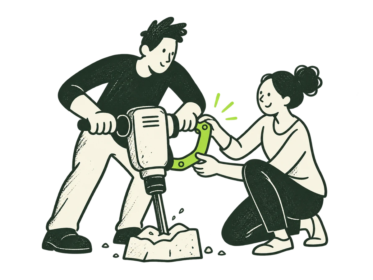 Focus Intelligent ProductHome / focus / intelligent-product+
ORIGINAL PRODUCTION PROMPT
Original IOXIQ editorial website illustration for an independent strategy and research consultancy. Communicate the business meaning through one recognisable human action. Sophisticated, curious and lightly witty. Dry forest-green ink (#1c3026), variable pressure, scratchy open contours and sparse grain inside the marks. Flat cream forms (#f6f6e9), one strong lime patch (#beff67), and at most one small secondary accent. One or two expressive people with oval heads, dot eyes, simple curved bodies and personality through posture. No more than three major props. Asymmetric but balanced; action readable at 300px. True transparent background, no ground rectangle; cream is allowed inside objects. Keep every limb and object in frame, with at least 12% clear edge space. Keep headings, captions and interface labels outside the artwork. No text, letters, numbers, logos, watermark, signatures, charts with invented data, generic office stock scenes, corporate vector clip art, uniform polished outlines, detached oversized hands, gradients, glossy 3D or drop shadows. Scene: A person fits a small lime assistive handle to a cream tool that another person is already using. Intelligence improves a real job, not a robot spectacle. Composition: landscape 4:3. One complete original standalone scene, no montage. Clear readable action at 300px. Fill the central 76% of the canvas, retaining 12% clear transparent edge space on all sides. Cream interiors must be opaque. Finished website asset; no text and no page mockup. Use geometric marks on blank evidence cards; do not draw trees, leaves, landscapes, forests or nature motifs. Every illustrated element belongs to the stated business metaphor.Download reference image
 Focus Ai ValueHome / focus / ai-value+
ORIGINAL PRODUCTION PROMPT
Original IOXIQ editorial website illustration for an independent strategy and research consultancy. Communicate the business meaning through one recognisable human action. Sophisticated, curious and lightly witty. Dry forest-green ink (#1c3026), variable pressure, scratchy open contours and sparse grain inside the marks. Flat cream forms (#f6f6e9), one strong lime patch (#beff67), and at most one small secondary accent. One or two expressive people with oval heads, dot eyes, simple curved bodies and personality through posture. No more than three major props. Asymmetric but balanced; action readable at 300px. True transparent background, no ground rectangle; cream is allowed inside objects. Keep every limb and object in frame, with at least 12% clear edge space. Keep headings, captions and interface labels outside the artwork. No text, letters, numbers, logos, watermark, signatures, charts with invented data, generic office stock scenes, corporate vector clip art, uniform polished outlines, detached oversized hands, gradients, glossy 3D or drop shadows. Scene: A person sorts three cream task tokens and places a lime ring around the one worth improving. AI opportunity selection, no computer chip or magic wand. Composition: landscape 4:3. One complete original standalone scene, no montage. Clear readable action at 300px. Fill the central 76% of the canvas, retaining 12% clear transparent edge space on all sides. Cream interiors must be opaque. Finished website asset; no text and no page mockup. Use geometric marks on blank evidence cards; do not draw trees, leaves, landscapes, forests or nature motifs. Every illustrated element belongs to the stated business metaphor.Download reference image
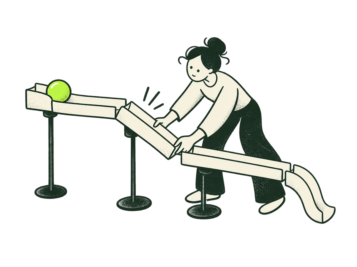 Focus WorkflowsHome / focus / workflows+
ORIGINAL PRODUCTION PROMPT
Original IOXIQ editorial website illustration for an independent strategy and research consultancy. Communicate the business meaning through one recognisable human action. Sophisticated, curious and lightly witty. Dry forest-green ink (#1c3026), variable pressure, scratchy open contours and sparse grain inside the marks. Flat cream forms (#f6f6e9), one strong lime patch (#beff67), and at most one small secondary accent. One or two expressive people with oval heads, dot eyes, simple curved bodies and personality through posture. No more than three major props. Asymmetric but balanced; action readable at 300px. True transparent background, no ground rectangle; cream is allowed inside objects. Keep every limb and object in frame, with at least 12% clear edge space. Keep headings, captions and interface labels outside the artwork. No text, letters, numbers, logos, watermark, signatures, charts with invented data, generic office stock scenes, corporate vector clip art, uniform polished outlines, detached oversized hands, gradients, glossy 3D or drop shadows. Scene: A person straightens a kink in a cream paper channel so a single lime ball can roll through its next stage. Improve the actual workflow. Composition: landscape 4:3. One complete original standalone scene, no montage. Clear readable action at 300px. Fill the central 76% of the canvas, retaining 12% clear transparent edge space on all sides. Cream interiors must be opaque. Finished website asset; no text and no page mockup. Use geometric marks on blank evidence cards; do not draw trees, leaves, landscapes, forests or nature motifs. Every illustrated element belongs to the stated business metaphor.Download reference image
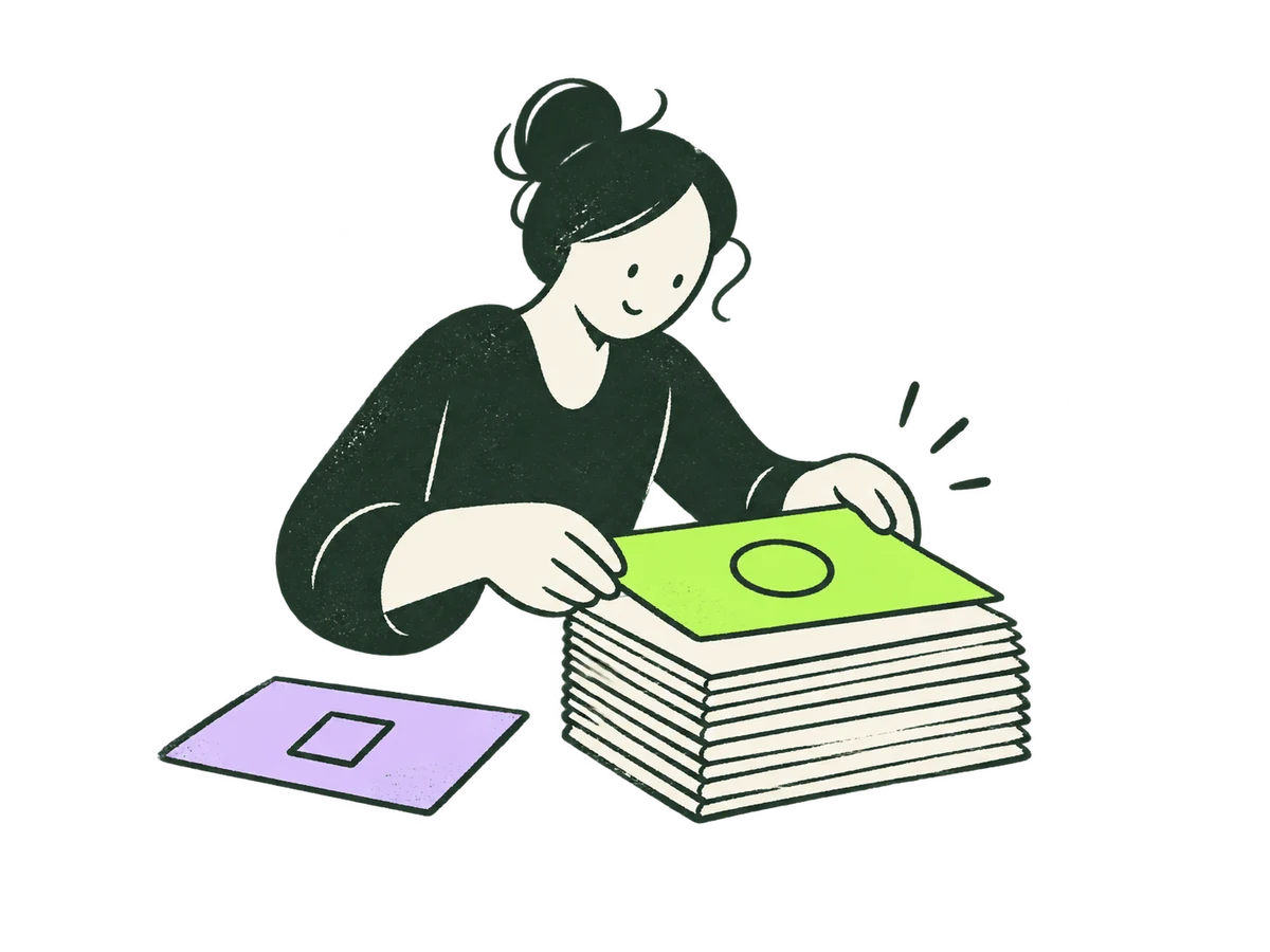 Focus Data FoundationsHome / focus / data-foundations+
ORIGINAL PRODUCTION PROMPT
Original IOXIQ editorial website illustration for an independent strategy and research consultancy. Communicate the business meaning through one recognisable human action. Sophisticated, curious and lightly witty. Dry forest-green ink (#1c3026), variable pressure, scratchy open contours and sparse grain inside the marks. Flat cream forms (#f6f6e9), one strong lime patch (#beff67), and at most one small secondary accent. One or two expressive people with oval heads, dot eyes, simple curved bodies and personality through posture. No more than three major props. Asymmetric but balanced; action readable at 300px. True transparent background, no ground rectangle; cream is allowed inside objects. Keep every limb and object in frame, with at least 12% clear edge space. Keep headings, captions and interface labels outside the artwork. No text, letters, numbers, logos, watermark, signatures, charts with invented data, generic office stock scenes, corporate vector clip art, uniform polished outlines, detached oversized hands, gradients, glossy 3D or drop shadows. Scene: A person squares and aligns a stack of cream source cards before placing a lime top card. A loose lilac card waits to be checked. Data readiness. Composition: landscape 4:3. One complete original standalone scene, no montage. Clear readable action at 300px. Fill the central 76% of the canvas, retaining 12% clear transparent edge space on all sides. Cream interiors must be opaque. Finished website asset; no text and no page mockup. Use geometric marks on blank evidence cards; do not draw trees, leaves, landscapes, forests or nature motifs. Every illustrated element belongs to the stated business metaphor.Download reference image
 Focus Knowledge ContextHome / focus / knowledge-context+
ORIGINAL PRODUCTION PROMPT
Original IOXIQ editorial website illustration for an independent strategy and research consultancy. Communicate the business meaning through one recognisable human action. Sophisticated, curious and lightly witty. Dry forest-green ink (#1c3026), variable pressure, scratchy open contours and sparse grain inside the marks. Flat cream forms (#f6f6e9), one strong lime patch (#beff67), and at most one small secondary accent. One or two expressive people with oval heads, dot eyes, simple curved bodies and personality through posture. No more than three major props. Asymmetric but balanced; action readable at 300px. True transparent background, no ground rectangle; cream is allowed inside objects. Keep every limb and object in frame, with at least 12% clear edge space. Keep headings, captions and interface labels outside the artwork. No text, letters, numbers, logos, watermark, signatures, charts with invented data, generic office stock scenes, corporate vector clip art, uniform polished outlines, detached oversized hands, gradients, glossy 3D or drop shadows. Scene: A person adds a lime contextual tab to an open cream reference book while comparing it with a small blank observation card. Business context grounds intelligence. Composition: landscape 4:3. One complete original standalone scene, no montage. Clear readable action at 300px. Fill the central 76% of the canvas, retaining 12% clear transparent edge space on all sides. Cream interiors must be opaque. Finished website asset; no text and no page mockup. Use geometric marks on blank evidence cards; do not draw trees, leaves, landscapes, forests or nature motifs. Every illustrated element belongs to the stated business metaphor.Download reference image
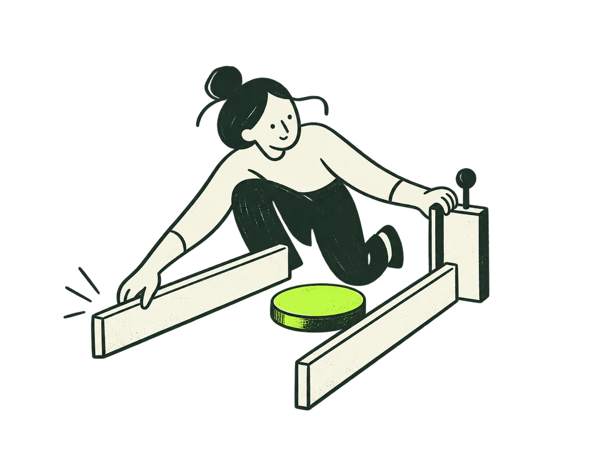 Focus AgentsHome / focus / agents+
ORIGINAL PRODUCTION PROMPT
Original IOXIQ editorial website illustration for an independent strategy and research consultancy. Communicate the business meaning through one recognisable human action. Sophisticated, curious and lightly witty. Dry forest-green ink (#1c3026), variable pressure, scratchy open contours and sparse grain inside the marks. Flat cream forms (#f6f6e9), one strong lime patch (#beff67), and at most one small secondary accent. One or two expressive people with oval heads, dot eyes, simple curved bodies and personality through posture. No more than three major props. Asymmetric but balanced; action readable at 300px. True transparent background, no ground rectangle; cream is allowed inside objects. Keep every limb and object in frame, with at least 12% clear edge space. Keep headings, captions and interface labels outside the artwork. No text, letters, numbers, logos, watermark, signatures, charts with invented data, generic office stock scenes, corporate vector clip art, uniform polished outlines, detached oversized hands, gradients, glossy 3D or drop shadows. Scene: A person adjusts two cream boundary rails around a small lime task token, keeping a hand on a simple stop gate. Define what an agent may and may not do. No robot. Composition: landscape 4:3. One complete original standalone scene, no montage. Clear readable action at 300px. Fill the central 76% of the canvas, retaining 12% clear transparent edge space on all sides. Cream interiors must be opaque. Finished website asset; no text and no page mockup. Use geometric marks on blank evidence cards; do not draw trees, leaves, landscapes, forests or nature motifs. Every illustrated element belongs to the stated business metaphor.Download reference image
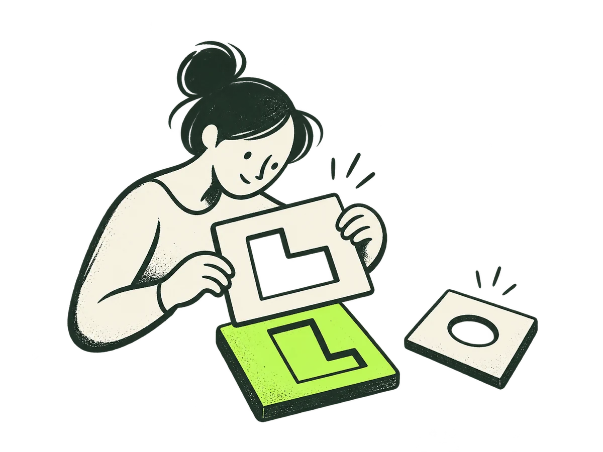 Focus Quality EvaluationHome / focus / quality-evaluation+
ORIGINAL PRODUCTION PROMPT
Original IOXIQ editorial website illustration for an independent strategy and research consultancy. Communicate the business meaning through one recognisable human action. Sophisticated, curious and lightly witty. Dry forest-green ink (#1c3026), variable pressure, scratchy open contours and sparse grain inside the marks. Flat cream forms (#f6f6e9), one strong lime patch (#beff67), and at most one small secondary accent. One or two expressive people with oval heads, dot eyes, simple curved bodies and personality through posture. No more than three major props. Asymmetric but balanced; action readable at 300px. True transparent background, no ground rectangle; cream is allowed inside objects. Keep every limb and object in frame, with at least 12% clear edge space. Keep headings, captions and interface labels outside the artwork. No text, letters, numbers, logos, watermark, signatures, charts with invented data, generic office stock scenes, corporate vector clip art, uniform polished outlines, detached oversized hands, gradients, glossy 3D or drop shadows. Scene: A person holds a cream test stencil over a lime output tile and inspects the fit. One cream rejected tile lies aside. Evaluate outputs against explicit criteria. Composition: landscape 4:3. One complete original standalone scene, no montage. Clear readable action at 300px. Fill the central 76% of the canvas, retaining 12% clear transparent edge space on all sides. Cream interiors must be opaque. Finished website asset; no text and no page mockup. Use geometric marks on blank evidence cards; do not draw trees, leaves, landscapes, forests or nature motifs. Every illustrated element belongs to the stated business metaphor.Download reference image
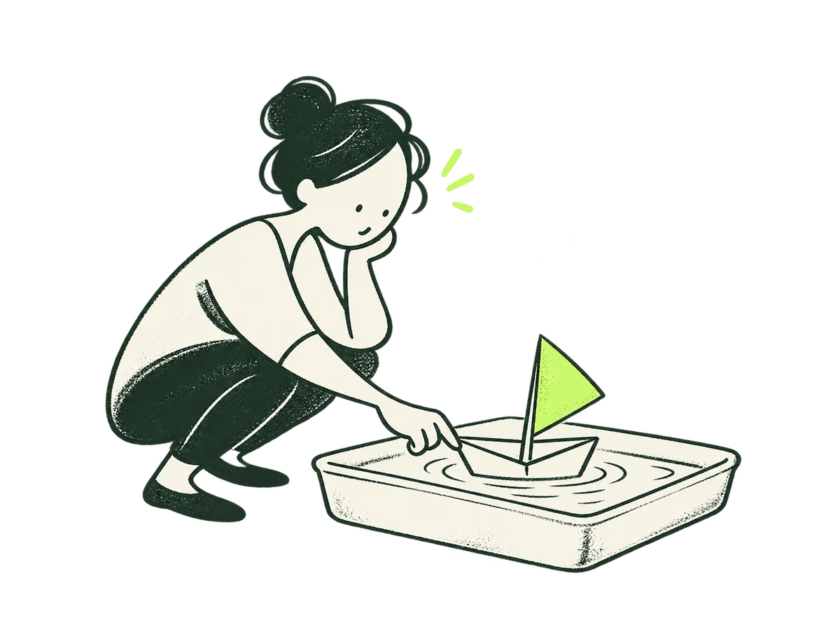 Focus PilotHome / focus / pilot+
ORIGINAL PRODUCTION PROMPT
Original IOXIQ editorial website illustration for an independent strategy and research consultancy. Communicate the business meaning through one recognisable human action. Sophisticated, curious and lightly witty. Dry forest-green ink (#1c3026), variable pressure, scratchy open contours and sparse grain inside the marks. Flat cream forms (#f6f6e9), one strong lime patch (#beff67), and at most one small secondary accent. One or two expressive people with oval heads, dot eyes, simple curved bodies and personality through posture. No more than three major props. Asymmetric but balanced; action readable at 300px. True transparent background, no ground rectangle; cream is allowed inside objects. Keep every limb and object in frame, with at least 12% clear edge space. Keep headings, captions and interface labels outside the artwork. No text, letters, numbers, logos, watermark, signatures, charts with invented data, generic office stock scenes, corporate vector clip art, uniform polished outlines, detached oversized hands, gradients, glossy 3D or drop shadows. Scene: A person tests a small cream folded boat with a lime sail in a shallow simple cream tray. A contained first experiment, not sailing to success. Composition: landscape 4:3. One complete original standalone scene, no montage. Clear readable action at 300px. Fill the central 76% of the canvas, retaining 12% clear transparent edge space on all sides. Cream interiors must be opaque. Finished website asset; no text and no page mockup. Use geometric marks on blank evidence cards; do not draw trees, leaves, landscapes, forests or nature motifs. Every illustrated element belongs to the stated business metaphor.Download reference image
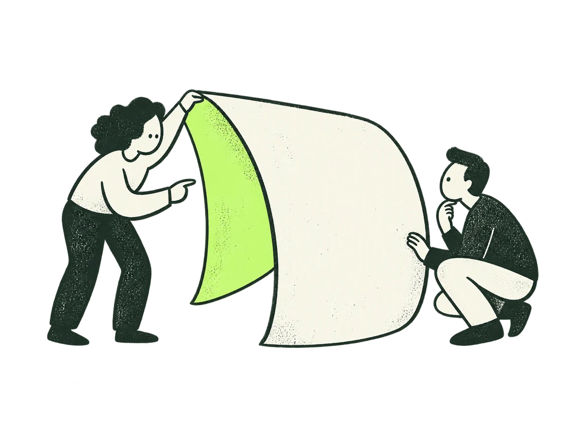 Focus Independent AdviceHome / focus / independent-advice+
ORIGINAL PRODUCTION PROMPT
Original IOXIQ editorial website illustration for an independent strategy and research consultancy. Communicate the business meaning through one recognisable human action. Sophisticated, curious and lightly witty. Dry forest-green ink (#1c3026), variable pressure, scratchy open contours and sparse grain inside the marks. Flat cream forms (#f6f6e9), one strong lime patch (#beff67), and at most one small secondary accent. One or two expressive people with oval heads, dot eyes, simple curved bodies and personality through posture. No more than three major props. Asymmetric but balanced; action readable at 300px. True transparent background, no ground rectangle; cream is allowed inside objects. Keep every limb and object in frame, with at least 12% clear edge space. Keep headings, captions and interface labels outside the artwork. No text, letters, numbers, logos, watermark, signatures, charts with invented data, generic office stock scenes, corporate vector clip art, uniform polished outlines, detached oversized hands, gradients, glossy 3D or drop shadows. Scene: Two people examine opposite sides of a curved cream object, one showing a hidden lime patch to the other. An independent perspective reveals a trade-off. Composition: landscape 4:3. One complete original standalone scene, no montage. Clear readable action at 300px. Fill the central 76% of the canvas, retaining 12% clear transparent edge space on all sides. Cream interiors must be opaque. Finished website asset; no text and no page mockup. Use geometric marks on blank evidence cards; do not draw trees, leaves, landscapes, forests or nature motifs. Every illustrated element belongs to the stated business metaphor.Download reference image
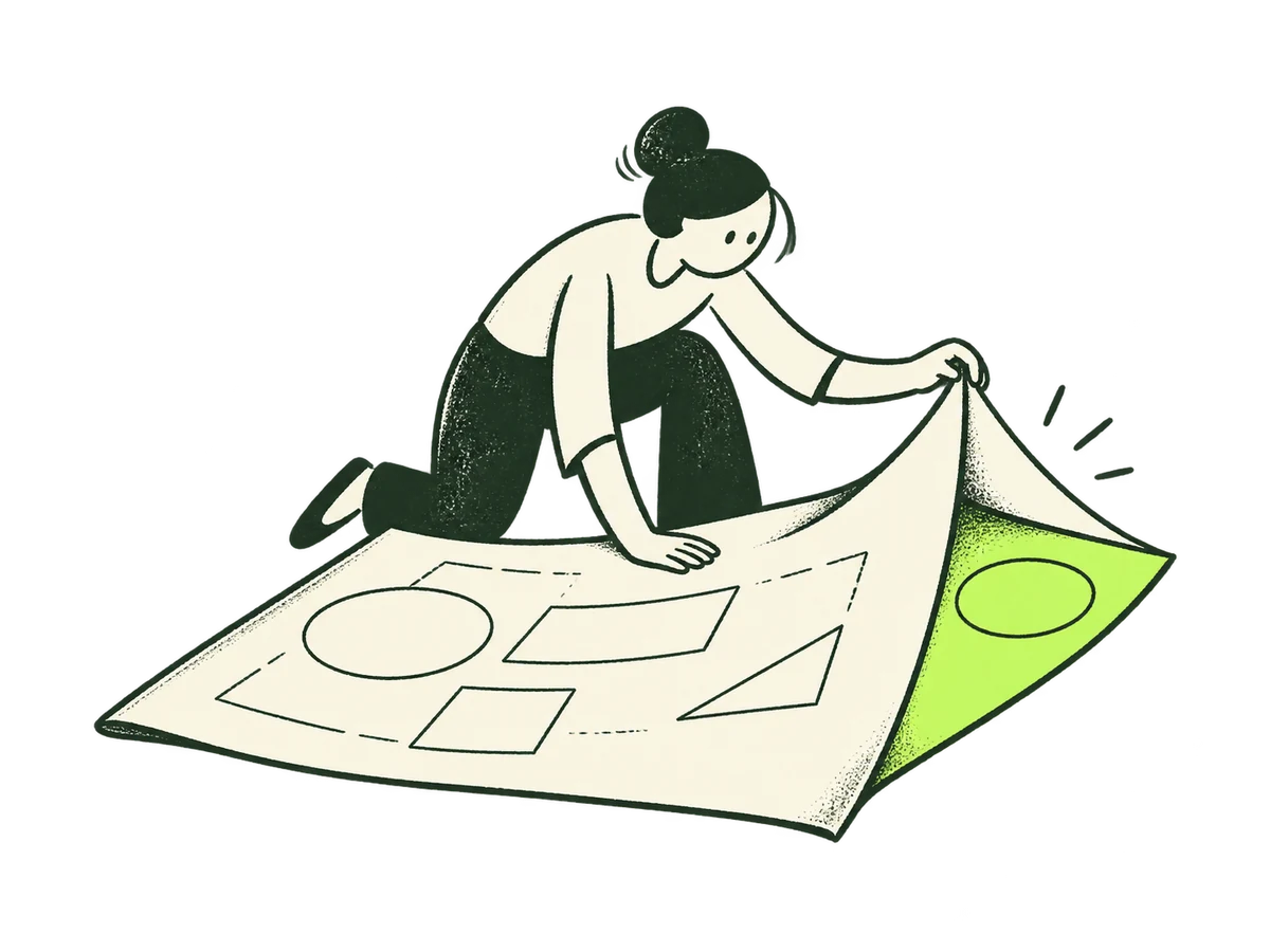 Focus Strategy ReviewHome / focus / strategy-review+
ORIGINAL PRODUCTION PROMPT
Original IOXIQ editorial website illustration for an independent strategy and research consultancy. Communicate the business meaning through one recognisable human action. Sophisticated, curious and lightly witty. Dry forest-green ink (#1c3026), variable pressure, scratchy open contours and sparse grain inside the marks. Flat cream forms (#f6f6e9), one strong lime patch (#beff67), and at most one small secondary accent. One or two expressive people with oval heads, dot eyes, simple curved bodies and personality through posture. No more than three major props. Asymmetric but balanced; action readable at 300px. True transparent background, no ground rectangle; cream is allowed inside objects. Keep every limb and object in frame, with at least 12% clear edge space. Keep headings, captions and interface labels outside the artwork. No text, letters, numbers, logos, watermark, signatures, charts with invented data, generic office stock scenes, corporate vector clip art, uniform polished outlines, detached oversized hands, gradients, glossy 3D or drop shadows. Scene: A person unfolds one corner of a large cream plan to inspect the lime assumption beneath, holding the rest steady. Review the plan deliberately. Composition: landscape 4:3. One complete original standalone scene, no montage. Clear readable action at 300px. Fill the central 76% of the canvas, retaining 12% clear transparent edge space on all sides. Cream interiors must be opaque. Finished website asset; no text and no page mockup. Use geometric marks on blank evidence cards; do not draw trees, leaves, landscapes, forests or nature motifs. Every illustrated element belongs to the stated business metaphor.Download reference image
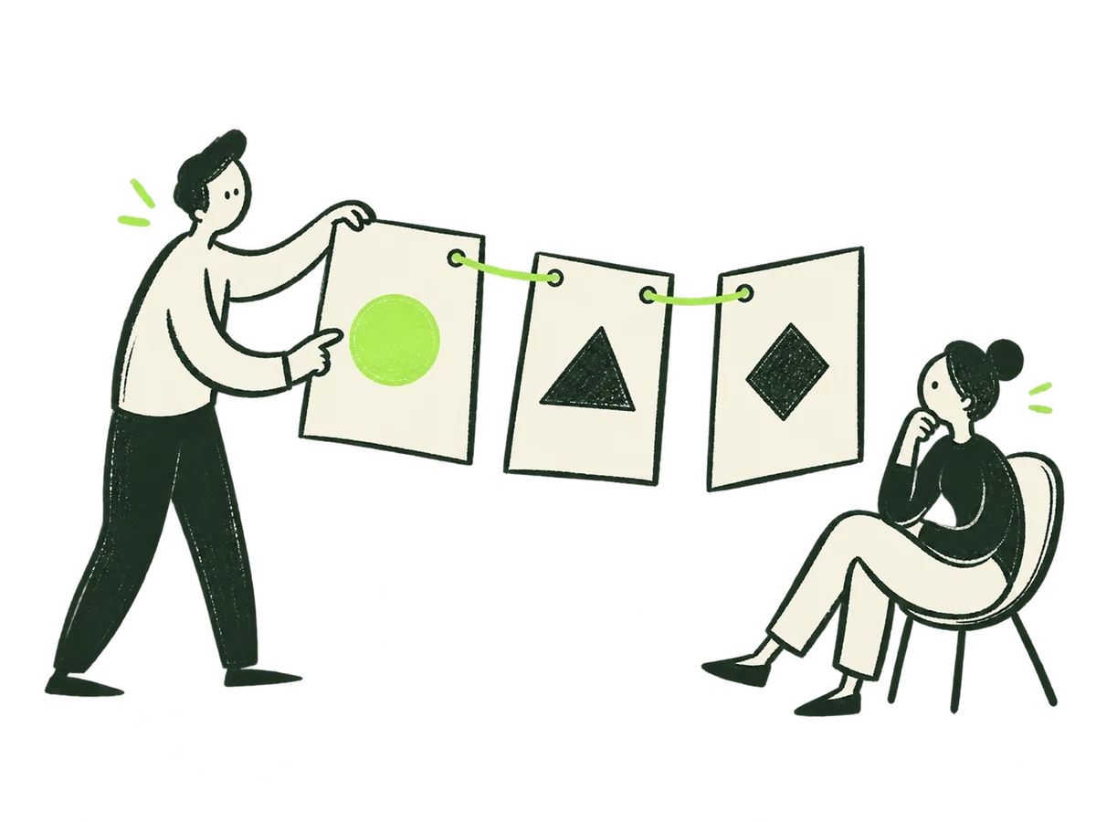 Focus Board StoryHome / focus / board-story+
ORIGINAL PRODUCTION PROMPT
Original IOXIQ editorial website illustration for an independent strategy and research consultancy. Communicate the business meaning through one recognisable human action. Sophisticated, curious and lightly witty. Dry forest-green ink (#1c3026), variable pressure, scratchy open contours and sparse grain inside the marks. Flat cream forms (#f6f6e9), one strong lime patch (#beff67), and at most one small secondary accent. One or two expressive people with oval heads, dot eyes, simple curved bodies and personality through posture. No more than three major props. Asymmetric but balanced; action readable at 300px. True transparent background, no ground rectangle; cream is allowed inside objects. Keep every limb and object in frame, with at least 12% clear edge space. Keep headings, captions and interface labels outside the artwork. No text, letters, numbers, logos, watermark, signatures, charts with invented data, generic office stock scenes, corporate vector clip art, uniform polished outlines, detached oversized hands, gradients, glossy 3D or drop shadows. Scene: A person arranges three large blank cream sheets into a simple upright sequence joined by a lime thread, rehearsing the argument with a second seated listener. No lettering. Composition: landscape 4:3. One complete original standalone scene, no montage. Clear readable action at 300px. Fill the central 76% of the canvas, retaining 12% clear transparent edge space on all sides. Cream interiors must be opaque. Finished website asset; no text and no page mockup. Use geometric marks on blank evidence cards; do not draw trees, leaves, landscapes, forests or nature motifs. Every illustrated element belongs to the stated business metaphor.Download reference image
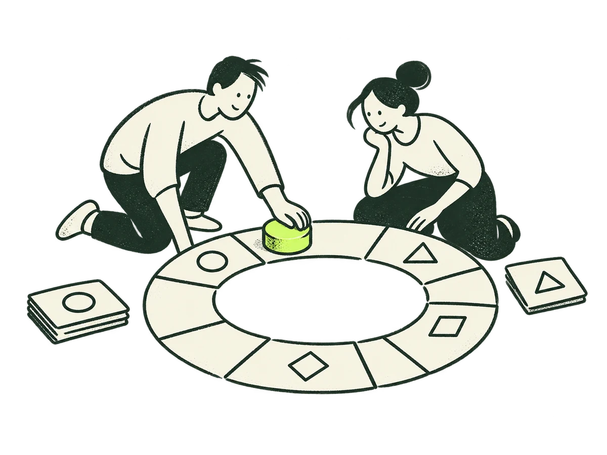 Focus Ongoing LeadershipHome / focus / ongoing-leadership+
ORIGINAL PRODUCTION PROMPT
Original IOXIQ editorial website illustration for an independent strategy and research consultancy. Communicate the business meaning through one recognisable human action. Sophisticated, curious and lightly witty. Dry forest-green ink (#1c3026), variable pressure, scratchy open contours and sparse grain inside the marks. Flat cream forms (#f6f6e9), one strong lime patch (#beff67), and at most one small secondary accent. One or two expressive people with oval heads, dot eyes, simple curved bodies and personality through posture. No more than three major props. Asymmetric but balanced; action readable at 300px. True transparent background, no ground rectangle; cream is allowed inside objects. Keep every limb and object in frame, with at least 12% clear edge space. Keep headings, captions and interface labels outside the artwork. No text, letters, numbers, logos, watermark, signatures, charts with invented data, generic office stock scenes, corporate vector clip art, uniform polished outlines, detached oversized hands, gradients, glossy 3D or drop shadows. Scene: Two people advance a single lime marker along a cream circular planning track together, checking the current step. Steady recurring guidance, no finish line. Composition: landscape 4:3. One complete original standalone scene, no montage. Clear readable action at 300px. Fill the central 76% of the canvas, retaining 12% clear transparent edge space on all sides. Cream interiors must be opaque. Finished website asset; no text and no page mockup. Use geometric marks on blank evidence cards; do not draw trees, leaves, landscapes, forests or nature motifs. Every illustrated element belongs to the stated business metaphor.Download reference image
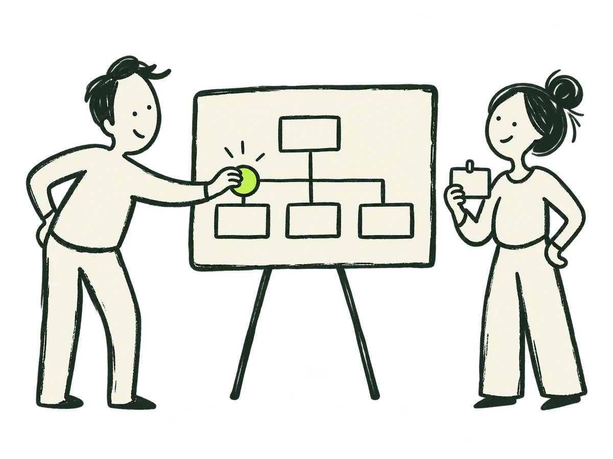 Your responsibilityContact / role question+
ORIGINAL PRODUCTION PROMPT
Create an original IOXIQ editorial ink illustration in 4:3 landscape. Dry dark forest green ink (#1c3026), scratchy open contours with variable pressure and sparse grain. Flat cream (#f6f6e9) people and objects, one bold lime (#beff67) marker. Hand drawn and witty, never glossy, never polished corporate vector, no gradients. Two expressive people with oval heads, dot eyes and simple curved bodies, character through posture. One person places a lime circular marker onto one branch of a simple cream organisation board while the other holds a small blank identity card. This explains a person's responsibility in a business. Exactly two people, one board, one card. No text, letters, numbers, extra faces, trees or nature motifs. True transparent background, no ground, every limb and object in frame with 12% transparent edge space. Readable at 300px. Match IOXIQ dry ink and paper illustrations.Download reference image
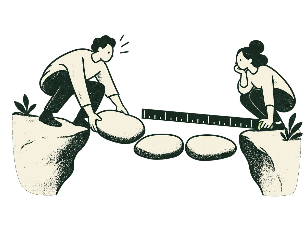 Strategy & Growth — measuring the next moveStrategy & Growth / hero+
ORIGINAL PRODUCTION PROMPT
Use case: precise-object-edit. Asset type: transparent editorial illustration for IOXIQ’s Strategy & Growth service page, displayed on a vivid lime-green background. Input image 1 is the edit target and style reference. Create a revised alternative by fixing the measuring tool only. Preserve the two people, their faces, clothes and poses, the two cream rock banks, the three stepping stones, the small plants, the composition and the hand-drawn grainy ink style as closely as possible. Replace the lime-green curved measuring strip held by the woman on the right with an unmistakable straight, solid dark forest-black ruler. It should have two clear parallel edges, a squared left end, and a broad opaque black face with crisp cream alternating long and short measurement ticks. No numbers or lettering. The woman must visibly grip its right end, and the ruler extends leftwards over the stepping stones in the same location as the current strip. Keep the ruler comfortably thick and readable at small website sizes: approximately 30–36 pixels across its face on a 1200-pixel-wide image. Dark ink #172b22, cream #f5f2df. No lime fill, see-through areas, yellow glow or green halo on the ruler. Keep the ruler clear of the stones so its silhouette reads as one continuous measuring instrument. No extra props or people. Preserve the original ink texture, warm opaque cream fills, friendly minimal facial features and full uncropped silhouettes. Landscape 4:3 composition, generous transparent space around the group. Return true transparent alpha outside the artwork, with no coloured background, checkerboard, white rectangle, text, logo, watermark or border.Download reference image
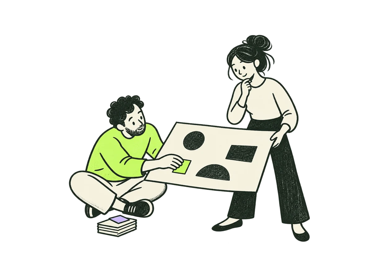 Creative Strategy / Strategic Debrief/how-we-work/#fees · Creative Strategy / Strategic Debrief+
ORIGINAL PRODUCTION PROMPT
Use case: illustration-story. Asset type: original IOXIQ editorial website illustration, sole story placement: How we work / Creative Strategy / Strategic Debrief fee card. Business meaning: an independent adviser helps an agency turn scattered client and industry inputs into one clear brief before creative development. Scene: exactly two expressive people prepare one broad cream creative-brief sheet together. An adviser sits low at the left, leaning forward to align a single bright lime tab onto the brief; an agency colleague stands at the right, gently holding the broad sheet nearly horizontal at waist height and looking thoughtfully at the adviser's action. One small stack of cream source cards rests beside the adviser, with just one tiny lilac slip. The brief has two or three abstract geometric ink marks, no writing. Clear collaborative thinking, warm and slightly witty, no victory pose. This must be a distinct composition from a kneeling person with an upright picture frame and from two crouching people over a floor map. Style: flat hand-drawn dry forest ink (#1c3026), varied pressure, scratchy open contours, visible sparse grain inside ink marks. Simple rounded bodies, expressive oval heads, dot eyes, warm curious faces, personality through gesture; full bodies, all limbs intact and naturally attached. Opaque cream (#f6f6e9) inside people and paper, one strong lime (#beff67) colour patch on the adviser's top and the small brief tab, at most one tiny lilac (#c2b2f2) slip. Restrained editorial drawing, closely coherent with IOXIQ's existing fee-card human inquiry illustrations. Composition: 4:3 landscape high-resolution PNG, ideally 1200 x 900. Asymmetric but balanced, people and action readable at 240–300 pixels wide. Fill the central 76% of the canvas, leave at least 12% transparent edge space on all sides. Exactly two people, one broad brief sheet and one small stack of source cards; no extra props or decorative backdrop. Background: genuine transparent alpha outside the complete scene, no floor, opaque rectangle, shadow, halo or checkerboard printed in the image; retain opaque cream interiors. Avoid: letters, numbers, text, logos, watermark, signatures, gradients, glossy 3D, polished corporate vector outlines, detached oversized hands, generic office stock scenes, handshakes, rockets, trophies, light bulbs, magic machines, invented success graphs, magnifying glasses, leaves, trees or nature motifs. No diagonal arrows.Download reference image
A coherent family for navigation and interaction. Precise SVGs do the interface work; expressive ink stays in the illustrations.
Select an icon to download its SVG. The nine priority symbols come directly from the current site; the utility set extends the same geometry for future work.
| Rule | Standard |
|---|---|
| Construction | 48 × 48 reference grid: category symbols retain 2-unit strokes, utility icons use 4-unit strokes, and directional arrows use 6-unit strokes. Round caps and joins; no fill by default. |
| Sizing | Utility icons use a 2px stroke at 24px; contained directional arrows use a bold 3px stroke. The website action set uses a native 24px grid; exported utility icons use the equivalent 48px grid. Category symbols stay at 32–48px. Inspect at actual size. |
| Optical alignment | Centre by visual weight; preserve breathing room around the drawing. Use the same size within a control group. |
| Colour | currentColor; one colour per icon. Ink on light, cream or lime on dark. |
| Meaning | Pair unfamiliar symbols with labels. An arrow indicates direction, a plus opens detail, a check confirms an actual completed state. |
| Accessibility | Decorative inline SVGs use aria-hidden. Icon-only controls need an accessible name and at least a 44px target. |
| New icons | Add to this family with the same grid and stroke. Avoid mixing emoji, filled stock icons and unrelated stroke weights. |
Use a speech bubble for a conversation, a document for scope or reading, and a plus for revealing more. Pair utility icons with explicit labels. Directional actions use a bold arrow with rounded caps and joins inside a circle or rounded rectangle. Forward and back point horizontally, including on hover. Use a 3px stroke at 24px for these arrows. Do not use diagonal arrows in the interface. Never use an asterisk as a substitute wordmark. A check mark may accompany a confirmation; it must never claim that an enquiry was received or an email delivered before the site knows it.
Download all 22 iconsMotion should reveal a relationship, acknowledge an action or offer a different perspective. Every scene must still make sense when it stops.
Connect the evidence. Let the answer settle.
The complete relationship remains visible without motion.
| Behaviour | Timing / movement | Purpose & fallback |
|---|---|---|
| Button / icon feedback | 180ms · 2px lift and a tactile press | Acknowledge a target. Colour and focus work without movement. |
| Disclosure / local feedback | 350ms · ease-out | Clarify a changed local state. Native controls remain usable. |
| Question-stage arrival | 650ms · up to 40px · power3.out | Mark the next form question after action. Settle immediately with motion off. |
| Editorial scroll | 16–36px travel · roughly ±4° rotation | Reveal a relationship while text remains readable. Reverse with scroll. |
| Evidence paths | Linear progress; scrub 0.5–0.8 where used | Connect sources to a conclusion. Static paths remain complete. |
| Identity strip | Position derives from native page scroll | Stops when scrolling stops and reverses on return. One static label without motion. |
| Focal sculpture | Slow, bounded movement plus click/tap | A change of perspective. Pause offscreen or in hidden tabs; preserve fallback image. |
| Header logo | 44-second colour cycle | The established ambient exception. White/black static fallbacks remain intact. |
Feedback follows a direct action. Scroll reveals a relationship as the reader advances. Ambient movement is reserved for the existing header logo and focal 3D objects.
Give each animated property one owner. Use linear easing for scroll progress, ease-out for feedback. Keep overshoot out of ordinary navigation and reading.
Device reduced motion takes precedence over the visible Motion control. The site remembers a user’s off preference. Changing the preference mid-animation must settle content and preserve form state.
Remove decorative transforms and path travel; show the complete static composition. About cards still open with an instant face switch. Chapter navigation and progress indicators can still report position without animating it.
Use local GSAP and ScrollTrigger for composed scroll scenes, CSS for simple feedback and Three.js only for the approved focal objects. Revert owned timelines on teardown. Pause 3D rendering when hidden or offscreen, cap pixel ratio and retain a usable fallback after rendering failure.
Test forward and reverse scroll, resize, keyboard interaction, rapid actions, hidden tabs, motion toggles during a transition, device reduced motion and no JavaScript. Movement must never be the only signal of a change.
Keep the logo, colours and type consistent. Adapt the layout to what the reader needs to do.
| Where | Story & visual role | Keep this true |
|---|---|---|
| Home | A business question, sculptural loop, lime identity strip, eight priority stories plus an open-question route. | Selection changes relevance; it does not diagnose the business. One editorial scene per selected priority. |
| How we help | Frame → investigate → recommend; cream investigation and lilac recommendation chapters. | Show the method, tangible output, scope and fees. Examples stay explicitly illustrative. |
| About | Fresh eyes, IO × IQ, better questions, evidence and people. | The folded-screen illustration and question cards support an outside perspective. Real identity stays grounded in supplied facts. |
| Contact | Short enquiry or eight guided questions; editable answers, review, sending and recovery states. | Preserve answers and explicit device drafts. The receipt appears only once the enquiry is saved. A live receipt must confirm durable acceptance; it must never imply email delivery without evidence. |
| Privacy | Calm, direct text with a straightforward hierarchy. | Accuracy and readability carry the page. An illustration is optional, not a requirement. |
| Proposals / reports | Question, evidence, recommendation, trade-offs, next step. | Use cream paper, dark copy, clear evidence labels and restrained accent annotations. Keep charts factual. |
| Social / presentation covers | One question or insight, one metaphor, one clear signature. | Use a short headline with safe margins. Keep text editable and logos separate from generated artwork. |
Use these files for IOXIQ communications. The notes explain how to apply them.
Logos · 22 SVG icons · colour & type tokens · 85 reference illustrations · prompt library · writing guide · usage notes
This edition includes Home, all nine priority states, How we help, About, both Contact paths, publishing templates, Privacy, and the shared navigation and footer. Contact sends enquiries, with confirmation and recovery states. Corporate recipient details stay private. The Services hub, six service areas and seven older entry routes connect to that journey.
This edition defines IOXIQ’s tone of voice, natural writing style and copywriting dos and don’ts alongside the visual and production standards. Shared interface values now come from one source: live CSS, the UI-kit foundations and the downloadable tokens agree. Contact and publishing share fields, validation, notices and receipts. Page compositions and editorial artwork keep their own layouts. When the website evolves, update the relevant rule, example and downloadable token together. Archive superseded guidance and record what changed.
Changes to the logo, core palette, typography or illustration language are brand decisions for IOXIQ’s owner. Contributors can compose within these rules; proposed extensions should include a real use case and a comparison with the existing family.